Human Factors

Are medical errors really the third most common cause of death?

You can guarantee that during any discussion about human factors in Medicine the statistic that medical errors are the third most common cause of patient death will be thrown up. A figure of 250,000 to 400,000 deaths a year is often quoted in the media. It provokes passionate exhortations to action, of new initiatives to reduce error, for patients to speak up against negligent medical workers.

It’s essential that everyone working in healthcare does their best to reduce error. This blog is not looking to argue that human factors aren’t important. However, that statistic seems rather large. Does evidence really show that medical errors kill nearly half a million people every year? The short answer is no. Here’s why.

It’s safe to say that this statistic has been pervasive amongst people working in human factors and the medico-legal sphere.

It’s safe to say that this statistic has been pervasive amongst people working in human factors and the medico-legal sphere.

Where did the figure come from?

The statistic came from a BMJ article in 2016. The authors Martin Makary and Michael Daniel from John Hopkins University in Baltimore, USA used previous studies to extrapolate an estimate of the number of deaths in the US every year due to medical error. This created the statistic of 250,000 to 400,000 deaths a year. They petitioned the CDC to allow physicians to list ‘medical error’ on death certificates. This figure, if correct, would make medical error the third most common cause of death in the US after heart disease (610,000 deaths a year) and cancer (609, 640 deaths a year.) If correct it would mean that medical error kills ten times the number of Americans that automobile accidents do. Every single year.

Problems with the research

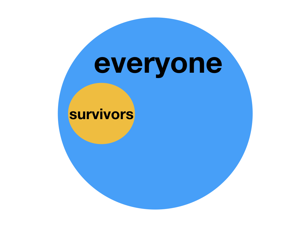
Delving deeper Makary and Daniel didn’t look at the total number of deaths every year in the US, which is 2,813,503. Instead they looked at the number of patients dying in US hospitals every year, which has been reported at 715,000. So if Makary and Daniel are correct with the 250,000 to 400,000 figure that would mean that 35-58% of hospital deaths in the US every year are due to medical error. This seems implausible to put it mildly.

It needs to be said that this was not an original piece of research. As I said earlier this was an analysis and extrapolation of previous studies all with flaws in their design. In doing their research Makary and Daniel used a very broad and vague definition of ‘medical error’:

“Medical error has been defined as an unintended act (either of omission or commission) or one that does not achieve its intended outcome, the failure of a planned action to be completed as intended (an error of execution), the use of a wrong plan to achieve an aim (an error of planning), or a deviation from the process of care that may or may not cause harm to the patient.”

It’s worth highlighting a few points here:

Let’s look at the bit about “does not achieve its intended outcome”. Let’s say a surgery is planned to remove a cancerous bowel tumour. The surgeon may well plan to remove the whole tumour. Let’s say that during the surgery they realise the cancer is too advanced and abort the surgery for palliation. That’s not the intended outcome of the surgery. But is it medical error? If that patient then died of their cancer was their death due to that unintended outcome of surgery? Probably not. Makary and Daniel didn’t make that distinction though. They would have recorded that a medical error took place and the patient died.

There was no distinction as to whether deaths were avoidable or not. They used data designed for insurance billing not for clinical research. They also didn’t look at whether errors “may or may not cause harm to the patient”. Just that they occurred. They also applied value judgements when reporting cases such as this:

“A young woman recovered well after a successful transplant operation. However, she was readmitted for non-specific complaints that were evaluated with extensive tests, some of which were unnecessary, including a pericardiocentesis. She was discharged but came back to the hospital days later with intra-abdominal hemorrhage and cardiopulmonary arrest. An autopsy revealed that the needle inserted during the pericardiocentesis grazed the liver causing a pseudoaneurysm that resulted in subsequent rupture and death. The death certificate listed the cause of death as cardiovascular.”

Notice the phrase “extensive tests, some of which were unnecessary”. Says who? We can’t tell how they made that judgement. It is unfortunate that this patient died. Less than 1% of patients having a pericardiocentesis will die due to injury due to the procedure. However, bleeding is a known complication of pericardiocentesis for which the patient would have been consented. Even the most skilled technician cannot avoid all complications. Therefore it is a stretch to put this death down to medical error.

This great blog by oncologist David Gorksi goes into much more detail about the flaws of Makary and Daniel’s work.

So what is the real figure?

A study published earlier this year (which received much less fanfare it has to be said) explored the impact of error on patient mortality. They studied the impact of all adverse events (medical and otherwise) on mortality rates in the US between 1990 and 2016. They found that the number of deaths in that whole 26 year period due to adverse events was 123,603. That’s 4754 deaths a year. Roughly one hundredth the figure banded around following Makary and Daniel (2016). Based on 2,813,503 total deaths in the US every year that makes adverse events responsible for 0.17% of deaths in the US. Not a third. 0.17%.

Of course, 4754 deaths every year due to adverse events is 4754 too many. One death due to adverse events would be one too many. We have to study and change processes to prevent these avoidable deaths. But we don’t do those patients any favours by propagating false figures.

Thanks for reading.

- Jamie

Medicine and Game Theory: How to win

board-game-1846400_960_720.jpg

You have to learn the rules of the game; then learn to play better than anyone else - Albert Einstein

Game theory is a field of mathematics which emerged in the 20th century looking at how players in a game interact. In game theory any interaction between two or more people can be described as a game. In this musing I’m looking at how game theory can influence healthcare both in the way we view an individual patient as well as future policy.

There are at least two kinds of games. One could be called finite, the other infinite. A finite game is played for the purpose of winning, an infinite game for the purpose of continuing the play.     

James P. Carse Author of Finite and Infinite Games

Game theory is often mentioned in sports and business

In a finite game all the players and all the rules are known. The game also has a known end point. A football match would therefore be an example of a finite game. There are two teams of eleven players with their respective coaches. There are two halves of 45 minutes and clear laws of football officiated by a referee. After 90 minutes the match is either won, lost or drawn and is definitely over.

Infinite games have innumerable players and no end points. Players can stop playing or join or be absorbed by other teams. The goal is not an endpoint but to keep playing. A football season or even several football seasons could be described as an infinite game. Key to infinite games then is a vision and principles. A team may lose one match but success is viewed by the team remaining consistent to that vision; such as avoiding relegation every season or promoting young talent. Athletic Club in Spain are perhaps the prime example of this. Their whole raison d'être is that they only use players from the Basque Region of Spain. This infinite game of promoting local talent eschews any short term game. In fact their supporters regularly report they’d rather get relegated than play non-Basque players.

Problems arise by confusing finite and infinite games. When Sir Alex Ferguson retired as Manchester United manager after 27 years in 2013 the club attempted to play an infinite game. They chose as his replacement David Moyes, a manager with a similar background and ethics to Ferguson, giving him a 9 year contract. 6 months into that he was fired and since then United have been playing a finite game choosing more short term appointments, Louis van Gaal and Jose Mourinho, rather than following a vision.

It’s easy to see lessons for business from game theory. You may get a deal or not. You may have good quarters or bad quarters. But whilst those finite games are going on you have your overall business plan, an infinite game. You’re playing to keep playing by staying in business.

What about healthcare?

So a clinician and patient could be said to be players in a finite game competing against whatever illness the patient has. In this game the clinician and patient have to work together and use their own experiences to first diagnose and then treat the illness. The right diagnosis is made and the patient gets better. The game is won and over. Or the wrong diagnosis is made and the patient doesn’t get better. The game is lost and over. But what about if the right diagnosis is made but for whatever reason the patient doesn’t get better? That finite game is lost. But what about the infinite game?

Let’s say our patient has an infection. That infection has got worse and now the patient has sepsis. In the United Kingdom we have very clear guidelines on how to manage sepsis from the National Institute of Clinical Excellence. Management is usually summed up as the ‘Sepsis Six’. There are clear principles about how to play this game. So we follow these principles as we treat our patient. We follow the Sepsis Six. But they aren’t guarantees. We use them because they give us the best possible chance to win this particular finite game. Sometimes it will work and the patient will get better and we win. Sometimes it won’t and the patient may die. Even if all the ‘rules’ are followed, due to reasons beyond any of the players. But whilst each individual patient may be seen as a finite game there is a larger infinite game being played. By making sure we approach each patient with these same principles we not only give them the best chance of winning their finite game but we also keep the infinite game going; of ensuring each patient with sepsis is managed in the same optimum way. By playing the infinite game well we have a better chance of winning finite games.

This works at the wider level too. For example, if we look at pneumonia we know that up to 70% of patients develop sepsis. We know that smokers who develop chronic obstructive pulmonary disease (COPD) have up to 50% greater risk of developing pneumonia. We know that the pneumococcal vaccine has reduced pneumonia rates especially amongst patients in more deprived areas. Reducing smoking and ensuring vaccination are infinite game goals and they work. This is beyond the control of one person and needs a coordinated approach across healthcare policy.

wood-100181_960_720.jpg

Are infinite games the future of healthcare?

In March 2015 just before the UK General Election the Faculty of Public Health published their manifesto called ‘Start Well, Live Better’ for improving general health. The manifesto consisted of 12 points:

The Start Well, Live Better 12 priorities from Lindsey Stewart, Liz Skinner, Mark Weiss, John Middleton, Start Well, Live Better—a manifesto for the public's health, Journal of Public Health, Volume 37, Issue 1, March 2015, Pages 3–5,

There’s a mixture of finite goals here - establishing a living wage for example - and some infinite goals as well such as universal healthcare. The problem is that finite game success is much more short-term and easier to measure than with infinite games. We can put a certain policy in place and then measure impact. However, infinite games aimed improving a population’s general health take years if not decades to show tangible benefit. Politicians who control healthcare policy and heads of department have a limited time in office and need to show benefits immediately. The political and budgetary cycles are short. It is therefore tempting to choose to play finite games only rather than infinite.

The National Health Service Long Term Plan is an attempt to commit to playing an infinite game. The NHS England Chief Simon Stevens laid out five priorities for the NHS focusing health spending over the next 5 years: mental health, cardiovascular disease, cancer, child services and reducing inequalities. This comes after a succession of NHS plans since 2000 which all focused on increasing competition and choice. The Kings Fund have been ambivalent about the benefit those plans made.

Since its inception the National Health Service has been an infinite game changing how we view illness and the relationship between the state and patients. Yet if we chase finite games that are incongruous to our finite game we risk that infinite game. There is a very clear link between the effect of the UK government’s austerity policy on social care and its impact on the NHS.

We all need to identify the infinite game we want to play and make sure it fits our principles and vision. We have to accept that benefits will often be intangible and appreciate the difficulties and scale we’re working with. We then have to be careful with the finite games we choose to play and make sure they don’t cost us the infinite game.

Playing an infinite game means committing to values at both a personal and institutional level. It says a lot about us and where we work. It means those in power putting aside division and ego. Above all it would mean honesty.

Thanks for reading

- Jamie

Spoiler Alert: why we actually love spoilers and what this tells us about communication

spoiler-alert.jpg

Last week the very last episode of Game of Thrones was broadcast. I was surrounded by friends and loved ones all doing everything they could to avoid hearing the ending before they’d seen it; even it this meant fingers in the ears and loud singing. I’ve only ever seen one episode so don’t worry I won’t spoil the ending for you. But actually that wouldn’t be as bad as you think. Spoiler alert: we actually love spoilers. And knowing this improves we way we communicate.

For all we complain if someone ‘spoils the ending’ of something the opposite is true. In 2011 a series of experiments explored the effect of spoilers on the enjoyment of a story. Subjects were given twelve stories from a variety of genres. One group were told the plot twist as part of a separate introduction. In the second the outcome was given away in the opening paragraph and the third group had no spoilers. The groups receiving the spoilers reported enjoying the story more than the group without spoilers. The group where the spoiler was a separate introduction actually enjoyed the story the most. This is known as the spoiler paradox.

Understanding the spoiler paradox is to understand how human beings find meaning. This is known as ‘theory of mind’. This means we like giving meaning and intentions to other people and even inanimate objects. As a result we love stories. A lot. Therefore we find stories a better way of sharing a message. The message “don’t tell lies” is an important one we’ve tried to teach others for generations. But one of the best ways to teach it was to give it a story: ‘The Boy Who Cried Wolf’. Consider Aesop’s fables or the parables of Jesus. Stories have a power.

Therefore, if we know where the story is going it becomes easier for us to follow. We don’t have to waste cognitive energy wondering where the story is taking us. Instead we can focus on the information as it comes. Knowing the final point makes the ‘journey’ easier.

Think how often we’ll watch a favourite movie or read a favourite book even though we know the end. We all know the story of Romeo and Juliet but will still watch it in the theatre. We’ll still go to see a film based on a book we’ve read. Knowing the ending doesn’t detract at all. In fact, I’d argue that focusing on twists and spoilers actually detracts from telling a good story. If you’re relying on spoilers to keep your audience’s attention then your story isn’t going to stand up to much. As a fan of BBC’s Sherlock I think the series went downhill fast in Series 3 when the writers focused on plot twists rather than just telling a decent updated version of the classic stories.

So, how can knowing about the spoiler paradox shape the way we communicate?

In healthcare we’re encouraged to user the ‘SBAR’ model to communicate about a patient. SBAR (Situation, Background, Assessment and Recommendation) was originally used by the military in the early 21st century before becoming widely adopted in healthcare where it has been shown to improve patient safety. In order to standardise communication about a patient SBAR proformas are often included by phones. There’s clear guidance about the content for each section of SBAR.

Situation:

Why I’m calling

Background:

What led to me seeing this patient

Assessment:

What I’ve found and done

Recommendation:

What I need from you

Handing over a patient on the phone to a senior is regularly included as a core skill to be assessed in examinations.

You’ll notice that right at the very beginning of the proforma in this photo (taken by me in the Resus room at Queens Medical Centre, Nottingham) it says ‘Presenting Complaint’. In other proformas I’ve seen this is also written as ‘Reason for call’. This makes a big impact on how easy the handover is for the other person. For example:

“Hi, is that the surgical registrar on call? My name is Jamie I’m one of the doctors in the Emergency Department. I’ve got a 20 year old man called John Smith down here who’s got lower right abdominal pain. He’s normally well and takes no medications. The pain started yesterday near his belly button and has moved to his right lower abdomen. He’s been vomiting and has a fever. His inflammatory markers are raised. I think he has appendicitis and would like to refer him to you for assessment.

OR

“Hi, is that the surgical registrar on call? My name is Jamie I’m one of the doctors in the Emergency Department. I’d like to refer a patient for assessment who I think has appendicitis. He’s a 20 year old man called John Smith who’s got lower right abdominal pain. He’s normally well and takes no medications. The pain started yesterday near his belly button and has moved to his right lower abdomen. He’s been vomiting and has a fever. His inflammatory markers are raised. Could I please send him for assessment?”

Both are the same story with the same intended message - I’ve got a patient with appendicitis I’d like to refer. But which one would be easier for a tired, stress surgeon on call to follow?

Or:

We can use this simple hack to make our presenting more effective as well. Rather than our audience sitting their trying to formulate their own ideas and meaning, which risks them either taking the wrong message home or just giving up, we must be explicit from the beginning.

“Hello my name is Jamie. I’m going to talk about diabetic ketoacidosis which affects 4% of our patients with Type 1 Diabetes. In particular I’m going to focus on three key points: what causes DKA, the three features we need to make a diagnosis and how the treatment for DKA is different from other diabetic emergencies and why we that it is important.”

Your audience immediately knows what is coming and what to look out for without any ambiguity. Communication is based on stories. Knowing what is coming actually helps us follow that story. The real spoiler is that we love spoilers. Don’t try and pull a rabbit from the hat. Punchlines are for jokes. Be clear with what you want.

Thanks for reading

- Jamie

Game of thrones.gif

"Obviously a major malfunction" - how unrealistic targets, organisational failings and misuse of statistics destroyed Challenger

AP8601281739-1.jpg

There is a saying commonly misattributed to Gene Kranz the Apollo 13 flight director: failure is not an option. In a way that’s true. Failure isn’t an option. I would say it’s inevitable in any complicated system. Most of us work in one organisation or another. All of us rely on various organisations in our day to day lives. I work in the National Health Service, one of 1.5 million people. A complex system doing complex work.

In a recent musing I looked at how poor communication through PowerPoint had helped destroy the space shuttle Columbia in 2003. That, of course, was the second shuttle disaster. In this musing I’m going to look at the first.

This is the story of how NASA was arrogant; of unrealistic targets, of disconnect between seniors and those on the shop floor and of the misuse of statistics. It’s a story of the science of failure and how failure is inevitable. This is the story of the Challenger disaster.

”An accident rooted in history”

It’s January 28th 1986 at Cape Canaveral, Florida. 73 seconds after launching the space shuttle Challenger explodes. All seven of its crew are lost. Over the tannoy a distraught audience hears the words, “obviously a major malfunction.” After the horror come the questions.

The Rogers Commission is formed to investigate the disaster. Amongst its members are astronaut Sally Ride, Air Force General Donald Kutyna, Neil Armstrong, the first man on the moon, and Professor Richard Feynman; legendary quantum physicist, bongo enthusiast and educator.

The components of the space shuttle system (From https://www.nasa.gov/returntoflight/system/system_STS.html)

The shuttle programme was designed to be as reusable as possible. Not only was the orbiter itself reused (this was Challenger’s tenth mission) but the two solid rocket boosters (SRBs) were also retrieved and re-serviced for each launch. The cause of the Challenger disaster was found to be a flaw in the right SRB. The SRBs were not one long section but rather several which connected with two rubber O-rings (a primary and a secondary) sealing the join. The commission discovered longstanding concerns regarding the O-rings.

In January 1985 following a launch with the shuttle Discovery soot was found between the O-rings indicating that the primary ring hadn’t maintained a seal. At that time the launch had been the coldest yet at about 12 degrees Celsius. At that temperature the rubber contracted and became brittle making it harder to maintain a seal. On other missions the primary ring was nearly completely eroded through. The flawed O-ring design had been known about since 1977 leading the commission to describe Challenger, “an accident rooted in history.”

The forecast for the launch of Challenger would break the cold temperature record of Discovery: -1 degrees Celsius. On the eve of the launch engineers from Morton Thiokol alerted NASA managers of the danger of O-ring failure. They advised waiting for a warmer launch day. NASA however pushed back and asked for proof of failure rather than proof of safety. An impossibility.

“My God Thiokol, when do you want me to launch? Next April?”

Lawrence Molloy, SRB Manager at NASA

NASA pressed Morton Thiokol managers to go over their engineers and approve launch. On the morning of the 28th the forecast was proved right and the launch site was covered with ice. Reviewing launch footage the Rogers Commission found that in the cold temperature O-rings on the right SRB had failed to maintain a seal. 0.678 seconds into the launch grey smoke was seen escaping the right SRB. Due to ignition the SRB casing expanded slightly and the rings should have moved with the casing to maintain the seal. However, at minus one degrees Celsius they were too brittle and failed to do so. This should have caused Challenger to explode on the launch pad but aluminium oxides from the rocket fuel filled the damaged joint and did the job of the O-rings by sealing the site. This temporary seal allowed the Challenger to lift off.

This piece of good fortune might have allowed Challenger and its crew to survive. Sadly, 58.788 seconds into the launch Challenger hit a strong wind sheer which dislodged the aluminium oxide. This allowed hot air to escape and ignite. The right SRB burned through its joint to the external tank, coming loose and colliding with it. This caused a fireball which ignited the whole stack.

Challenger disintegrated and the crew cabin was sent into free fall before crashing into the sea. When the cabin was retrieved from the sea bed the personal safety equipment of three of the crew had been activated suggesting they survived the explosion but not the crash into the sea. The horrible truth is that it is possible they were conscious for at least a part of the free fall. Two minutes and forty five seconds.

So why the push back from NASA? Why did they proceed when there were concerns about the safety of the O-rings? This is where we have to look at NASA as an organisation arrogantly assumed it could guarantee safety. This included its own unrealistic targets.

NASA’s unrealistic targets

NASA had been through decades of boom and bust. The sixties had begun with them lagging behind the Soviets in the space race and finished with the stars and stripes planted on the moon. Yet the political enthusiasm triggered by President Kennedy and the Apollo missions had dried up and with it the public’s enthusiasm also waned. The economic troubles of the seventies were now followed by the fiscal conservatism of President Reagan. The money had dried up. NASA managers looked to shape the space programme in a way to fit the new economic order.

First, space shuttles would be reusable. Second, NASA made bold promises to the government. Their space shuttles would be so reliable and easy to use there would be no need to spend money on any military space programme; instead give the money to NASA to launch spy satellites. In between any government mission the shuttles would be a source of income as the private sector paid to use them. In short, the shuttle would be a dependable bus service to space. NASA promised that they could complete sixty missions a year with two shuttles at any one time ready to launch. This promise meant the pressure was immediately on to perform.

Four shuttles were initially built: Atlantis, Challenger, Columbia and Discovery. The first shuttle to launch was Columbia on 12th April 1981, one of two missions that year. In 1985 nine shuttle missions were completed. This was a peak that NASA would never exceed. By 1986 the target of sixty flights a year was becoming a monkey on the back of NASA. STS-51-L’s launch date had been pushed back five times due to bad weather and the previous mission itself being delayed seven times. Delays in that previous mission were even more embarrassing as Congressman Bill Nelson was part of the crew. Expectation was mounting and not just from the government.

Partly in order to inspire public interest in the shuttle programme the ‘Teacher in Space Project’ had been created in 1984 to carry teachers into space as civilian members of future shuttle crews. From 11,000 completed applications one teacher, Christa McAuliffe from New Hampshire was chosen to fly on Challenger as the first civilian in space. She would deliver two fifteen minute lessons from space to be watched by school children in their classrooms. The project worked. There was widespread interest in the mission with the ‘first teacher in space’ becoming something of a celebrity. It also created more pressure. McAuliffe was due to deliver her lessons on Day 4 of the mission. Launching on 28th January meant Day 4 would be a Friday. Any further delays and Day 4 would fall on the weekend; there wouldn’t be any children in school to watch her lessons. Fatefully, the interest also meant 17% of Americans would watch Challenger’s launch on television.

NASA were never able to get anywhere close to their target of sixty missions a year. They were caught out by the amount of refurbishment needed after each shuttle flight to get the orbiter and solid rocket boosters ready to be used again. They were hamstrung immediately from conception by an unrealistic target they never should have made. Their move to inspire public interest arguably increased demand to perform. But they had more problems including a disconnect between senior staff and those on the ground floor.

Organisational failings

During the Rogers Commission NASA managers quoted that the risk of a catastrophic accident (one that would cause loss of craft and life) befalling their shuttles was 1 in 100,000. Feynman found this figure ludicrous. A risk of 1 in 100,000 meant that NASA could expect to launch a shuttle every day for 274 years before they had a catastrophic accident. The figure of 1 in 100,000 was found to have been calculated as a necessity; it had to be that high. It had been used to reassure both the government and astronauts. It had also helped encourage a civilian to agree to be part of the mission. Once that figure was agreed NASA managers had worked backwards to make sure that the safety figures for all the shuttle components combined to make an overall risk of 1 in 100,000. NASA engineers knew this to be the case and formed their own opinion of risk. Feynman spoke to them directly. They perceived the risk at somewhere between 1 in 50 and 1 in 200. Assuming NASA managed to launch sixty missions a year that meant their engineers expected a catastrophic accident somewhere between once a year to once every three years. As it turned out the Challenger disaster would occur on the 25th shuttle mission. There was a clear disengagement between the perceptions of managers and those with hands on experience regarding the shuttle programme’s safety. But there were also fundamental errors when it came to calculating how safe the shuttle programme was.

Misusing statistics

One of those safety figures NASA included in their 1 in 100,000 figure involved the O rings responsible for the disaster. NASA had given the O rings a safety factor of 3. This was based on test results which showed that the O rings could maintain a seal despite being burnt a third of the way through. Feynman again tore this argument apart. A safety factor of 3 actually means that something can withstand conditions three times those its actually designed for. He used the analogy of a bridge built to only hold 1000 pounds being able to hold a 3000 pound load as showing a safety factor of 3. If a 1000 pound truck drove over the bridge and it cracked a third of a way through then the bridge would be defective, even if it managed to still hold the truck. The O rings shouldn’t have burnt through at all. Regardless of them still maintaining a seal the test results actually showed that they were defective. Therefore the safety factor for the O rings was not 3. It was zero. NASA misused the definitions and values of statistics to ‘sell’ the space shuttle as safer that it was. There was an assumption of total control. No American astronaut had ever been killed on a mission. Even when a mission went wrong like Apollo 13 the astronauts were brought home safely. NASA were drunk on their reputation.

Aftermath

The Rogers Commission Report was published on 9th June 1986. Feynman was concerned that the report was too lenient to NASA and so insisted his own thoughts were published as Appendix F. The investigation into Challenger would be his final adventure; he was terminally ill with cancer during the hearing and died in 1988. Sally Ride would also be part of the team investigating the Columbia disaster; the only person to do so. After she died in 2012 Kutyna revealed she had been the person discretely pointing the commission in the correct direction of the faulty O-rings. The shuttle programme underwent a major redesign and it would be two years before there was another mission.

Sadly, the investigation following the Columbia disaster found that NASA had failed to learn lessons from Challenger with similar organisational dysfunction. The programme was retired in 2011 after 30 years and 133 successful missions and 2 tragedies. Since then NASA has been using the Russian Soyuz rocket programme to get to space.

The science of failure

Failure isn’t an option. It’s inevitable. By its nature the shuttle programme was always experimental at best. It was wrong to pretend otherwise. Feynman would later compare NASA’s attitude to safety to a child believing that running across the road is safe because they didn’t get run over. In a system of over two million parts to have complete control is a fallacy.

We may not all work in spaceflight but Challenger and then Columbia offer stark lessons in human factors we should all learn from. A system may seem perfect because its imperfection is yet to be found, or has been ignored or misunderstood.

The key lesson is this: We may think our systems are safe, but how will we really know?

"For a successful technology, reality must take precedence over public relations,

for Nature cannot be fooled."

Professor Richard Feynman

Bullet Holes & Bias: The Story of Abraham Wald

“History is written by the victors”

Sir Winston Churchill

It is some achievement if we can be acknowledged as succeeding in our field of work. If that field of work happens to be helping to win the most bloody conflict in history then our achievement deserves legendary status. What then do you say of a man who not only succeeded in his field and helped the Allies win the Second World War but whose work continues to resonate throughout life today? Abraham Wald was a statistician whose unique insight echoes in areas as diverse as clinical research, finance and the modern celebrity obsession. This is his story and the story of survivorship bias. This is the story of why we must take a step back and think.

Abraham Wald and Bullet Holes in Planes

Wald was born in 1902 in the then Austria-Hungarian empire. After graduating in Mathematics he lectured in Economics in Vienna. As a Jew following the Anschluss between Nazi Germany and Austria in 1938 Wald and his family faced persecution and so they emigrated to the USA after he was offered a university position at Yale. During World War Two Wald was a member of the Statistical Research Group (SRG) as the US tried to approach military problems with research methodology.

One problem the US military faced was how to reduce aircraft casualties. They researched the damage received to their planes returning from conflict. By mapping out damage they found their planes were receiving most bullet holes to the wings and tail. The engine was spared.

DISTRIBUTION OF BULLET HOLES IN AIRCRAFT THAT RETURNED TO BASE AFTER MISSIONS. SKETCH BY WALD. IN “VISUAL REVELATIONS” BY HOWARD WAINER. LAWRENCE ERLBAUM AND ASSOCIATES, 1997.

Abraham Wald

The US military’s conclusion was simple: the wings and tail are obviously vulnerable to receiving bullets. We need to increase armour to these areas. Wald stepped in. His conclusion was surprising: don’t armour the wings and tail. Armour the engine.

Wald’s insight and reasoning was based on understanding what we now call survivorship bias. Bias is any factor in the research process which skews the results. Survivorship bias describes the error of looking only at subjects who’ve reached a certain point without considering the (often invisible) subjects who haven’t. In the case of the US military they were only studying the planes which had returned to base following conflict i.e. the survivors. In other words what their diagram of bullet holes actually showed was the areas their planes could sustain damage and still be able to fly and bring their pilots home.

No matter what you’re studying if you’re only looking at the results you want and not the whole then you’re subject to survivorship bias.

No matter what you’re studying if you’re only looking at the results you want and not the whole then you’re subject to survivorship bias.

Wald surmised that it was actually the engines which were vulnerable: if these were hit the plane and its pilot went down and didn’t return to base to be counted in the research. The military listened and armoured the engine not the wings and tail.

The US Airforce suffered over 88,000 casualties during the Second World War. Without Wald’s research this undoubtedly would have been higher. But his insight continues to this day and has become an issue in clinical research, financial markets and the people we choose to look up to.

Survivorship Bias in Clinical Research

In 2010 in Boston, Massachusetts a trial was conducted at Harvard Medical School and Beth Israel Deaconess Medical Center (BIDMC) into improving patient survival following trauma. A major problem following trauma is if the patient develops abnormal blood clotting or coagulopathy. This hinders them in stemming any bleeding they have and increases their chances of bleeding to death. Within our blood are naturally occurring proteins called factors which act to encourage blood clotting. The team at Harvard and BIDMC investigated whether giving trauma patients one of these factors would improve survival. The study was aimed at patients who had received 4-8 blood transfusions within 12 hours of their injury. They hoped to recruit 1502 patients but abandoned the trial after recruiting only 573.

Why? Survivorship bias. The trial only included patients who survived their initial accident and then received care in the Emergency Department before going to Intensive Care with enough time passed to have been given at least 4 bags of blood. Those patients who died prior to hospital or in the Emergency Department were not included. The team concluded that due to rising standards in emergency care it was actually very difficult to find patients suitable for the trial. It was therefore pointless to continue with the research.

This research was not the only piece reporting survivorship bias in trauma research. Does this matter? Yes. Trauma is the biggest cause of death worldwide in the under 45 year-olds. About 5.8 million people die worldwide due to trauma. That’s more than the annual total of deaths due to malaria, tuberculosis and HIV/AIDS. Combined. Or, to put it another way, one third of the total number of deaths in combat during the whole of the Second World War. Every year. Anything that impedes research into trauma has to be understood. Otherwise it costs lives. But 90% of injury deaths occur in less economically developed countries. Yet we perform research in Major Trauma Units in the West. Survivorship bias again.

As our understanding of survivorship bias grows so we are realising that no area of Medicine is safe. It clouds outcomes in surgery and anti-microbial research. It touches cancer research. Cancer survival rates are usually expressed as 5 year survival; the percentage of patients alive 5 years after survival. But this doesn’t include the patients who died of something other than cancer and so may be falsely optimistic. However, Medicine is only a part of the human experience survivorship bias touches.

Survivorship Bias in Financial Markets & our Role Models

Between 1950 and 1980 Mexico industrialised at an amazing rate achieving an average of 6.5% growth annually. The ‘Mexico Miracle’ was held up as an example of how to run an economy as well as encouraging investment into Latin American markets. However, since 1980 the miracle has run out and never returned. Again, looking only at the successes and not the failures can cost investors a lot of money.

Say I’m a fund manager and I approach you asking for investment. I quote an average of 1.8% growth across my funds. Sensibly you do your research and request my full portfolio:

Funds.jpeg

It is common practice in the fund market to only quote active funds. Poorly performing funds, especially those with negative growth, are closed. If we only look at my active funds in this example then yes, my average growth is 1.8%. You might invest in me. If however you look at all of my portfolio then actually my average performance is -0.2% growth. You probably wouldn’t invest then.

Yet survivorship bias has a slight less tangible effect on modern life now. How often is Mark Zuckerberg held up as an example for anyone working in business? We focus on the one self-made billionaire who dropped out of education before making their fortune and not the thousands who followed the same path but failed. A single actor or sports star is used as a case study on how to succeed and we are encouraged to follow their path never mind that many who do fail. Think as well about how we look at other aspects of life. How often do we look at one car still in use after 50 years or one building still standing after centuries and say, “we don’t make them like they used to”? We overlook how many cars or buildings of a similar age have now rusted or crumbled away. All of this is the same thought process going through the minds of the US Military as they counted bullet holes in their planes.

To the victor belong the spoils but we must always remember the danger of only looking at the positive outcomes and ignoring those often invisible negatives. We must be aware of the need to see the whole picture and notice when we are not. With our appreciation of survivorship bias must also come an appreciation of Abraham Wald. A man whose simple yet profound insight shows us the value of stepping back and thinking.

Thanks for reading

- Jamie

Death by PowerPoint: the slide that killed seven people

The space shuttle Columbia disintegrating in the atmosphere (Creative Commons)

We’ve all sat in those presentations. A speaker with a stream of slides full of text, monotonously reading them off as we read along. We’re so used to it we expect it. We accept it. We even consider it ‘learning’. As an educator I push against ‘death by PowerPoint’ and I'm fascinated with how we can improve the way we present and teach. The fact is we know that PowerPoint kills. Most often the only victims are our audience’s inspiration and interest. This, however, is the story of a PowerPoint slide that actually helped kill seven people.

January 16th 2003. NASA Mission STS-107 is underway. The Space Shuttle Columbia launches carrying its crew of seven to low orbit. Their objective was to study the effects of microgravity on the human body and on ants and spiders they had with them. Columbia had been the first Space Shuttle, first launched in 1981 and had been on 27 missions prior to this one. Whereas other shuttle crews had focused on work to the Hubble Space Telescope or to the International Space Station this mission was one of pure scientific research.

The launch proceeded as normal. The crew settled into their mission. They would spend 16 days in orbit, completing 80 experiments. One day into their mission it was clear to those back on Earth that something had gone wrong.

As a matter of protocol NASA staff reviewed footage from an external camera mounted to the fuel tank. At eighty-two seconds into the launch a piece of spray on foam insulation (SOFI) fell from one of the ramps that attached the shuttle to its external fuel tank. As the crew rose at 28,968 kilometres per hour the piece of foam collided with one of the tiles on the outer edge of the shuttle’s left wing.

Frame of NASA launch footage showing the moment the foam struck the shuttle’s left wing (Creative Commons)

It was impossible to tell from Earth how much damage this foam, falling nine times faster than a fired bullet, would have caused when it collided with the wing. Foam falling during launch was nothing new. It had happened on four previous missions and was one of the reasons why the camera was there in the first place. But the tile the foam had struck was on the edge of the wing designed to protect the shuttle from the heat of Earth’s atmosphere during launch and re-entry. In space the shuttle was safe but NASA didn’t know how it would respond to re-entry. There were a number of options. The astronauts could perform a spacewalk and visually inspect the hull. NASA could launch another Space Shuttle to pick the crew up. Or they could risk re-entry.

NASA officials sat down with Boeing Corporation engineers who took them through three reports; a total of 28 slides. The salient point was whilst there was data showing that the tiles on the shuttle wing could tolerate being hit by the foam this was based on test conditions using foam more than 600 times smaller than that that had struck Columbia. This is the slide the engineers chose to illustrate this point:

NASA managers listened to the engineers and their PowerPoint. The engineers felt they had communicated the potential risks. NASA felt the engineers didn’t know what would happen but that all data pointed to there not being enough damage to put the lives of the crew in danger. They rejected the other options and pushed ahead with Columbia re-entering Earth’s atmosphere as normal. Columbia was scheduled to land at 0916 (EST) on February 1st 2003. Just before 0900, 61,170 metres above Dallas at 18 times the speed of sound, temperature readings on the shuttle’s left wing were abnormally high and then were lost. Tyre pressures on the left side were soon lost as was communication with the crew. At 0912, as Columbia should have been approaching the runway, ground control heard reports from residents near Dallas that the shuttle had been seen disintegrating. Columbia was lost and with it her crew of seven. The oldest crew member was 48.

The shuttle programme was on lock down, grounded for two years as the investigation began. The cause of the accident became clear: a hole in a tile on the left wing caused by the foam let the wing dangerously overheat until the shuttle disintegrated.

The questions to answer included a very simple one: Why, given that the foam strike had occurred at a force massively out of test conditions had NASA proceeded with re-entry?

Edward Tufte, a Professor at Yale University and expert in communication reviewed the slideshow the Boeing engineers had given NASA, in particular the above slide. His findings were tragically profound.

Firstly, the slide had a misleadingly reassuring title claiming that test data pointed to the tile being able to withstand the foam strike. This was not the case but the presence of the title, centred in the largest font makes this seem the salient, summary point of this slide. This helped Boeing’s message be lost almost immediately.

Secondly, the slide contains four different bullet points with no explanation of what they mean. This means that interpretation is left up to the reader. Is number 1 the main bullet point? Do the bullet points become less important or more? It’s not helped that there’s a change in font sizes as well. In all with bullet points and indents six levels of hierarchy were created. This allowed NASA managers to imply a hierarchy of importance in their head: the writing lower down and in smaller font was ignored. Actually, this had been where the contradictory (and most important) information was placed.

Thirdly, there is a huge amount of text, more than 100 words or figures on one screen. Two words, ‘SOFI’ and ‘ramp’ both mean the same thing: the foam. Vague terms are used. Sufficient is used once, significant or significantly, five times with little or no quantifiable data. As a result this left a lot open to audience interpretation. How much is significant? Is it statistical significance you mean or something else?

Finally the single most important fact, that the foam strike had occurred at forces massively out of test conditions, is hidden at the very bottom. Twelve little words which the audience would have had to wade through more than 100 to get to. If they even managed to keep reading to that point. In the middle it does say that it is possible for the foam to damage the tile. This is in the smallest font, lost.

NASA’s subsequent report criticised technical aspects along with human factors. Their report mentioned an over-reliance on PowerPoint:

“The Board views the endemic use of PowerPoint briefing slides instead of technical papers as an illustration of the problematic methods of technical communication at NASA.”

Edward Tufte’s full report makes for fascinating reading. Since being released in 1987 PowerPoint has grown exponentially to the point where it is now estimated than thirty million PowerPoint presentations are made every day. Yet, PowerPoint is blamed by academics for killing critical thought. Amazon’s CEO Jeff Bezos has banned it from meetings. Typing text on a screen and reading it out loud does not count as teaching. An audience reading text off the screen does not count as learning. Imagine if the engineers had put up a slide with just: “foam strike more than 600 times bigger than test data.” Maybe NASA would have listened. Maybe they wouldn’t have attempted re-entry. Next time you’re asked to give a talk remember Columbia. Don’t just jump to your laptop and write out slides of text. Think about your message. Don’t let that message be lost amongst text. Death by PowerPoint is a real thing. Sometimes literally.

Thanks for reading

- Jamie

Columbia’s final crew (from https://www.space.com/19436-columbia-disaster.html)


What if I Told You About Morpheus and 'The Mandela Effect'?

We’ve probably all seen this meme of Morpheus played by Laurence Fishburne from the movie The Matrix. In the film Morpheus has a ‘teacher role’ and reveals the true nature of reality to Keanu Reeve’s character, Neo. The meme has been in use since 2012 often as social commentary noting a common observed truth. I’ve also seen it in use in PowerPoint presentations. A simple search via Google reveals the sheer number of Morpheus memes there are out there:

However, the truth is that Morpheus never actually says the line, “what if I told you” in the film. Despite this, people who have seen it may say that they remember the line from the film and not from a meme often in this scene:

How about Darth Vader when he reveals he’s Luke Skywalker’s father in the film ‘Empire Strikes Back’? Chances are you’re thinking “Luke, I am your father”, when he actually says:

And if I asked you what the Queen in ‘Snow White’ says to her mirror? Did you think “Mirror, Mirror on the wall?” Wrong again.

This phenomenon of commonly reported false memories is known as ‘The Mandela Effect’ due to a large number of South Africans recalling that they heard news of the death of Nelson Mandela in the 1980s despite the fact he went on to become their president in 1994 and actually died in 2013. Searching for the Mandela Effect will bring up pseudoscientific websites who explain the phenomenon as multiverses mixing together. Psychologists would describe it as confabulation and it’s incredibly common. It’s been shown in studies that subjects will falsely recall a certain word (sleep) if they’ve been hearing related words (tired, bed, pillow etc). In another study participants were told of 4 events that happened to them aged between 4 and 6; three of them were real and one (getting lost in a mall) was false. 25% of participants stated that they could remember the false memory and even elaborated and embellished giving new details they ‘remembered’. In another experiment participants’ recall of a witnessed car crash was affected by the way they were questioned. If they were asked “what speed were the cars going when they smashed?” they tended to recall a much faster speed than if they were asked “what speed were the cars going when they contacted?”

We all rely on our memories to help make us who we are and establish the values we have. It is important to be aware of how our recall and that of our patients may be affected by context or other factors we may not be aware of.

No one is easier to fool than yourself.

Thanks for reading.

- Jamie