This sketch by Mitchell and Webb is funny but also has an important message behind it: evidence based medicine (EBM) is the centre of clinical practice. The reason we don’t reach for quartz crystals or start diluting down poisons is because we want to follow the evidence base. Yet while we want to practice evidence based healthcare do we always practice evidence based education? Do we route our education practices in the evidence base as much as we do in healthcare? Or do debunked educational theories such as learning styles still survive and spread? If we wouldn’t try and treat a trauma patient with crystals why try and teach with the educational equivalent of homeopathy?
This blog will take a look at the evidence base of how we learn and use that to form an approach to a teaching session that will make it easy for your audience. Whenever we teach our audience need to be our sole priority. Understanding how they think and learn should be central to how we design a teaching session.
What did you have to eat for lunch three weeks ago? What was the name of your first childhood pet? Chances are you won’t remember the former but will the latter even though your childhood pet may have been years ago. The reason is because of how human beings store information and form memories.
There’s essentially two types of information: the here and now and the long term. There here and now is dealt with by our working memory. Working memory is a cognitive system with a limited capacity. It temporarily holds information available to us to use immediately. Working memory is made of the phonological loop, which deals with sound information, the visual-spatial sketch pad, which deals with visual information and spatial awareness, and the central executive which controls information within the different areas. We therefore use our working memory for tasks such as reading, problem solving and navigation.
Working memory can hold a maximum of nine items (the seven plus or minus two principle) at any one time for fifteen to thirty seconds. That includes sensory information. This is why we have neural adaptation; after a while we no longer feel the clothes we’re wearing or smell the aftershave or perfume we’re wearing. If there’s a constant stimulus eventually our brain will start to ignore it in order to free up working memory.
Working memory becomes long term memory by categorising information into knowledge structures called ‘schema’. Through integrating these schema with existing knowledge and then repeated retrieval of the knowledge it becomes embedded in our long term memory. The lunch you ate three weeks ago would have been processed in your working memory, the here and now. But once eaten unless you repeated retrieving the memory it quickly became lost. However, your childhood pet, central to so many experiences over a long time, will be part of your long term memory and easily recalled.
The effort of turning working memory into long term memory is called cognitive load. As with physical effort it has its limits; just as if you try and lift too much weight you need to put it down and rest so too if your audience’s cognitive load is too much then they won’t learn.
We can see this outside of the classroom. Say you’re driving to work. A route you use every working day. The radio is on and you’re singing along word for word. Suddenly you see there’s road works and you have to go down a different route you’re not familiar with. There’s a tight parking spot and you need to do a three point turn. What about the song? Now it’s no longer pleasant but a distraction. It’s like you don’t have the head space to listen and perform your tasks. You turn the radio down. Now it all feels easier. That is due to cognitive load. What we think of as multi-tasking is actually us moving attention between information and tasks. The more information and tasks going on the harder it is to manage.
There are three types of cognitive load which make up the total effort: the Good, the Bad and the Ugly. It’s a zero sum process so if there is too much negative load the less space there is for learning. We have to simplify the ugly, reduce the bad and maximise the good. This is cognitive load theory.
THE (CAN BE) UGLY

Intrinsic cognitive load is the amount of cognitive resources the person would need to use to transfer new information to long term memory. This basically how complex the material being taught is. Therefore it can be ugly. Too much complexity and there is too much of a cognitive load on our audience. An educator needs to manage this part and simplify their message as much as possible. This minimises intrinsic cognitive load and prevents it getting ugly. How can we find the right level for our message?
Bloom’s cognitive taxonomy
Benjamin Bloom (1913-1999) was an American education psychologist who chaired a committee of educators which devised three hierarchical models for education in the domains of cognition (knowledge), affection (emotion) and psychomotor (action). These models classify learning into increasing levels of complexity and are used to devise learning objectives and design a teaching session.
The cognitive domain is used as the basis of traditional curricula. A student must first be able to achieve the basics before they can be expected to achieve the highest levels. First they must remember facts, understand them, apply that knowledge before analysing and evaluating material before finally creating it themselves.
Before you can understand a concept, you must remember it.
To apply a concept you must first understand it.
In order to evaluate a process, you must have analysed it.
To create an accurate conclusion, you must have completed a thorough evaluation.
We can use the cognitive domain to design a teaching session. For instance, if you’re designing a session on sepsis and you’re audience have never heard the term before you would want to focus your session on remembering and understanding and so reduce intrinsic load. Higher level skills should only be attempted once the basics are covered.
I was lucky enough to see Professor Brian Cox, one of my role models as a teacher, live on tour. Was he covering everything? Did we leave knowing everything he knew? Did we know everything there is to know about space and time and quantum mechanics? No. He knew his audience and he tailored his message for us. We were only on the lowest levels of Bloom’s cognitive taxonomy but the level was perfect.
Find the right level for your talk. Find the right message. Your message should be one sentence, one breath. This is what I am going to talk to you about. It should be made clear right at the beginning of your talk. Your message is not a punchline for the end. It should be there at the beginning. For all we complain if someone ‘spoils the ending’ of something the opposite is true.
In 2011 a series of experiments explored the effect of spoilers on the enjoyment of a story. Subjects were given twelve stories from a variety of genres. One group were told the plot twist as part of a separate introduction. In the second the outcome was given away in the opening paragraph and the third group had no spoilers. The groups receiving the spoilers reported enjoying the story more than the group without spoilers. The group where the spoiler was a separate introduction actually enjoyed the story the most. This is known as the spoiler paradox.
Understanding the spoiler paradox is to understand how human beings find meaning. This is known as ‘theory of mind’. This means we like giving meaning and intentions to other people and even inanimate objects. As a result we love stories. A lot. Therefore we find stories a better way of sharing a message. The message “don’t tell lies” is an important one we’ve tried to teach others for generations. But one of the best ways to teach it was to give it a story: ‘The Boy Who Cried Wolf’. Consider Aesop’s fables or the parables of Jesus. Stories have a power.
Therefore, if we know where the story is going it becomes easier for us to follow. We don’t have to waste cognitive energy wondering where the story is taking us. Instead we can focus on the information as it comes. Knowing the final point makes the ‘journey’ easier. We use this principle in healthcare when we make a handover:
“Hi, is that the surgical registrar on call? My name is Jamie I’m one of the doctors in the Emergency Department. I’ve got a 20 year old man called John Smith down here who’s got lower right abdominal pain. He’s normally well and takes no medications. The pain started yesterday near his belly button and has moved to his right lower abdomen. He’s been vomiting and has a fever. His inflammatory markers are raised. I think he has appendicitis and would like to refer him to you for assessment.”
OR
“Hi, is that the surgical registrar on call? My name is Jamie I’m one of the doctors in the Emergency Department. I’d like to refer a patient for assessment who I think has appendicitis. He’s a 20 year old man called John Smith who’s got lower right abdominal pain. He’s normally well and takes no medications. The pain started yesterday near his belly button and has moved to his right lower abdomen. He’s been vomiting and has a fever. His inflammatory markers are raised. Could I please send him for assessment?”
Both are the same story with the same intended message - I’ve got a patient with appendicitis I’d like to refer. But which one would be easier for a tired, stressed surgeon on call to follow? In the last one the reason for the phone call is right there at the beginning and so the person at the other end knows exactly what they’re listening out for. Teaching sessions should be the same.
“Hello my name is Jamie. I’m going to talk about diabetic ketoacidosis which affects 4% of our patients with Type 1 Diabetes. In particular I’m going to focus on three key points: what causes DKA, the three features we need to make a diagnosis and how the treatment for DKA is different from other diabetic emergencies and why we that it is important.”
Your audience immediately knows what is coming and what to look out for without any ambiguity.
Brevity is beautiful. Brevity is also hard. It goes against our instincts as we want to show everything we know and all about the work we’ve done. The less time you hard the harder it is. The hardest talk I’ve ever had to give was a three minute talk on a project. The project involved me designing a smartphone application for use in simulation sessions and to support my students during their week in the department. This work had taken over eight months and I was supposed to boil this down to three minutes? It seemed impossible.
This is why you need to go away and write out everything. Write a blog or a report or make a handout. Record a podcast. Something where everything is. In that act you’ll spot the key bits to take out and put into your presentation. The rest your audience can find out afterwards from your blog or your report or your podcast. This bit has to be done.
Having written out the blog containing all the information I identified the three key parts of the process and with that my message. My message was how a custom made application could maximise the short time students had with me. This was right at the beginning. I then highlighted the three key points at the beginning and went through those. I signposted to the blog for them to find out more.
Ethos comes from the speaker themselves. This is you, your background and standing and how you come across. Logos is using logic during your talk. An example would be, “my project has shown we can save X amount of money by not needing to do pointless blood tests”. It is also about how clear and easy to follow your message is and how logical it seems. Finally, pathos appeals to the emotions of the audience, their desire to do good and prevent suffering. You can combine all three to be an effective speaker.
THE BAD

Extraneous cognitive load creates distractions and prevents working memory from processing new information. It stops us learning. Distractions in the room and badly chosen media increase extraneous cognitive load and makes it harder to turn working memory into long term memory. As a result extraneous cognitive load must be reduced as much as is possible.
Remember the seven plus two principle of working memory from before. That’s a very small space which can be taken up very quickly by distractions. Once again we can turn to psychology to help us identify potential distractions with Maslow’s Hierarchy of Needs.
Maslow’s Hierarchy of Needs
Abraham Maslow (1908-1970) was an American psychologist. His hierarchy of needs is a model for human psychological wellbeing with the most basic and fundamental needs at the bottom and more complex processes at the top. Just as with Bloom’s taxonomy an individual can’t achieve the highest levels without those at the bottom. This means that we can’t self-actualise (achieving our full potential) without meeting our physiological needs, feeling safe, relationships and feeling a sense of self-esteem. While educators can’t cater for all of our audience needs we can think of Maslow’s hierarchy to reduce extraneous load. Think about room design, background noise, temperature, time of the day and physiological needs such as hunger or needing the toilet. If those basic needs are met then your audience working memory is being taken up with thoughts of hunger, their bladder or feeling cold.
Once we’ve thought about our learning environment we need to then think about our learning materials and minimising extraneous load by using words and images correctly. History gives us an important lesson of the potential consequences of this…
In January 2003 the Space Shuttle Columbia launched. During launch a piece of foam fell from the external fuel tank and hit Columbia’s left wing.
Foam falling during launch was nothing new. It had happened on four previous missions and was one of the reasons why the camera was there in the first place. But the tile the foam had struck was on the edge of the wing designed to protect the shuttle from the heat of Earth’s atmosphere during launch and re-entry. In space the shuttle was safe but NASA didn’t know how it would respond to re-entry. There were a number of options. The astronauts could perform a spacewalk and visually inspect the hull. NASA could launch another Space Shuttle to pick the crew up. Or they could risk re-entry.
NASA officials sat down with Boeing Corporation engineers who took them through three reports; a total of 28 slides. The salient point was whilst there was data showing that the tiles on the shuttle wing could tolerate being hit by the foam this was based on test conditions using foam more than 600 times smaller than that that had struck Columbia. This is the slide the engineers chose to illustrate this point:
NASA managers listened to the engineers and read their PowerPoint and thought this was learning. Boeing read out their slides and thought this was teaching. NASA decided to go for re-entry.
Columbia was scheduled to land at 0916 (EST) on February 1st 2003. At 0912, as Columbia should have been approaching the runway, ground control heard reports from residents near Dallas that the shuttle had been seen disintegrating. Columbia was lost and with it her crew of seven. The oldest crew member was 48.

Edward Tufte, a Professor at Yale University and expert in communication reviewed the slideshow the Boeing engineers had given NASA, in particular the above slide. His findings were tragically profound.


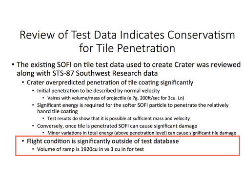
Firstly, the slide had a misleadingly reassuring title claiming that test data pointed to the tile being able to withstand the foam strike. This was not the case but the presence of the title, centred in the largest font makes this seem the salient, summary point of this slide. This helped Boeing’s message be lost almost immediately.
Secondly, the slide contains four different bullet points with no explanation of what they mean. This means that interpretation is left up to the reader. Is number 1 the main bullet point? Do the bullet points become less important or more? It’s not helped that there’s a change in font sizes as well. In all with bullet points and indents six levels of hierarchy were created. This allowed NASA managers to imply a hierarchy of importance in their head: the writing lower down and in smaller font was ignored. Actually, this had been where the contradictory (and most important) information was placed.
Thirdly, there is a huge amount of text, more than 100 words or figures on one screen. Two words, ‘SOFI’ and ‘ramp’ both mean the same thing: the foam. Vague terms are used. Sufficient is used once, significant or significantly, five times with little or no quantifiable data. As a result this left a lot open to audience interpretation. How much is significant? Is it statistical significance you mean or something else?
Finally the single most important fact, that the foam strike had occurred at forces massively out of test conditions, is hidden at the very bottom. Twelve little words which the audience would have had to wade through more than 100 to get to. If they even managed to keep reading to that point. In the middle it does say that it is possible for the foam to damage the tile. This is in the smallest font, lost.
NASA’s subsequent report criticised technical aspects along with human factors. Their report mentioned an over-reliance on PowerPoint:
“The Board views the endemic use of PowerPoint briefing slides instead of technical papers as an illustration of the problematic methods of technical communication at NASA.”

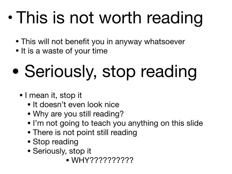
It’s not the audience’s fault though. Human beings love patterns. And words are a lovely pattern of letters together with meaning. Put them in front of an audience and it doesn’t matter whether it’s a mobile phone contract (left) or even if it’s telling you not to read (right) chances are people will get to the bottom.
Human beings are addicted to words. Words are a controlled drug. And just like a controlled drug whilst they have a use they have to be used with caution.
Yet when we open up PowerPoint or Keynote we are presented with a host of templates with obscure backgrounds and hard to read text, making it very easy to fall into the same traps:
One common mistake, which Boeing used when they presented to NASA, is to write lists of data on the slide. This is easy to do yet simply doesn’t work. I could write down the first twenty elements of the periodic table. The audience could read along with me. Yet that is not teaching. Read the twenty elements. Which one is the eighth? Chances are you’ll have to look back.
There’s another problem, as Edward Tufte pointed out, that bullet pointed lists imply a hierarchy. Those at the top are the most important and those at the bottom are the least. Look at this poster for the ‘Sepsis Six’. Obviously an important campaign and message yet by numbering the points it implies that the higher up steps are more prominent than those at the bottom. From a communication point of view this is a problem.
You only need one point per slide. That point is then the focus of that slide and your audience. As it’s one point you don't need a heading. Limit the number of words and make your point clear.
There. The eighth element is oxygen. A clear and memorable point.


However, just as words can be used badly so too can images. They can be distracting, misleading or just sheer pointless.
In order to minimise extraneous load we have to be careful about how we use images.
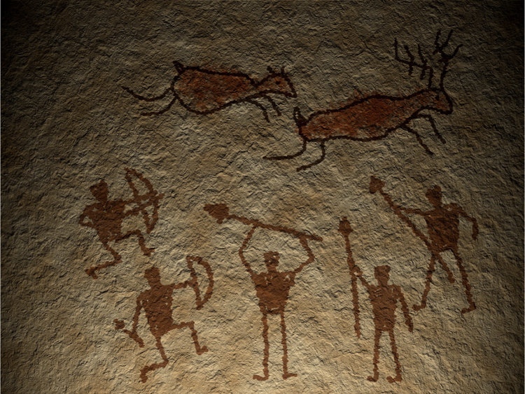
“A picture is worth a thousand words.” It’s a cliche but it’s true. Look at cave paintings. Despite the millennia that separate us from our ancestors there is a still a message that cuts through in a way which would be lost with the written word.

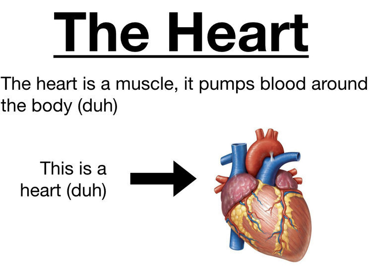

These slides contain some lovely images but also some mistakes. In the slide on the left there are four smalls on one slide. If you were talking about the heart this means there are three other distracting images for your audience to look at. It also means the image is too small. In the slide in the middle there’s pointless and patronising heading and annotation. The slide on the right contains one single, large, clear image. Perfect for use while you talk about the heart.
Pictures also have emotive power. Pictures can change the world. In 1990 HIV/AIDS had been public knowledge for seven years. There has probably never been a disease as stigmatising for its victims. For most it was a disease of gays, of drug users or immigrants. It wasn’t a disease that would affect us. It wasn’t a disease we could empathise with. The red ribbon campaign was still to come. The US didn’t even have a national AIDS policy. Then in 1990 a photograph was published.
Think how many thousands, how many millions of words had been written about HIV/AIDS by 1990. This photograph made more impact than all of them together. It shows David Kirby, a young man dying of AIDS, surrounded by his family. A patient with AIDS dying with a father, mother and sister grieving him. This photograph, known as ‘The Face of AIDS’, is credited with changing public opinion immediately. In 1992 it was used as part of a provocative campaign from Benetton, a clothing company. It was taken by Therese Frare, a photographer who befriended David Kirby in the final stages of his illness and was allowed to capture his final moments. Almost biblical, it humanised AIDS. These patients were not outcasts, they were people with loved ones just like everyone else.
Remember the photograph of Alan Kurdi, the three year Syrian refugee who drowned in the Mediterranean Sea. Within 24 hours of its publication the charity Migrant Offshore Aid Station reported a fifteen fold increase in donations.
it is possible to read words and be detached. Unless you are a psychopath it is impossible to look at a photograph like ‘The Face of AIDS’ and not feel something. If there’s a face on the screen we’ll find it and we’ll interpret it. Our neural pathways fire and we’ll empathise with that face. We’ll feel what they feel. This is pathos in action. Using an image like ‘The Face of AIDS’ in your slides cuts through far more than a slide of text.
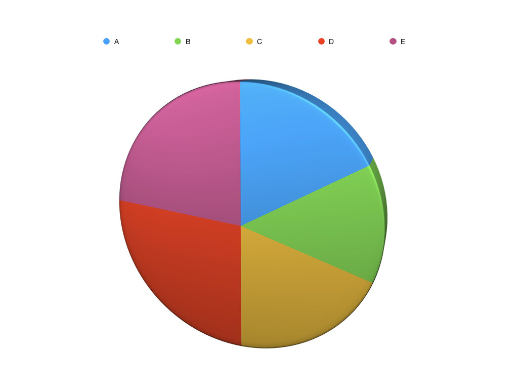


Data presentation is often a part, or even the reason, for presenting. Just as with words and images we need to present data in a clear way to reduce extraneous load. These graphs all show the same data. The one on the left and in the middle are both pie charts. To interpret them you need to look back at the label, find the colour and work out which looks biggest. Even with labels showing the percentage you still need to compare with others. This takes time and increases extraneous load. The bar chart on the right is much clearer. E immediately looks bigger than the others. This reduces load.

Another way of reducing extraneous load is to find the message in your data. A common mistake is to show all of the data in one slide. The slide on the left here shows data for a made up drug. There’s a table and a bar chart comparing this new drug to existing treatment. “Sorry for the busy slide, I’ll talk you through it” we’ll say and maybe even use a red box to highlight the key point: that the new treatment reduces mortality by a half.

Firstly, never use a slide you have to apologise for. Secondly if there’s a key point of your data then make that the single point of your slide. An easy to repeat and understand key point. If your audience want more data you can signpost them to a blog, report, podcast. Dropbox, Google Drive wherever. But they’ll take away a very simple message. Your brand new wonder drug halves mortality compared to previous treatment.
THE GOOD
Germane cognitive load is a deep process. It describes the organisation of information by integrating and connecting it with exiting knowledge. This is how our audience takes what’s been presented to them there and then and turns it into long term memory. Germane cognitive load needs to be maximised as much as possible.
It’s the night before your big exam. There you are, hunched over your books, highlighter in hand, caffeine in your bloodstream, flooding your short term memory with as much as you can. You continue doing so even as you wait to be called into the exam hall. You try and remember as much as you can. The next day, as the adrenaline leaves your system and you can finally get your life back you realise you remember very little about what you covered in those final, intense sessions of revision. The following day you remember even less. Eventually, despite having forced yourself to remember all those final bits of knowledge, you realise you remember nothing of it. You’ve passed your exam yet you have actually learnt nothing. We’re all guilty of the learn and burn approach of cramming. Yet we are all living, breathing proof it doesn’t work. This is the story of Hermann Ebbinghaus, the forgetting curve and how interleaving our learning can prevent the loss of knowledge.
Hermann Ebbinghaus (1850 – 1909) was a German psychologist. Contrary to the scholarly fashion of the time he was interesting in studying memory using himself as a test subject. He tried to memorise a collection of nonsense words and plotted how many he could remember a week or so later. He published his work in 1885 as Über das Gedächtnis (later translated into English as Memory: A Contribution to Experimental Psychology). He charted how poor recall was following an isolated learning event was without frequent calls to draw on that knowledge. The more frequently he recalled the nonsense words the longer he could remember them. This is the forgetting curve.
Ebbinghaus gave the process a formula and hypothesised several contributing factors to the ability to recall knowledge: how complex the subject was, how it linked to previous learning and personal factors such as sleep and stress. Time is unlikely to be the sole factor but the forgetting curve demonstrates a remarkable loss of learning unless that subject is regularly reviewed as shown below.

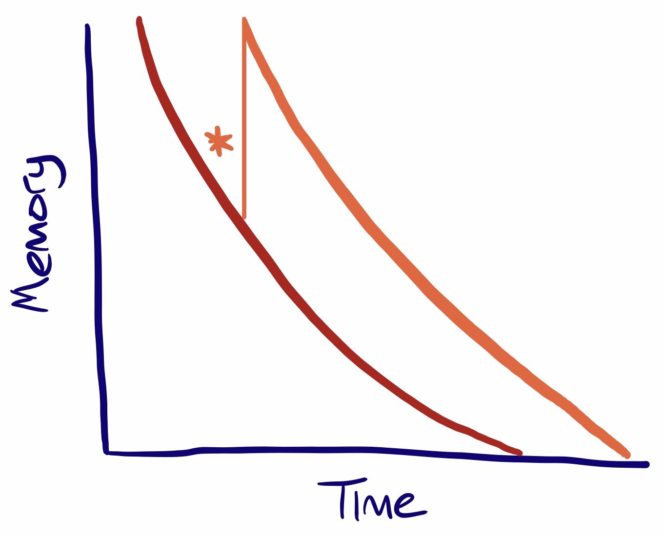

However, through repeated reviews of the learning material (the stars) we can shift the learning curve and improve retention of knowledge. This shows how it is impossible to cover everything in a talk. Your audience won’t retain it. This also goes back to intrinsic load and the importance of a clear, simple message. No subject can be completely covered in a presentation and if you try to do so you’ll fail. Your presentation should be like an iceberg. You can only show so much. Present your message and inspire your audience to find out more.
You should also try to encourage germane cognitive load through deep linkage to previous knowledge. This is difficult and goes against traditional learning. It also goes against that desire to cram.
The traditional model for curricula is to cover a topic in its entirety before moving onto the next which is covered in its entirety before moving onto the next and so on and so on. This is called blocking.
Blocked learning. Each topic is covered in its entirety and then the learning moves on. Assessment is separate and at the end.
In order to avoid blocking and the forgetting curve there are a number of potential solutions: interleaving, spaced practice and retrieval practice.
Interleaving
Rather than finishing a topic and moving on, never to return to look back in interleaving learners move between topics and ideas. he benefits of interleaving were first studied in rifle shooters in 1979 before also being found to benefit mathematics and music students when compared to blocked learning. The focus is on making connections with otherwise disparate topics.
Further research has shown that interleaving helps students distinguish between similar but different topics, a point not covered by blocked learning. The key seems to be that the topics have some inherent similarity; a paper from Indonesia in 2014 didn’t find any benefit from interleaving compared to blocked learning when learning anatomical words and translations. There is also a problem in terms of methodology. The paper looking at mathematics tested over a 3 month period, the paper looking at music skills tested a day after interleaving whilst the paper from Indonesia tested its subjects at 48 hours and one week. A lack of a coherent approach makes it hard to find a best practice. This is the challenge for educators to take on and find the best way to interleave learning.
Spaced Practice
Spaced practice is the opposite of cramming. The same amount of teaching is spaced out over time. Rather than five hours in one day you learn for one hour for five days. This takes us back to intrinsic load and the iceberg. We can’t cover everything in one session, we have to break a topic up and spread it around.
Retrieval practice
Retrieval practice involves recreating something you’ve been taught from your memory and thinking about it now. This is the basis of the shifting the forgetting curve as we looked at above. The idea is that some time must pass from the teaching session and the retrieval. Different tactics can be used such as quizzes, mock exams or flashcards.
For more information The Learning Scientists have excellent blogs on interleaving, spaced practice and retrieval practice.
This is how our month might look with interleaving and spaced practice. It’s the same number of teaching sessions as during the example of blocking but there’s a swapping between topics and spacing. Assessment could be in the form of retrieval practice covering what’s previously been taught. The idea is to overcome the forgetting curve.
This shows that the single presentation can’t be seen in isolation. It’s impossible to cover everything in one talk as it means too much intrinsic load and it prevents germane load. The focus must be on forming connections with previous learning and signposting to further resources or future sessions.
This should shape how we plan the session. Start with your clear message. Recall previous learning through discussion or activity. Introduce the new material. Show the connections between the new material and previous and future learning. Signpost.
TED talks have an 18 minute limit on their talks. This is to focus speakers and ensure they keep their audience’s attention. We can use something similar in our sessions, aim for no more than 18 minutes on a section of your talk, use exercises to break between sections and keep focus.
We gave up trying to resuscitate patients with smoke up their bottom because there wasn’t an evidence base. We can’t keep trying to educate without an evidence base either. Shape your sessions with the evidence.
Simplify intrinsic load
One simple message. Remember the spoiler paradox. Simplify the complex.
Reduce extraneous load
Remember Columbia. One point per slide. Use images and data correctly.
Maximise germane load
Beat the forgetting curve. Interleave. Use spaced and retrieval practice.
Thanks for reading
- Jamie