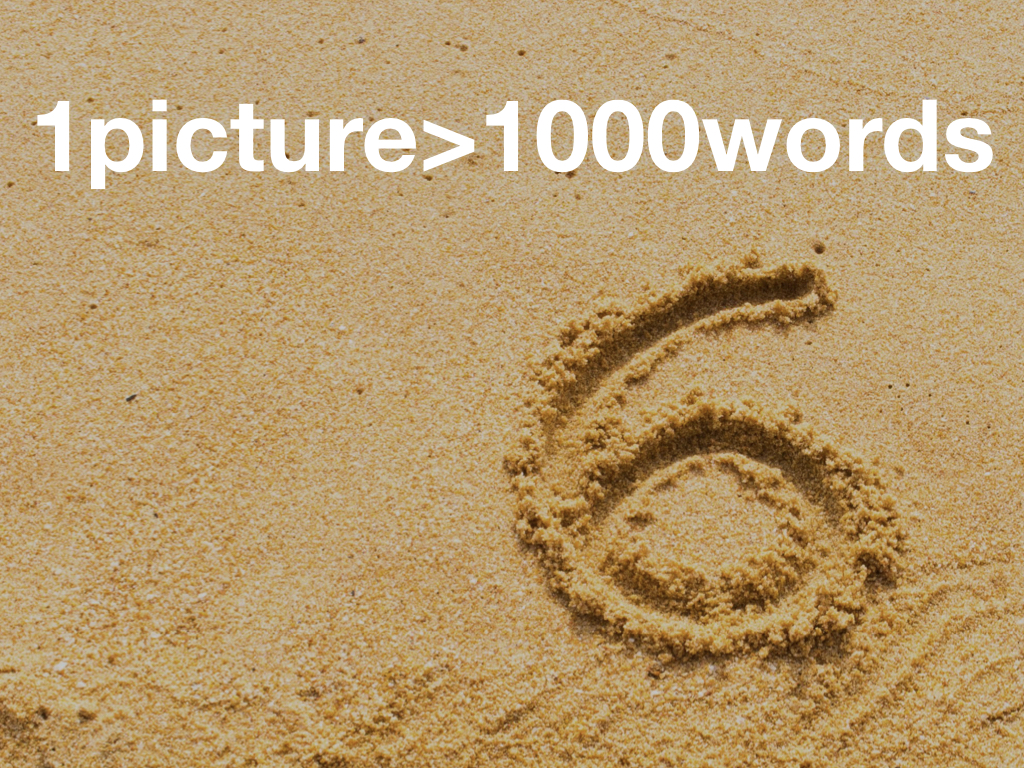
You know the old saying: A picture is worth a thousand words. I’d say that’s wrong. A picture is worth much more than a thousand words. Use our pictures’ power.

Pictures can provide a clarity lost by words and language. Look at this cave painting. Looking at it we know that five people; two with bows and three with spears went hunting and found a stag and a doe. If they’d written this out in words or symbols we possibly wouldn’t understand it. The picture however immediately cuts through any language barrier. The pictures we use in our presentation should have a similar clarity. They should add to our presentation, not take away.

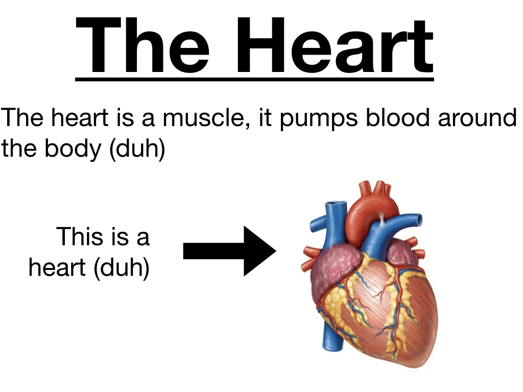
A common mistake we make with our images is to put more than one in a slide. We’ll tell our audience only to look at the heart in the top left but by putting up multiple images not only do we make them smaller and harder to see we also let our audiences’ eyes wander on to other images. All the while we want them to be looking at the heart some of our audience will be looking at the brain bottom right or the lungs top right.
Another common mistake is unnecessary labelling. I’ve sat in presentations with a consultant presenting to other consultants and they have labelling like this. They put information on the slide defining what shock is. Everyone in that room knew what shock was. There was no point having the information on the slide.

All text is distracting. Pointless annotation is exactly that. Pointless. Don’t use it!
Don’t patronise your audience. Don’t have pointless text on the slide. Think of your audience. They’ll know what the heart is. You don’t need a title. Even if you’re not sure they’ll know what a heart looks like you can actually say, “this is a heart.”
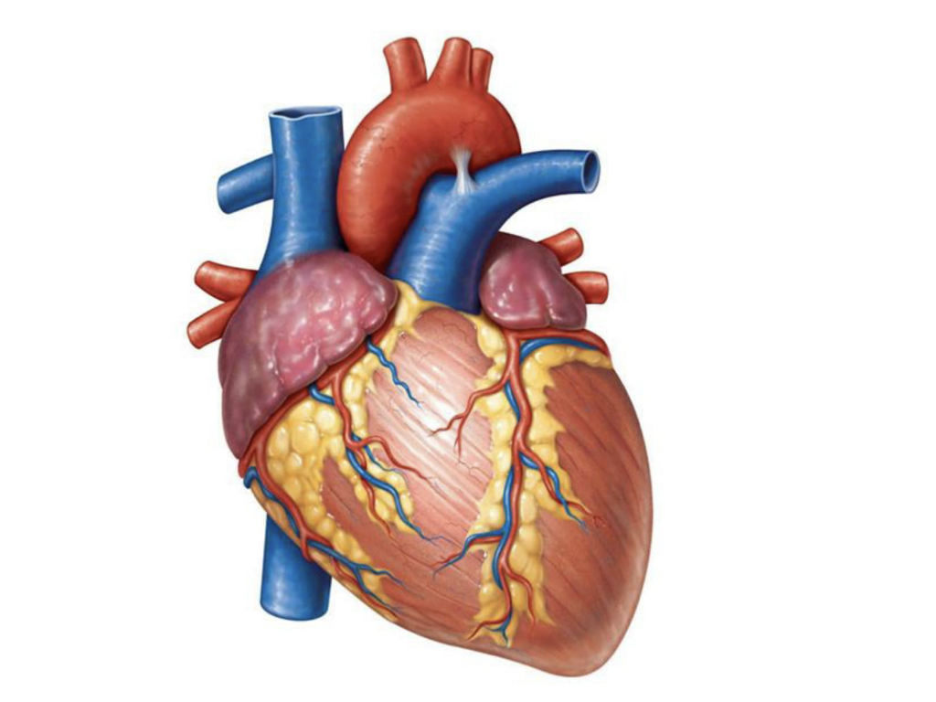
One image per slide. Let the image dominate. Blend it to the sides. Make it as clear as possible. This slide already says more about the heart than text could. There’s no confusion. I am talking about the heart. This is a heart. I want you to look at it. Here it is.
Pictures are worth more than a thousand words. But they have even more power than that. Pictures can change the world. In 1990 HIV/AIDS had been public knowledge for seven years. There has probably never been a disease as stigmatising for its victims. For most it was a disease of gays, of drug users or immigrants. It wasn’t a disease that would affect us. It wasn’t a disease we could empathise with. The red ribbon campaign was still to come. The US didn’t even have a national AIDS policy. Then in 1990 a photograph was published.
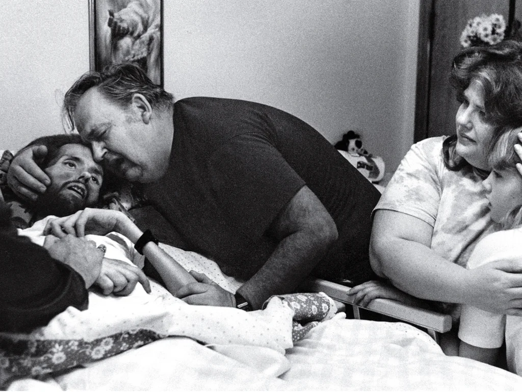
Think how many thousands, how many millions of words had been written about HIV/AIDS by 1990. This photograph made more impact than all of them together. It shows David Kirby, a young man dying of AIDS, surrounded by his family. A patient with AIDS dying with a father, mother and sister grieving him. This photograph, known as ‘The Face of AIDS’, is credited with changing public opinion immediately. In 1992 it was used as part of a provocative campaign from Benetton, a clothing company. It was taken by Therese Frare, a photographer who befriended David Kirby in the final stages of his illness and was allowed to capture his final moments. Almost biblical, it humanised AIDS. These patients were not outcasts, they were people with loved ones just like everyone else.
Remember the photograph of Alan Kurdi, the three year Syrian refugee who drowned in the Mediterranean Sea. Within 24 hours of its publication the charity Migrant Offshore Aid Station reported a fifteen fold increase in donations.
it is possible to read words and be detached. Unless you are a psychopath it is impossible to look at a photograph like ‘The Face of AIDS’ and not feel something. There’s neuroscience here. Remember we’re programmed to find faces. If there’s a face on the screen we’ll find it and we’ll interpret it. Our neural pathways fire and we’ll empathise with that face. We’ll feel what they feel. This is pathos in action. Using an image like ‘The Face of AIDS’ in your slides cuts through far more than a slide of text.
Patients with abdominal pain scare me. It can be nothing. It can be something benign. Sometimes it’s very serious. So I use a bit of pathos. I ask my audience to imagine being in a small boat at sea. Then you look over and you see something.
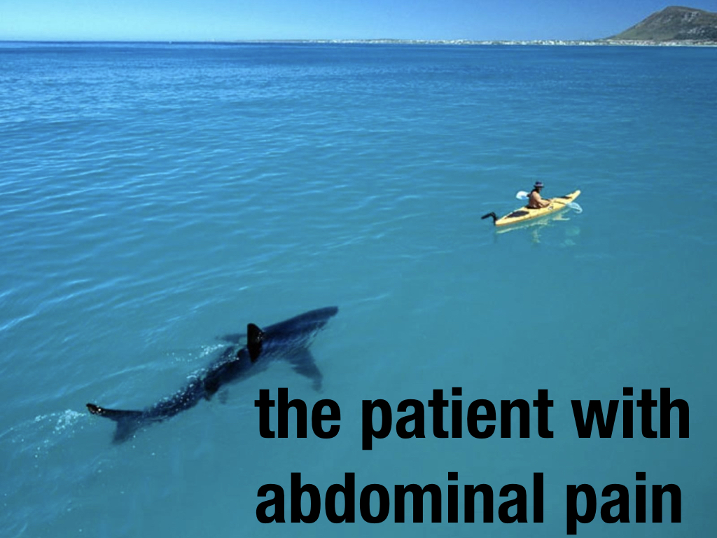
Cue a shudder in the audience as they put themselves in that boat. That’s how I feel with a patient with abdominal pain. There is something there. It might be benign. It might be sinister. This image shows that far better than any words ever could.
We can also manipulate our images in a way that makes them easier for our audience and nicer to look at. Have a look at this image.
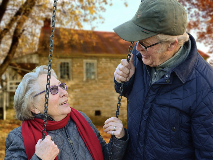
It shows an elderly couple on the swings. It’s nice to look. It looks professional. It’s hard to say why but we like it.
How about this image?
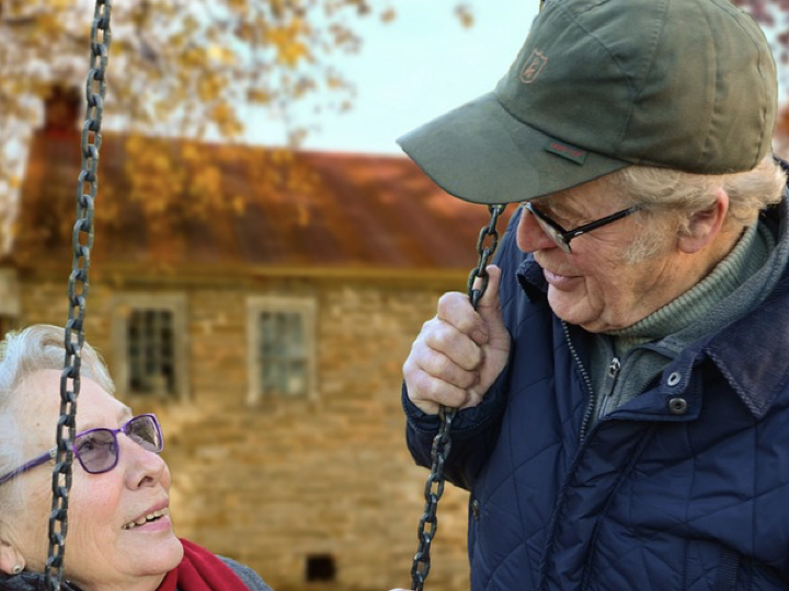
Suddenly the man is dominating even though he’s not in the middle but we’re drawn to him more.

Now we’re drawn to the woman.

This is the rule of thirds. Yes, another case of three being the magic number. Professional photographers divide any picture with three vertical and three horizontal lines like this:

Where those lines meet forms four ‘power points’. These four places are where you should put your point of interest. This is the difference from amateur photographers who point their subject in the middle. Using the four power points creates interest and tension in the picture.

Where the man dominates we see his face is near one power point.

Where the woman dominates we see his face is near another power point.

In the original we see how both faces are near a power point, the diagonally opposite power points in fact. There is a clear balance. This is why this photograph is nice to look at.
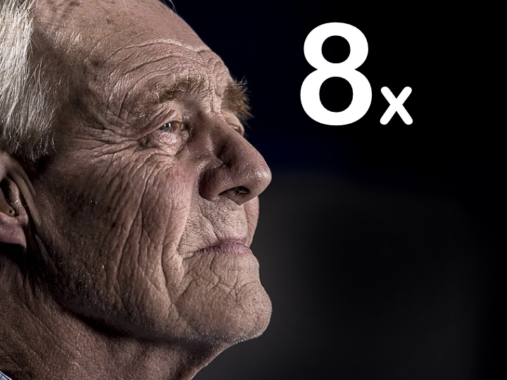
We can use faces and the rule of threes to make powerful slides. This is a slide I use when talking about how abdominal pain in the elderly has an 8 times increased mortality.

Once we see a face on the slide our eyes follow wherever that face is looking. So we look at this man’s face and then follow his gaze. We can move him so his eye falls on a power point.
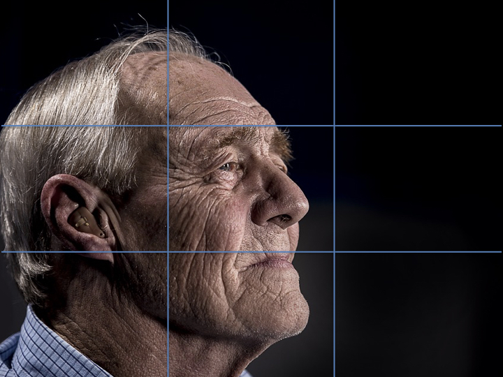
We can then follow his gaze with an arrow and make sure the ‘8x’ is in line and on another power point.
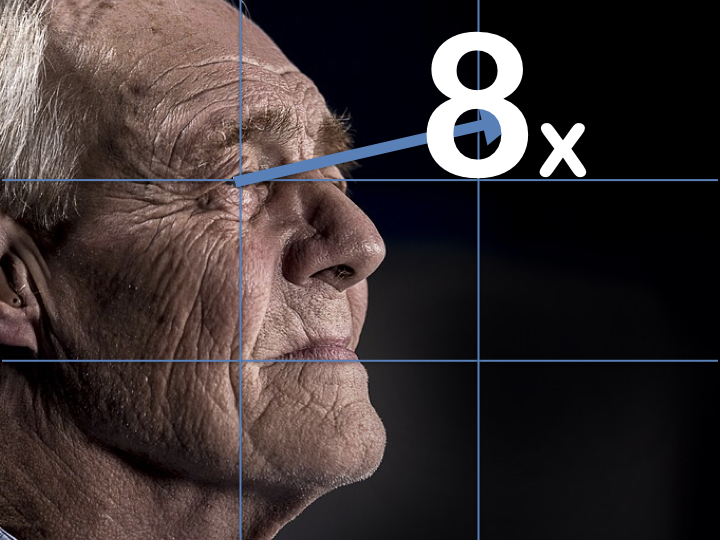
This creates a slide designed to have impact and be easy to follow.
In Step Two we put the audience first, second and third. Part of this was to find out where we would be presenting. There is no excuse to have slides that not all your audience can see.
A tip is to look at your slide deck. If you can’t see your slides on the slide deck then your audience won’t be able to see them if you’re in a big hall.
Garr Reynolds (Presentation Zen) has a brilliant page covering more about visuals in presentations.

Luckily there’s never been more ways of finding brilliant images. Here’s a few I use:
Pixabay (free)
Unsplash (free)
Pexels (free)
Shutterstock (subscription)
You’re looking for images with Creative Commons licensing. This means they are free for use. If you’re using the picture for financial gain just make sure the licensing covers commercial use otherwise you will need to attribute the image.

There’s a reason road signs are in mostly lower case and not capitals. That’s because we don’t read words letter by letter. We read them as a shape.
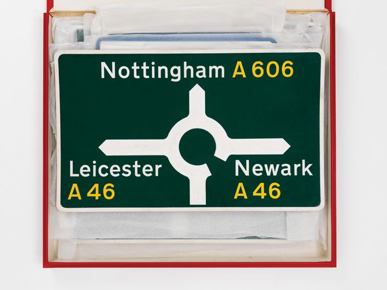
If all your letters are capital and the same size you can’t read the ‘shape’ of the word and have to read letter by letter. Use lowercase letters and it makes your words easier for your audience to read and follow and reduces their cognitive load.
For more on the discussion of fonts in presentation there’s a great page by Ross Fisher.
Remember when we started using PowerPoint in school? We’d add sound effects and spinning words and fancy slide transitions. It was annoying then. It’s still annoying. Don’t use them. They distract and might cost you respect/ethos.
Pictures have power. Use them wisely.