History rhymes: two Prime Ministers, two pandemics

The United Kingdom is in the throes of a pandemic. A new virus without cure or vaccine kills with frightening speed. The Prime Minister is struck down with fever. His life hangs in the balance. It is September 1918. The Prime Minister is David Lloyd George. History may not repeat but she does love to rhyme.

15th September 1918. David Lloyd George, Prime Minister and leader of the wartime coalition government, although not the leader of his party the Liberals, visits Manchester to receive the freedom of the city. It is the last few months of the bloodiest conflict known to man. By the end of the month the German High Command would telegram the Kaiser that victory was impossible. Peace would soon be in sight. However, far more people worldwide would lose their lives to a different, invisible enemy.

Lloyd George receiving the Freedom of Manchester Photo: Illustrated London News [London, England] 15 September 191721 September 1918

H1N1 influenza may well have been circulating in military camps for a while before 1918; the confines and poor hygiene were perfect for viruses to spread and mutate. There is much debate as to where the virus first appeared but given wartime censorship it was credited neutral Spain whose open reporting gave it the impression of being the disease’s epicentre. It would go to infect a third of the world’s population, killing at least 50 million people; more than double the deaths in World War One.

Unusually for ‘flu the victims were not children or the elderly but young to middle-aged adults. There’s a number of theories for this; whether their stronger immune systems actually turned against them and made the disease worse or if those old enough to have lived through the 1889–1890 ‘Russian ‘flu’ pandemic had retained some form of immunity. Whatever the reason those who succumbed rapidly developed pneumonia. As their lungs failed to supply their face and extremities with oxygen they would go blue with hypoxia. This harbinger of death was given the name ‘heliotropic cyanosis’ after the flower whose colour patients were said to resemble.

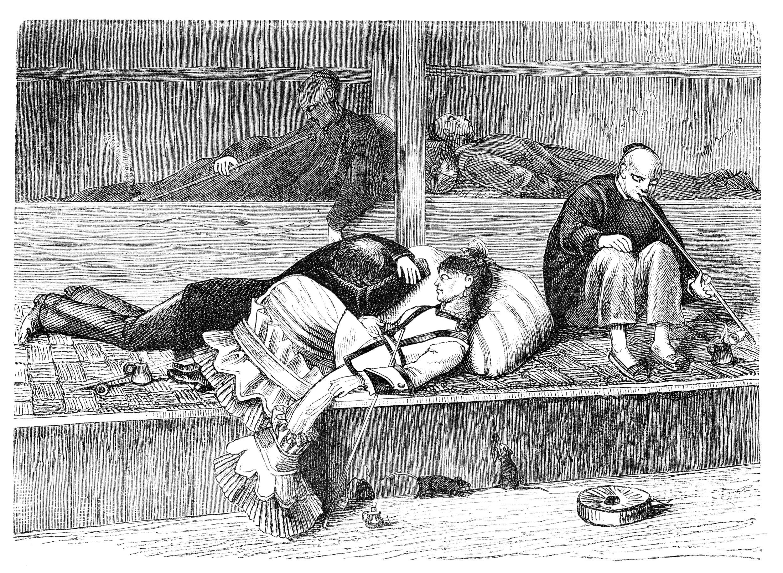
A plate from Clinical Features of the Influenza Epidemic of 1918–19 by Herbert French

And so to Albert Square, Manchester. David Lloyd George receives the keys to the city. The weather is appalling. Pouring with rain, the Prime Minister is soaked during the lengthy ceremony. He is met by dignitaries and well-wishers, shaking hands and exchanging pleasantries. By the end of the day he is hit by ‘a chill’. Although underplayed this chill renders him unable to leave Manchester Town Hall. A hospital bed is installed for Lloyd George. His personal physician visits him daily. It is eleven days before the Prime Minister is well enough to leave his bed wearing a respirator to both protect his stricken lungs and to prevent infection of others.

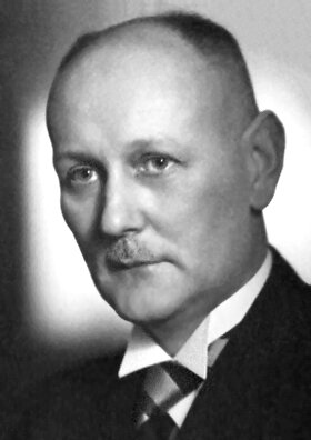
Manchester itself was to be an innovator in its response to the ‘flu pandemic. At the time there was no centralised Ministry of Health and so Public Health was a matter for local authorities under the auspices of Medical Officers. The Medical Officer for Manchester since 1894 was James Niven, a Scottish physician and statistician. With total war still ongoing Sir Arthur Newsholme, a senior health advisor to the British government, advised that even with ‘flu spreading munitions factories had to remain open and troop movements could not be interrupted. It was up to Medical Officers to think autonomously. Niven looked back at the pandemic of 1889–90 and noted that unlike seasonal ‘flu which strikes annually, pandemic ‘flu came in waves with each wave often more virulent than before. He argues:

“public health authorities should press for further precautions in the presence of a severe outbreak”

James Niven, Creative Commons

After the first cases of influenza were seen in Manchester in spring 1918 Niven therefore worked to prepare the city for the next wave that he predicted would hit later that year. Manchester was a densely packed working class city, a perfect breeding ground for disease. He closed schools and public areas such as cinemas. Areas which couldn’t be closed were disinfected. He studied statistics to be published on posters throughout the city to give people as much information as possible. He became a regular columnist in the Manchester Guardian advising readers on the symptoms of the disease. He advised that anyone showing symptoms must,

“on no account join assemblages of people for at least 10 days after the beginning of the attack, and in severe cases they should remain away from work for at least three weeks”

Manchester’s ‘flu outbreak would peak on 30th November 1918. Niven reflected that it might have occurred sooner without Armistice celebrations where he was powerless to prevent people congregating on the streets. Niven would remain in post until 1922. As well as his work fighting influenza he also led slum clearance, sanitation installation and improving air quality. Despite Manchester’s population increasing from 517,000 to 770,000 during his tenure the death rate per 1,000 population fell from 24.26 to 13.82. Despite his success in retirement he would be struck by depression. In 1925 he took poison and drowned himself in the sea off the Isle of Man.

Lloyd George would make a full recovery from his illness. He led the country’s Armistice celebrations and remained as Prime Minister until 1922 through the support of his Conservative coalition partners. His struggles for the leadership of the Liberals with his long time rival Herbert Asquith would dominate the party for at least the next decade and see them fall from government to third place in British politics. They would never return. Lloyd George remains the last Liberal Prime Minister in the United Kingdom. He would live to see his hard fought peace shatter and very nearly saw it return again, dying in March 1945.

History doesn’t repeat but she does rhyme. It is human nature to look for patterns and reason comparing the present to what has gone before. For Lloyd George stricken with influenza see Boris Johnson admitted to intensive care with COVID-19. For James Niven see Chris Whitty. However, our knowledge of disease, access to sanitation and healthcare progression is without equal in history. The H1N1 influenza virus behind the pandemic of 1918–19 would not be genetically sequenced until 1999. When COVID-19 first emerged in late December 2019 its genetic sequence was identified within a month. Intensive care and ventilation weren’t even figments of the imagination for the patient in 1918, Prime Minister or not. However, until a cure or vaccine for COVID-19 are realised our best weapon against it remains the advice of James Niven from over a century ago. From a time before social media or hashtags. Stay home.

Super Spreaders: The Story of 'Typhoid Mary'

A new virus which first appeared in a food market in China has crossed the world in a couple of months and declared a pandemic by the World Health Organisation As of 11th March there have been 118 619 confirmed cases of this virus, called COVID-19, worldwide, with 456 in the United Kingdom. Six people in the UK have died. Of those cases in the UK four were all linked to one other infected person who also infected another six, five in France and one in Spain. This is the story of a modern super-spreader and his Victorian era counterpart, ‘Typhoid’ Mary Mallon.

Steve Walsh Pic: Servomex

The case of our modern super-spreader Steve Walsh has been well covered in the media since he reported himself to health authorities. The 53 year old works for the gas analysis company Servomex. From 20th to 22nd January 2020 he attended a work conference in Singapore, one of 94 delegates travelling from overseas to the 109 strong body. One attendee was from Wuhan, China the centre of the epidemic. During the conference Walsh was exposed to COVID-19. Following the conference he joined his family for a holiday at Les Contamines-Montjoie near Mont Blanc in the French Alps from 24th to 28th January, staying in a ski chalet. Still feeling well he travelled on a busy easyJet flight from Geneva to Gatwick and went to a local pub, The Grenadier in Hove, on the 1st February. It was only after conference organisers alerted attendees that one of their number had tested positive for COVID-19 that Walsh alerted the authorities and was himself tested. By this time five Britons who had stayed in the same chalet became ill in France, another Brit returned to their house in Mallorca and fell ill and another group of four people flew home to the UK from the same ski resort and became unwell. All tested positive for COVID-19. All had had contact with Walsh. In the two week incubation period and without feeling unwell Walsh had inadvertently infected 10 people. After a mild illness in quarantine at the specialist infectious diseases unit at Guy’s and St Thomas’ NHS Foundation Trust in London he was discharged on 12th February.

A super-spreader is an individual who is more likely to spread a disease compared to other people with the same infection. The principle which is often used is the ‘20-80’ rule; 20% of people are behind 80% of transmissions. There are many different reasons why one person may be more contagious than others: vaccination rates, the environment, co-infections (men infected with HIV are more contagious if they also are infected with syphilis compared to those infected with HIV alone) and their viral load. A super-spreader may also be a carrier, completely symptom free, who yet can pass a disease onto others. Perhaps the most famous example of this kind of super-spreader was ‘Typhoid’ Mary Mallon.

Mary Mallon was born on September 23, 1869 in Cookstown, County Tyrone in what is now Northern Ireland. By 1884 she had moved to America to live with her aunt and uncle and to seek work as a cook for wealthy families. Between 1900 and 1907 she worked for seven families in the New York City area.

Mary Mallon in quarantine Creative Commons

A strange pattern emerged. Wherever Mary worked there was an outbreak of typhoid fever. This disease is caused by a type of Salmonella bacterium called Samonella typhi and spread in contaminated food and drink. Infected patients develop fever, abdominal and joint pains and vomiting and diarrhea. Some patients develop a rash.

This was very unusual. Typhoid fever was traditionally seen in slum areas and the poverty stricken, not the affluent houses Mary worked at. In 1900, she moved to work in  Mamaroneck, New York. Within a fortnight of her arrival residents fell ill with typhoid fever. The same thing happened in 1901 when she moved to Manhattan. The laundress at the house she worked at died of the disease. She then was employed by a lawyer and again left after seven of the eight people in the house fell ill.

In 1906 she moved to the very well to do area of Oyster Bay in Long Island. At the first house she worked at ten out of the eleven family members living there were hospitalised with typhoid fever. The same thing happened at another three households. Mary continued to change jobs after each outbreak.

She was eventually employed by a wealthy banker, Charles Henry Warren, as a cook. In 1906 when the family summered in Oyster Bay Mary joined them. From August 27 to September 3, six of the 11 people in the family came down with typhoid fever. George Thompson, the man whose house they had holidayed in, was concerned that the water supply might be contaminated and cause further outbreaks. He secured the services of a sanitation engineer George Soper who had investigated similar cases.

Soper published the findings of his research in the Journal of the American Medical Association on June 15th, 1907:

“It was found that the family changed cooks on August 4. This was about three weeks before the typhoid epidemic broke out. The new cook, Mallon, remained in the family only a short time and left about three weeks after the outbreak occurred. Mallon was described as an Irish woman about 40 years of age, tall, heavy, single. She seemed to be in perfect health.”

Soper could link 22 cases and one death to this Irish cook who seemed to vanish after each outbreak. So began a chase similar to that in the movie ‘Catch Me if you Can’; as Soper tried to track down Mary Mallon. When he eventually found her and asked for samples of her faeces and urine she violently refused:

“She seized a carving fork and advanced in my direction. I passed rapidly down the long narrow hall, through the tall iron gate, and so to the sidewalk. I felt rather lucky to escape.”

On another encounter in a hospital where Mary was being treated she locked herself in a toilet and refused to open the door until Soper left. She refused to accept she was the cause of the outbreaks and that she couldn’t work as a cook.

Soper passed the case over to physician Sara Josephine Baker with whom Mary still refused to engage. In the end Baker had to enlist the help of the New York police who arrested Mary. Stool samples confirmed the presence of Salmonella typhi. In 1908 the Journal of the American Association had dubbed Mallon ‘Typhoid Mary’.

Mary was held in isolation for three years of quarantine. By 1910 she was was released having signed an affidavit that she would no longer work as a cook and take all precautions to prevent infecting others. She began to find work as a laundress a position with less job security and lower income. Having struggled to make ends meet she changed her name to Mary Brown and began to work as a cook again. Typhoid once again followed her.

In 1915 she caused an outbreak at Sloane Hospital for Women in New York City infecting 25 of whom 3 died. As before she left her position following the outbreak but authorities found her visiting a friend and arrested her again. This time there would be no second chance and Mary Mallon spent the rest of her life in quarantine. She worked at the hospital she was confined to cleaning bottles in the laboratory. In 1932 she was paralysed by a stroke. She died of pneumonia on November 11, 1938 aged 69.

At post mortem Salmonella typhia bacteria were found in her gallbladder. She had remained a carrier until her death. We now know that 1 in 20 patients with typhoid fever who are not treated will become carriers. They themselves feel well even though the bacteria lives in their faeces and urine and can be spread by poorly washed hands. This is probably what happened to Mary Mallon.

Thanks to her aliases and avoiding authorities Mary Mallon may well have caused up to 50 deaths due to typhoid fever.

Mary Mallon and Steve Walsh both show the impact one part of the infection chain can have. However, that’s as far as the similarities go. Mary knew she was contagious and yet continued to work and put people at risk and did all she could to avoid detection. Yes it’s easy for me to criticise a woman who lived a century ago without job security who feared losing her livelihood. Whatever her reasons as a result of her actions people died. Walsh didn’t know he was infected and made himself known to and co-operated with the authorities as soon as he thought he might be. They both illustrate the same key importance of the public health approach; of contact tracing and identifying sources to break the chain of infection. They also show the value of an individual’s attitude. If we think we might be at risk of passing an infectious disease on we all have to make the choice. Are we going to be like Mary Mallon or Steve Walsh?

Thanks for reading

- Jamie

The Truthtellers: Li Wenliang & Ignaz Semmelweis

“Sunlight is the best disinfectant”

Louis Brandeis - US Lawyer

Disease feeds on ignorance and misinformation. And yet it is often human nature to conceal or silence due to vested self-interest. George Orwell said, “in a time of universal deceit telling the truth is a revolutionary act.” This is the story of a modern medical truth teller Li Wenliang and his predecessor of nearly two centuries: Ignaz Semmelweis.

Li Wenliang, Creative Commons

Li Wenliang was an ophthalmologist working at Wuhan Central Hospital since 2014. Like a lot of doctors (myself included) Li enjoyed using social media, especially the Chinese microblogging site Weibo.  Like myself food featured heavily in his posts, in particular Japanese food and fried chicken, as well as his favourite singer and actor Xiao Zhan.  He was a husband and father.  On his final birthday he posted a resolution to be a simple person, refusing to let the world’s complications bother him.  He was an optimistic person and entered various lotteries and competitions especially if the prize involved gadgets. 

On 30th December 2019 he saw a patient’s blood result confirming infection by a coronavirus, the same family of virus which had caused the Severe Acute Respiratory Syndrome (SARS) epidemic of 2003. SARS had originated in South China but news of the disease was suppressed by the government. The World Health Organisation was made aware of SARS through internet monitoring and China refused to share information for several months. By the time action was taken 2000 more people had been infected. In total 8098 people were infected with 774 deaths across 17 countries. The possibility of a new disease was politically sensitive. Li knew this.

Li alerted a group of his medical schoolmates on the social media application WeChat about the result. He warned them:

“Don't circulate the information outside of this group. Tell you family and beloved one to take caution.”

Li’s letter of admonishment, Creative Commons

On 31st December 2019 the World Health Organisation was alerted about an outbreak of pneumonia in the city centred around the Huanan Seafood Market. Despite asking for secrecy screenshots of Li’s warning were shared on social media. On 3rd January 2020 Li was interrogated by police staff for rumourmongering. He was warned about his conduct and against making claims on the internet. Li was given an official letter of admonishment which he was forced to sign.  He then had to give written answers to two questions: in future, could he stop his illegal activities and did he understand that if he continued he would be punished under the law?  “I can” and “I understand” he wrote, placing his thumbprint in red ink by both answer.  It wasn’t enough to scare him, this was the kind of punishment given to a schoolboy.  His name and the accusations were broadcast by state television. The message from was clear: toe the line.

The People’s Republic of China celebrated its 70th anniversary in October 2019 with a display of military might and what can be achieved through communist rule: mega cities, high speed travel and economic stability.  President Xi Jingping became only the second ruler after founding dictator Mao Zedong to have his political philosophy (Xi Jinping Thought on Socialism with Chinese Characteristics for a New Era or simply Xi Jinping Thought) incorporated into the Chinese constitution.  In 2018 the Chinese Communist Party voted to remove the two term limit on presidency, in place since Mao, leaving Xi free to indulge in a cult of personality similar to those of Maoism. The unspoken contract between the government and people was simple: in exchange for reduced freedom of speech we will give you efficient and effective government. First came a downturn in economic growth and a trade war with the US. Then the ongoing revolt in Hong Kong. This new disease was a third significant crack in the facade of the Chinese government’s strength.

On 7th January Li returned to work. The next day in clinic he saw a patient with glaucoma who worked at the Huanan market.  The patient didn’t have a fever and so Li saw her without a mask.  On January 10th he started to cough.  He sent his family to his in-laws 200 miles away and checked into a hotel.  On February 1st he tested positive for the new coronavirus.  “Well that’s it then, confirmed”, he wrote on Weibo from his bed.   Li was admitted to intensive care on the 12th January and tested positive for the new coronavirus on the 30th. He died on 7th February 2020 aged 33. There has been an outpouring of support for Li and criticism of the communist government of China with calls for freedom of speech. Despite a ruling from the Chinese Supreme Court on 4th February that Li should not have been punished there has been no apology at the time of writing from the government.

In the hours after Dr Li’s death nearly two million Chinese netizens had shared the hashtag “I want freedom of speech” on social media before it was taken down by authorities.  Petitions have been signed and sent calling for greater freedom of expression to be guaranteed in China.  Party chiefs are now using Dr Li as a hero, blaming his mistreatment as mistakes being made by individuals.  Global Times, a nationalist tabloid, has stressed that Dr Li was a loyal Communist party member and the pro-democracy forces whipped up by his death are the work of enemies abroad and dissidents in Hong Kong.

The new coronavirus has been named COVID-19 by the World Health Organisation who then declared a Public Health Emergency of International Concern. On 12th February 2020 the Chinese authorities announced a previous unrecorded extra 13,332 cases and 254 deaths. The official explanation is that this is due to recording patients with lung changes on CT scan suggestive of infection rather than just those with confirmed positive blood tests. The memory of SARS casts a long shadow, however, and suspicion remains that China are not being truthful about the extent of the epidemic. President Xi Jingping, despite being invisible for much of the early outbreak, is now the “commander of the people’s war against the epidemic” according to the state news agency, Xinhua.  Stirring stuff, but as scientists point out, the language of war doesn’t leave room for debate and discussion.  The international medical community is pushing against the censorship of a governnment. In the past, however, doctors have been behind the suppression of knowledge.

Ignaz Semmelweis, Creative Commons

Ignaz Semmelweis was born on July 1, 1818 in the Tabán, an area of Buda which is part of present day Budapest, Hungary which was then part of the Austrian Empire. He was the fifth child of ten of the family of grocer Josef and Teresia Müller Semmelweis. In 1837 he began studying Law at the University of Vienna but a year later switched to Medicine and graduated in 1844. After failing to secure a position in Internal Medicine Semmelweis was appointed assistant to Professor Johann Klein in the First Obstetrical Clinic of the Vienna General Hospital on July 1, 1846.

At the time free maternity care was available to women as long as they agreed to let medical and midwifery students to learn from them. Semmelweis was in charge of logging all patients as well as preparing for teaching and ward rounds. There were actually two clinics: the First Clinic was led by doctors and medical students, the Second was midlife which alternated daily. Semmelweis caught wind of the terrible reputation the First Clinic had. Indeed, destitute women would rather give birth in the street and wait a day than be admitted to the First Clinic. The difference was due to mortality. 10% of women admitted to the First Clinic died of fever compared to less than 4% of those in the Second Clinic. What was the difference? Meticulous to the extreme, Semmelweis began investigating and eliminating differences. The climate was the same, there was no difference in religious practice, it couldn’t be overcrowding as the Second Clinic was actually the busier. He was haunted by the question.

Jakob Kolletschka, Creative Commons

Tragedy would give him his answer. In 1847 his good friend Jakob Kolletschka, a Professor of Forensic Medicine at the University of Vienna, accidentally cut himself with a scalpel during a post mortem examination. He developed fever and multi-organ failure. Semmelweis had actually left Vienna to give himself a break from the question of the First Clinic. He returned on 20th March 1847 to discover that Kolletschka had died a week earlier. Semmelweis wrote:

“Day and night I was haunted by the image of Kolletschka's disease and was forced to recognize, ever more decisively, that the disease from which Kolletschka died was identical to that from which so many maternity patients died”

Rather than looking at just the clinic Semmelweis looked at what was taking place elsewhere. The medical students who ran the First Clinic started their day in the mortuary performing dissections before coming to see patients. The midwives of the Second Clinic spent all their time on the ward. Semmelweis surmised that there was a link between dead bodies and the fever which had killed his friend and was killing his patients. This was decades before the work of Koch and Pasteur and ‘germ theory’. All Semmelweis could postulate was that some ‘cadaverous particles’ were on the scalpel which cut his friend and caused his death and these particles were being spread to his patients by the medical students.

Semmelweis instituted a policy of using a solution of chlorinated lime (modern calcium hypochlorite, the compound used in today’s common household bleach) for washing hands between autopsy work and the examination of patients. He felt a strong smelling solution would eradicate the smell of rotting flesh and so eliminate whatever infectious agent was causing disease. Mortality in the First Clinic plummeted from 18.3% in April 1847 to 1.95% by the August.

Semmelweis had discovered that rates of infection could be cut dramatically by the simple act of handwashing. This went against established medical theory at the time which had concluded that miasmas or ‘bad air’ was behind infection and that balancing the humours through procedures such as blood letting were the basis of treatment.

In a precedent to modern China this was also a time of political upheaval. 1848 saw revolutions across Europe and in Hungary saw an independence movement rise up against Austria. Although ultimately quashed the rebellion would have consequences for Semmelweis’s research. His brothers were involved in the movement and his superior Professor Johann Klein was a conservative Austrian who probably didn’t approve of their actions. Semmelweis had other struggles. With no scientific explanation as to why hand washing worked he was faced with scepticism. The medical community was not prepared to accept that they were somehow unclean and responsible for the deaths of patients. There was also a problem with Semmelweis’s poor presentation of his project and high handed manner which some of his colleagues found off putting.

In 1851 Semmelweis took a new post on the obstetric ward at St. Rochus Hospital in Pest (now part of Budapest), Hungary. Again through handwashing he virtually eliminated post-partum fever amongst his patients. Between 1851 and 1855 only 8 patients out of 933 births died due to fever. However, even within the same city his ideas failed to spread. Ede Flórián Birly, the Professor of Obstetrics at the University of Pest, continued to believe that puerperal fever was due to uncleanliness of the mother’s bowel and so continued to practice extensive purging.

In 1858, Semmelweis finally published his own account of his work in an essay entitled, “The Etiology of Childbed Fever”. Two years later he published a second essay, “The Difference in Opinion between Myself and the English Physicians regarding Childbed Fever”. In 1861, Semmelweis published his main work Die Ätiologie, der Begriff und die Prophylaxis des Kindbettfiebers (The Etiology, Concept and Prophylaxis of Childbed Fever). In his 1861 book he lamented:

“Most medical lecture halls continue to resound with lectures on epidemic childbed fever and with discourses against my theories. The medical literature for the last twelve years continues to swell with reports of puerperal epidemics, and in 1854 in Vienna, the birthplace of my theory, 400 maternity patients died from childbed fever. In published medical works, my teachings are either ignored or attacked. The medical faculty at Würzburg awarded a prize to a monograph written in 1859 in which my teachings were rejected”

His health was in decline. He was obsessed with his work and the wronging he had suffered. He aged physically and became increasingly absent minded in his work and distant at home, slipping into depression. By 1865 he was drinking and visiting prostitutes. It’s been suggested that this was due to mental illness, the beginnings of dementia or even third-stage syphilis; a disease that obstetricians sometimes picked up from their patients. In 1865 a board made up of University of Pest professors referred Semmelweis to a mental institution where ‘treatment’ including being placed into a straitjacket, doused in water and beaten up. During one beating by the institution’s guards Semmelweis received a cut to his right hand which became gangrenous. Two weeks after his institutionalisation Semmelweis died of septicaemia; the condition he had spent his career fighting. His funeral was a quiet, poorly attended affair.

Two decades later Louis Pasteur confirmed the germ theory of infectious disease. Joseph Lister would pioneer aseptic surgery. Ignaz Semmelweis’s reputation was revised by a humbled profession. Now he was “the saviour of mothers”. There is a university named after him in Budapest and his home is now a museum. It is too soon to be able to fully evaluate Li’s legacy but in the immediate aftermath of his death he is being held up as a martyr to the nascent Chinese pro-democracy movement.

COVID-19 has been described as potentially China’s ‘Chernobyl moment’. As as with the USSR China’s monolithic one party state is struggling to contain and respond to a human disaster. The government is attempting to make the fight against the disease as a test of Chinese pride, a populist struggle to rise to. However, as history tells us disease is no respecter of borders, regimes or reputations. I’ll leave the last words to Dr Li given to Chinese media from his hospital bed shortly before he died:

“I think there should be more than one voice in a healthy society”

Thanks for reading.

- Jamie

Using evidence based education to design a teaching session

This sketch by Mitchell and Webb is funny but also has an important message behind it: evidence based medicine (EBM) is the centre of clinical practice. The reason we don’t reach for quartz crystals or start diluting down poisons is because we want to follow the evidence base. Yet while we want to practice evidence based healthcare do we always practice evidence based education? Do we route our education practices in the evidence base as much as we do in healthcare? Or do debunked educational theories such as learning styles still survive and spread? If we wouldn’t try and treat a trauma patient with crystals why try and teach with the educational equivalent of homeopathy?

This blog will take a look at the evidence base of how we learn and use that to form an approach to a teaching session that will make it easy for your audience. Whenever we teach our audience need to be our sole priority. Understanding how they think and learn should be central to how we design a teaching session.

What did you have to eat for lunch three weeks ago? What was the name of your first childhood pet? Chances are you won’t remember the former but will the latter even though your childhood pet may have been years ago. The reason is because of how human beings store information and form memories.

There’s essentially two types of information: the here and now and the long term. There here and now is dealt with by our working memory. Working memory is a cognitive system with a limited capacity. It temporarily holds information available to us to use immediately. Working memory is made of the phonological loop, which deals with sound information, the visual-spatial sketch pad, which deals with visual information and spatial awareness, and the central executive which controls information within the different areas. We therefore use our working memory for tasks such as reading, problem solving and navigation.

Working memory can hold a maximum of nine items (the seven plus or minus two principle) at any one time for fifteen to thirty seconds. That includes sensory information. This is why we have neural adaptation; after a while we no longer feel the clothes we’re wearing or smell the aftershave or perfume we’re wearing. If there’s a constant stimulus eventually our brain will start to ignore it in order to free up working memory.

Working memory becomes long term memory by categorising information into knowledge structures called ‘schema’. Through integrating these schema with existing knowledge and then repeated retrieval of the knowledge it becomes embedded in our long term memory. The lunch you ate three weeks ago would have been processed in your working memory, the here and now. But once eaten unless you repeated retrieving the memory it quickly became lost. However, your childhood pet, central to so many experiences over a long time, will be part of your long term memory and easily recalled.

The effort of turning working memory into long term memory is called cognitive load. As with physical effort it has its limits; just as if you try and lift too much weight you need to put it down and rest so too if your audience’s cognitive load is too much then they won’t learn.

We can see this outside of the classroom. Say you’re driving to work.  A route you use every working day.  The radio is on and you’re singing along word for word.  Suddenly you see there’s road works and you have to go down a different route you’re not familiar with.  There’s a tight parking spot and you need to do a three point turn.  What about the song?  Now it’s no longer pleasant but a distraction.  It’s like you don’t have the head space to listen and perform your tasks.  You turn the radio down.  Now it all feels easier. That is due to cognitive load. What we think of as multi-tasking is actually us moving attention between information and tasks. The more information and tasks going on the harder it is to manage.

There are three types of cognitive load which make up the total effort: the Good, the Bad and the Ugly. It’s a zero sum process so if there is too much negative load the less space there is for learning. We have to simplify the ugly, reduce the bad and maximise the good. This is cognitive load theory.

THE (CAN BE) UGLY

Evidence Based Education.003.jpeg

Intrinsic cognitive load is the amount of cognitive resources the person would need to use to transfer new information to long term memory. This basically how complex the material being taught is. Therefore it can be ugly. Too much complexity and there is too much of a cognitive load on our audience. An educator needs to manage this part and simplify their message as much as possible. This minimises intrinsic cognitive load and prevents it getting ugly. How can we find the right level for our message?

Bloom’s cognitive taxonomy

Benjamin Bloom (1913-1999) was an American education psychologist who chaired a committee of educators which devised three hierarchical models for education in the domains of cognition (knowledge), affection (emotion) and psychomotor (action).  These models classify learning into increasing levels of complexity and are used to devise learning objectives and design a teaching session.  

The cognitive domain is used as the basis of traditional curricula.  A student must first be able to achieve the basics before they can be expected to achieve the highest levels.  First they must remember facts, understand them, apply that knowledge before analysing and evaluating material before finally creating it themselves.  

  • Before you can understand a concept, you must remember it.

  • To apply a concept you must first understand it.

  • In order to evaluate a process, you must have analysed it.

  • To create an accurate conclusion, you must have completed a thorough evaluation.

We can use the cognitive domain to design a teaching session.  For instance, if you’re designing a session on sepsis and you’re audience have never heard the term before you would want to focus your session on remembering and understanding and so reduce intrinsic load.  Higher level skills should only be attempted once the basics are covered.  

I was lucky enough to see Professor Brian Cox, one of my role models as a teacher, live on tour. Was he covering everything? Did we leave knowing everything he knew? Did we know everything there is to know about space and time and quantum mechanics? No. He knew his audience and he tailored his message for us. We were only on the lowest levels of Bloom’s cognitive taxonomy but the level was perfect.

Find the right level for your talk.  Find the right message. Your message should be one sentence, one breath.  This is what I am going to talk to you about.  It should be made clear right at the beginning of your talk. Your message is not a punchline for the end.  It should be there at the beginning.  For all we complain if someone ‘spoils the ending’ of something the opposite is true.

In 2011 a series of experiments explored the effect of spoilers on the enjoyment of a story. Subjects were given twelve stories from a variety of genres. One group were told the plot twist as part of a separate introduction. In the second the outcome was given away in the opening paragraph and the third group had no spoilers. The groups receiving the spoilers reported enjoying the story more than the group without spoilers. The group where the spoiler was a separate introduction actually enjoyed the story the most. This is known as the spoiler paradox.

Understanding the spoiler paradox is to understand how human beings find meaning. This is known as ‘theory of mind’. This means we like giving meaning and intentions to other people and even inanimate objects. As a result we love stories. A lot. Therefore we find stories a better way of sharing a message. The message “don’t tell lies” is an important one we’ve tried to teach others for generations. But one of the best ways to teach it was to give it a story: ‘The Boy Who Cried Wolf’. Consider Aesop’s fables or the parables of Jesus. Stories have a power.

Therefore, if we know where the story is going it becomes easier for us to follow. We don’t have to waste cognitive energy wondering where the story is taking us. Instead we can focus on the information as it comes. Knowing the final point makes the ‘journey’ easier. We use this principle in healthcare when we make a handover:

“Hi, is that the surgical registrar on call? My name is Jamie I’m one of the doctors in the Emergency Department. I’ve got a 20 year old man called John Smith down here who’s got lower right abdominal pain. He’s normally well and takes no medications. The pain started yesterday near his belly button and has moved to his right lower abdomen. He’s been vomiting and has a fever. His inflammatory markers are raised. I think he has appendicitis and would like to refer him to you for assessment.

OR

“Hi, is that the surgical registrar on call? My name is Jamie I’m one of the doctors in the Emergency Department. I’d like to refer a patient for assessment who I think has appendicitis. He’s a 20 year old man called John Smith who’s got lower right abdominal pain. He’s normally well and takes no medications. The pain started yesterday near his belly button and has moved to his right lower abdomen. He’s been vomiting and has a fever. His inflammatory markers are raised. Could I please send him for assessment?”

Both are the same story with the same intended message - I’ve got a patient with appendicitis I’d like to refer. But which one would be easier for a tired, stressed surgeon on call to follow? In the last one the reason for the phone call is right there at the beginning and so the person at the other end knows exactly what they’re listening out for. Teaching sessions should be the same.

“Hello my name is Jamie. I’m going to talk about diabetic ketoacidosis which affects 4% of our patients with Type 1 Diabetes. In particular I’m going to focus on three key points: what causes DKA, the three features we need to make a diagnosis and how the treatment for DKA is different from other diabetic emergencies and why we that it is important.”

Your audience immediately knows what is coming and what to look out for without any ambiguity.

Brevity is beautiful.  Brevity is also hard.  It goes against our instincts as we want to show everything we know and all about the work we’ve done.  The less time you hard the harder it is.  The hardest talk I’ve ever had to give was a three minute talk on a project.  The project involved me designing a smartphone application for use in simulation sessions and to support my students during their week in the department.  This work had taken over eight months and I was supposed to boil this down to three minutes?  It seemed impossible.

This is why you need to go away and write out everything.  Write a blog or a report or make a handout.  Record a podcast.  Something where everything is.  In that act you’ll spot the key bits to take out and put into your presentation.  The rest your audience can find out afterwards from your blog or your report or your podcast.  This bit has to be done.

Having written out the blog containing all the information I identified the three key parts of the process and with that my message.  My message was how a custom made application could maximise the short time students had with me.  This was right at the beginning.  I then highlighted the three key points at the beginning and went through those.  I signposted to the blog for them to find out more.

Ethos comes from the speaker themselves.  This is you, your background and standing and how you come across.  Logos is using logic during your talk.  An example would be, “my project has shown we can save X amount of money by not needing to do pointless blood tests”.  It is also about how clear and easy to follow your message is and how logical it seems. Finally, pathos appeals to the emotions of the audience, their desire to do good and prevent suffering.  You can combine all three to be an effective speaker. 

THE BAD

Evidence Based Education.007.jpeg

Extraneous cognitive load creates distractions and prevents working memory from processing new information. It stops us learning. Distractions in the room and badly chosen media increase extraneous cognitive load and makes it harder to turn working memory into long term memory. As a result extraneous cognitive load must be reduced as much as is possible.

Remember the seven plus two principle of working memory from before. That’s a very small space which can be taken up very quickly by distractions. Once again we can turn to psychology to help us identify potential distractions with Maslow’s Hierarchy of Needs.

Maslow’s Hierarchy of Needs

Abraham Maslow (1908-1970) was an American psychologist.  His hierarchy of needs is a model for human psychological wellbeing with the most basic and fundamental needs at the bottom and more complex processes at the top.  Just as with Bloom’s taxonomy an individual can’t achieve the highest levels without those at the bottom.  This means that we can’t self-actualise (achieving our full potential) without meeting our physiological needs, feeling safe, relationships and feeling a sense of self-esteem.  While educators can’t cater for all of our audience needs we can think of Maslow’s hierarchy to reduce extraneous load.  Think about room design, background noise, temperature, time of the day and physiological needs such as hunger or needing the toilet.  If those basic needs are met then your audience working memory is being taken up with thoughts of hunger, their bladder or feeling cold.  

Once we’ve thought about our learning environment we need to then think about our learning materials and minimising extraneous load by using words and images correctly. History gives us an important lesson of the potential consequences of this…

In January 2003 the Space Shuttle Columbia launched. During launch a piece of foam fell from the external fuel tank and hit Columbia’s left wing.

Foam falling during launch was nothing new. It had happened on four previous missions and was one of the reasons why the camera was there in the first place. But the tile the foam had struck was on the edge of the wing designed to protect the shuttle from the heat of Earth’s atmosphere during launch and re-entry. In space the shuttle was safe but NASA didn’t know how it would respond to re-entry. There were a number of options. The astronauts could perform a spacewalk and visually inspect the hull. NASA could launch another Space Shuttle to pick the crew up. Or they could risk re-entry.

NASA officials sat down with Boeing Corporation engineers who took them through three reports; a total of 28 slides. The salient point was whilst there was data showing that the tiles on the shuttle wing could tolerate being hit by the foam this was based on test conditions using foam more than 600 times smaller than that that had struck Columbia. This is the slide the engineers chose to illustrate this point:

NASA managers listened to the engineers and read their PowerPoint and thought this was learning. Boeing read out their slides and thought this was teaching. NASA decided to go for re-entry.

Columbia was scheduled to land at 0916 (EST) on February 1st 2003. At 0912, as Columbia should have been approaching the runway, ground control heard reports from residents near Dallas that the shuttle had been seen disintegrating. Columbia was lost and with it her crew of seven. The oldest crew member was 48.

Presentationist+Workshop.010.jpeg

Edward Tufte, a Professor at Yale University and expert in communication reviewed the slideshow the Boeing engineers had given NASA, in particular the above slide. His findings were tragically profound.

Firstly, the slide had a misleadingly reassuring title claiming that test data pointed to the tile being able to withstand the foam strike. This was not the case but the presence of the title, centred in the largest font makes this seem the salient, summary point of this slide. This helped Boeing’s message be lost almost immediately.

Secondly, the slide contains four different bullet points with no explanation of what they mean. This means that interpretation is left up to the reader. Is number 1 the main bullet point? Do the bullet points become less important or more? It’s not helped that there’s a change in font sizes as well. In all with bullet points and indents six levels of hierarchy were created. This allowed NASA managers to imply a hierarchy of importance in their head: the writing lower down and in smaller font was ignored. Actually, this had been where the contradictory (and most important) information was placed.

Thirdly, there is a huge amount of text, more than 100 words or figures on one screen. Two words, ‘SOFI’ and ‘ramp’ both mean the same thing: the foam. Vague terms are used. Sufficient is used once, significant or significantly, five times with little or no quantifiable data. As a result this left a lot open to audience interpretation. How much is significant? Is it statistical significance you mean or something else?

Finally the single most important fact, that the foam strike had occurred at forces massively out of test conditions, is hidden at the very bottom. Twelve little words which the audience would have had to wade through more than 100 to get to. If they even managed to keep reading to that point. In the middle it does say that it is possible for the foam to damage the tile. This is in the smallest font, lost.

NASA’s subsequent report criticised technical aspects along with human factors. Their report mentioned an over-reliance on PowerPoint:

“The Board views the endemic use of PowerPoint briefing slides instead of technical papers as an illustration of the problematic methods of technical communication at NASA.”

It’s not the audience’s fault though. Human beings love patterns. And words are a lovely pattern of letters together with meaning. Put them in front of an audience and it doesn’t matter whether it’s a mobile phone contract (left) or even if it’s telling you not to read (right) chances are people will get to the bottom.

Human beings are addicted to words. Words are a controlled drug. And just like a controlled drug whilst they have a use they have to be used with caution.

Yet when we open up PowerPoint or Keynote we are presented with a host of templates with obscure backgrounds and hard to read text, making it very easy to fall into the same traps:

One common mistake, which Boeing used when they presented to NASA, is to write lists of data on the slide. This is easy to do yet simply doesn’t work. I could write down the first twenty elements of the periodic table. The audience could read along with me. Yet that is not teaching. Read the twenty elements. Which one is the eighth? Chances are you’ll have to look back.

There’s another problem, as Edward Tufte pointed out, that bullet pointed lists imply a hierarchy. Those at the top are the most important and those at the bottom are the least. Look at this poster for the ‘Sepsis Six’. Obviously an important campaign and message yet by numbering the points it implies that the higher up steps are more prominent than those at the bottom. From a communication point of view this is a problem.

You only need one point per slide. That point is then the focus of that slide and your audience. As it’s one point you don't need a heading. Limit the number of words and make your point clear.

There. The eighth element is oxygen. A clear and memorable point.

Presentationist+Workshop.034.jpeg

However, just as words can be used badly so too can images. They can be distracting, misleading or just sheer pointless.

In order to minimise extraneous load we have to be careful about how we use images.

“A picture is worth a thousand words.” It’s a cliche but it’s true. Look at cave paintings. Despite the millennia that separate us from our ancestors there is a still a message that cuts through in a way which would be lost with the written word.

These slides contain some lovely images but also some mistakes. In the slide on the left there are four smalls on one slide. If you were talking about the heart this means there are three other distracting images for your audience to look at. It also means the image is too small. In the slide in the middle there’s pointless and patronising heading and annotation. The slide on the right contains one single, large, clear image. Perfect for use while you talk about the heart.

Pictures also have emotive power. Pictures can change the world. In 1990 HIV/AIDS had been public knowledge for seven years. There has probably never been a disease as stigmatising for its victims. For most it was a disease of gays, of drug users or immigrants. It wasn’t a disease that would affect us. It wasn’t a disease we could empathise with. The red ribbon campaign was still to come. The US didn’t even have a national AIDS policy. Then in 1990 a photograph was published.

Think how many thousands, how many millions of words had been written about HIV/AIDS by 1990. This photograph made more impact than all of them together. It shows David Kirby, a young man dying of AIDS, surrounded by his family. A patient with AIDS dying with a father, mother and sister grieving him. This photograph, known as ‘The Face of AIDS’, is credited with changing public opinion immediately. In 1992 it was used as part of a provocative campaign from Benetton, a clothing company. It was taken by Therese Frare, a photographer who befriended David Kirby in the final stages of his illness and was allowed to capture his final moments. Almost biblical, it humanised AIDS. These patients were not outcasts, they were people with loved ones just like everyone else.

Remember the photograph of Alan Kurdi, the three year Syrian refugee who drowned in the Mediterranean Sea. Within 24 hours of its publication the charity Migrant Offshore Aid Station reported a fifteen fold increase in donations.

it is possible to read words and be detached. Unless you are a psychopath it is impossible to look at a photograph like ‘The Face of AIDS’ and not feel something. If there’s a face on the screen we’ll find it and we’ll interpret it. Our neural pathways fire and we’ll empathise with that face. We’ll feel what they feel. This is pathos in action. Using an image like ‘The Face of AIDS’ in your slides cuts through far more than a slide of text.

Data presentation is often a part, or even the reason, for presenting. Just as with words and images we need to present data in a clear way to reduce extraneous load. These graphs all show the same data. The one on the left and in the middle are both pie charts. To interpret them you need to look back at the label, find the colour and work out which looks biggest. Even with labels showing the percentage you still need to compare with others. This takes time and increases extraneous load. The bar chart on the right is much clearer. E immediately looks bigger than the others. This reduces load.

Another way of reducing extraneous load is to find the message in your data. A common mistake is to show all of the data in one slide. The slide on the left here shows data for a made up drug. There’s a table and a bar chart comparing this new drug to existing treatment. “Sorry for the busy slide, I’ll talk you through it” we’ll say and maybe even use a red box to highlight the key point: that the new treatment reduces mortality by a half.

Firstly, never use a slide you have to apologise for. Secondly if there’s a key point of your data then make that the single point of your slide. An easy to repeat and understand key point. If your audience want more data you can signpost them to a blog, report, podcast. Dropbox, Google Drive wherever. But they’ll take away a very simple message. Your brand new wonder drug halves mortality compared to previous treatment.

THE GOOD

Germane cognitive load is a deep process. It describes the organisation of information by integrating and connecting it with exiting knowledge. This is how our audience takes what’s been presented to them there and then and turns it into long term memory. Germane cognitive load needs to be maximised as much as possible.

It’s the night before your big exam. There you are, hunched over your books, highlighter in hand, caffeine in your bloodstream, flooding your short term memory with as much as you can. You continue doing so even as you wait to be called into the exam hall. You try and remember as much as you can. The next day, as the adrenaline leaves your system and you can finally get your life back you realise you remember very little about what you covered in those final, intense sessions of revision. The following day you remember even less. Eventually, despite having forced yourself to remember all those final bits of knowledge, you realise you remember nothing of it. You’ve passed your exam yet you have actually learnt nothing. We’re all guilty of the learn and burn approach of cramming. Yet we are all living, breathing proof it doesn’t work. This is the story of Hermann Ebbinghaus, the forgetting curve and how interleaving our learning can prevent the loss of knowledge.

Hermann Ebbinghaus (1850 – 1909) was a German psychologist. Contrary to the scholarly fashion of the time he was interesting in studying memory using himself as a test subject. He tried to memorise a collection of nonsense words and plotted how many he could remember a week or so later. He published his work in 1885 as Über das Gedächtnis (later translated into English as Memory: A Contribution to Experimental Psychology). He charted how poor recall was following an isolated learning event was without frequent calls to draw on that knowledge. The more frequently he recalled the nonsense words the longer he could remember them. This is the forgetting curve.

Ebbinghaus gave the process a formula and hypothesised several contributing factors to the ability to recall knowledge: how complex the subject was, how it linked to previous learning and personal factors such as sleep and stress. Time is unlikely to be the sole factor but the forgetting curve demonstrates a remarkable loss of learning unless that subject is regularly reviewed as shown below.

However, through repeated reviews of the learning material (the stars) we can shift the learning curve and improve retention of knowledge. This shows how it is impossible to cover everything in a talk. Your audience won’t retain it. This also goes back to intrinsic load and the importance of a clear, simple message. No subject can be completely covered in a presentation and if you try to do so you’ll fail.  Your presentation should be like an iceberg. You can only show so much.  Present your message and inspire your audience to find out more.  

You should also try to encourage germane cognitive load through deep linkage to previous knowledge. This is difficult and goes against traditional learning. It also goes against that desire to cram.

The traditional model for curricula is to cover a topic in its entirety before moving onto the next which is covered in its entirety before moving onto the next and so on and so on. This is called blocking.

Blocked learning. Each topic is covered in its entirety and then the learning moves on. Assessment is separate and at the end.

In order to avoid blocking and the forgetting curve there are a number of potential solutions: interleaving, spaced practice and retrieval practice.

Interleaving

Rather than finishing a topic and moving on, never to return to look back in interleaving learners move between topics and ideas. he benefits of interleaving were first studied in rifle shooters in 1979 before also being found to benefit mathematics and music students when compared to blocked learning. The focus is on making connections with otherwise disparate topics.

Further research has shown that interleaving helps students distinguish between similar but different topics, a point not covered by blocked learning. The key seems to be that the topics have some inherent similarity; a paper from Indonesia in 2014 didn’t find any benefit from interleaving compared to blocked learning when learning anatomical words and translations. There is also a problem in terms of methodology. The paper looking at mathematics tested over a 3 month period, the paper looking at music skills tested a day after interleaving whilst the paper from Indonesia tested its subjects at 48 hours and one week. A lack of a coherent approach makes it hard to find a best practice. This is the challenge for educators to take on and find the best way to interleave learning.

Spaced Practice

Spaced practice is the opposite of cramming. The same amount of teaching is spaced out over time. Rather than five hours in one day you learn for one hour for five days. This takes us back to intrinsic load and the iceberg. We can’t cover everything in one session, we have to break a topic up and spread it around.

Retrieval practice

Retrieval practice involves recreating something you’ve been taught from your memory and thinking about it now. This is the basis of the shifting the forgetting curve as we looked at above. The idea is that some time must pass from the teaching session and the retrieval. Different tactics can be used such as quizzes, mock exams or flashcards.

For more information The Learning Scientists have excellent blogs on interleaving, spaced practice and retrieval practice.

This is how our month might look with interleaving and spaced practice. It’s the same number of teaching sessions as during the example of blocking but there’s a swapping between topics and spacing. Assessment could be in the form of retrieval practice covering what’s previously been taught. The idea is to overcome the forgetting curve.

This shows that the single presentation can’t be seen in isolation. It’s impossible to cover everything in one talk as it means too much intrinsic load and it prevents germane load. The focus must be on forming connections with previous learning and signposting to further resources or future sessions.

This should shape how we plan the session. Start with your clear message. Recall previous learning through discussion or activity. Introduce the new material. Show the connections between the new material and previous and future learning. Signpost.

TED talks have an 18 minute limit on their talks. This is to focus speakers and ensure they keep their audience’s attention. We can use something similar in our sessions, aim for no more than 18 minutes on a section of your talk, use exercises to break between sections and keep focus.

We gave up trying to resuscitate patients with smoke up their bottom because there wasn’t an evidence base. We can’t keep trying to educate without an evidence base either. Shape your sessions with the evidence.

Simplify intrinsic load

One simple message. Remember the spoiler paradox. Simplify the complex.

Reduce extraneous load

Remember Columbia. One point per slide. Use images and data correctly.

Maximise germane load

Beat the forgetting curve. Interleave. Use spaced and retrieval practice.

Thanks for reading

- Jamie

Mouldy Mary and the Cantaloupe

public.jpeg

It’s a well known story and example of medical serendipity. Alexander Fleming (1881-1955) a Scottish microbiologist who returned to his laboratory following his summer holiday and found his growth plates of Staphylococcal bacteria had been contaminated with mould. Wherever the mould was growing the bacterial cells had been killed. Antibiotics had been discovered. Except this wasn’t the first antibiotic to be made. Medication with antibacterial action dates back to before the medieval period. When it came to penicillin Fleming’s discovery was only the beginning. And the penicillin still in use today owes much to an unsung hero called Mary and a mouldy cantaloupe.

Fleming surmised that the mould must be making some sort of chemical which was killing the Staphylococcus.  The mould in question was Penicillium notatum and so Fleming called this chemical Penicillin.  Fleming wasn’t skilled at chemistry and so was only able to extract small amounts of this penicillin which he demonstrated did kill bacteria and was safe in humans.

Sample of penicillin mould presented by Alexander Fleming, 1935. From https://blog.sciencemuseum.org.uk/oxford-and-the-forgotten-man-of-penicillin/

Fleming was a poor public speaker and despite presenting his findings at a Medical Research Club and publishing his results in the British Journal of Experimental Pathology in 1929 there was little recognition amongst his peers.  It wouldn’t be until 1939 that Ernst Chain and Sir Howard Florey managed to distil concentrated penicillin from the mould.  In 1940 they completed their first animal trials.  By 1941 they were ready to treat their first human patient but due to the experimental nature of their drug they needed someone who was seriously if not terminally ill.  In 1941 Albert Alexander, a police constable in Oxford, scratched his face on a rose thorn (although this explanation for the injury has been described as apocryphal).  The scratch became infected with both Staphylococcus and Streptococcus bacteria.  Abscesses covered his face and he lost an eye.  

On 12th February Alexander was given an intravenous infusion of 160mg of penicillin.  Within 24 hours his fever resolved and he regained strength and his appetite.  Sadly, it was already clear that Penicillium notatum made very little amounts of penicillin; it took gallons and gallons of the mould to make enough penicillin to even cover a fingernail.  After 5 days of treatment the team ran out of penicillin.  Alexander’s condition worsened again and he died.  

Whilst penicillin was clearly promising there needed to be a more efficient way to produce the antibiotic, especially at the height of the Second World War when demand couldn’t have been higher.  A solution would be found in America.

Mary Hunt worked at the Department of Agriculture’s Northern Regional Research Laboratory (NRRL) in Peoria, Illinois.  It was her job to search our for mould strains which might produce more penicillin than Penicillium notatum.  This earned her the nickname, ‘Mouldy Mary’.  One day in 1943 she found a mouldy cantaloupe in a grocery store.  Bringing it to the lab she found it was infected with Penicillium chrysogenum, a strain which produced two hundred times the amount of penicillin as notatum.  The next step sounds like it came right out of science fiction.  The chrysogenum was zapped with X-rays to cause mutation.  This mutated mould now produced a thousand times the amount of penicillin.  By D-Day in 1944 there was enough penicillin to treat every soldier in need.  By 1945 a million people had been treated with penicillin compared to fewer than 1000 in 1943.  

After the war Fleming, Florey and Chain received the Nobel Prize in Physiology and Medicine for the ‘discovery of penicillin and its curative effect in various infectious diseases’.  As for Mary Hunt, whilst researching this blog I couldn’t even find out when she was born or what she looked like.  She isn’t the first woman to be sidelined in history despite her massive contribution.  But all penicillin used today is related to that mouldy cantaloupe and owes its existence to ‘Mouldy’ Mary Hunt.

shutterstock_1394087879.jpg

Casting the dye: the first antibiotics

public.jpeg

To look at a photograph of microscopic life is to see a world of purple and blue.  Of swirls and dots.  Of course this isn’t the case but actually the result of dyes used to make this invisible world vivid under the lens.  Haematoxylin and eosin (H&E) are two such dyes regularly used.  Haematoxylin dyes the nuclei of cells (where DNA is stored) blue whilst eosin stains the cytoplasm (the goo which makes up most of the cell) pink.  Other structures take on dyes in various amounts to create the remarkable pictures which form the basis of life and disease.

Breast cancer cells viewed under a microscope using an H&E stain. Hematoxylin has stained the cell nuclei blue while eosin has dyed the cytoplasm pink. From Shutterstock.

Breast cancer cells viewed under a microscope using an H&E stain. Hematoxylin has stained the cell nuclei blue while eosin has dyed the cytoplasm pink. From Shutterstock.

Such a principle is impressive.  But with a bit of lateral thinking it would herald a medical revolution.  Decades before Alexander Fleming would find pencillium mould killing cultures of bacteria in his laboratory dyes would form the foundation for the first ever antibiotics.

Paul Ehrlich (1854–1915) was a German biochemist who started experimented with dyes in microscopy. In looking down his microscope and seeing how different cells and structures took up dyes in differing amounts Ehrlich hypothesised that it must be possible to find chemicals which could be taken up bacterial cells but not human cells.  If these chemicals were toxic to bacterial cells they would form an anti microbial treatment which would be safe for humans.  Such a chemical would be the ‘magic bullet’ doctors were crying out for.

Ehrlich painstakingly tested compounds of arsenic.  The 606th compound, Arsphenamine (later called Salvarsen) was shown to destroy Treponema pallidum, the cause of syphillis.  Patients with syphillis started treatment with Arsphenamine.  Sadly, it proved toxic and killed some of Ehrlich’s patients.  But a principle was proven and Ehrlich won the Nobel Prize for Medicine in 1908 for ‘outlining the principles of selective toxicity and for showing preferential eradication of cells by chemicals’.  

A stamp printed in Niger shows Nobel Prize in Medicine, Paul Ehrlich, circa 1977. From Shutterstock.

A stamp printed in Niger shows Nobel Prize in Medicine, Paul Ehrlich, circa 1977. From Shutterstock.

German chemical company, IG Farbenindustrie continued looking at dyes as a potential antibiotic treatment.  In 1932 Gerhard Domagk (1895-1964) discovered that a red dye, Prontosil, was toxic against Streptococcus bacteria.  What’s more, it was safe in humans.  The medical community were sceptical, however.  In 1936 President Roosevelt’s son took ill with a sore throat and high fever.  After conventional treatments were first exhausted doctors tried Prontosil.  It worked and he made a full recovery.  Fame followed for Domagk, with the American media extolling the virtues of Prontosil, but not fortune.  Whilst Prontosil had a patent over it researchers quickly found that its therapeutic effects only came through it being metabolised in the body into sulphanilamide which didn’t have a patent.  Sulphanilamides were free to be made by any drug company who wanted to.  Domagk would still be celebrated by the scientific community and, like Ehrlich, was awarded the Nobel Prize, this time in 1939.  However, the prize was frowned upon by the Nazis and Domagk was apprehended by the Gestapo when he attempted to travel to receive it.  He was finally free to receive it in 1947.  

Gerhard Domegk. Creative Commons.

Gerhard Domegk. Creative Commons.

However, by the time Domagk was awarded his Nobel Prize the potential of penicillin was starting to be realised. To Alexander Fleming would come fame. His story of serendipity and not those of Ehlrich and Domagk’s painstaking research would become part of folklore. However, the story of antibiotics does not stop with Fleming. There would need to a crucial intervention from someone with even less recognition than Ehlrich and Domagk. But more of that story later.

Thanks for reading.

- Jamie


#FOAMPUBMED 6: Type II Error

nothing-1394845_960_720.jpg

In a previous blog we looked at how Type I error means we wrongly reject our null hypothesis

TYPE II ERROR COMES ABOUT WHEN WE WRONGLY ACCEPT OUR NULL HYPOTHESIS. 

Say you’re developed a new drug. You give it to one patient and they don’t get better. One of two conclusions can be made at this point. Either the drug genuinely doesn’t work and so this is true negative. Or the drug does work but unfortunately not in this patient’s case and so this would be a false negative.

Type II Error is about too many false negatives in our results and not finding a relationship when there is one. This will mean that we will find our new drug isn’t better than the standard treatment (or placebo) when it actually is.

TYPE II ERROR IS ALSO CALLED BETA

In the above example you can see with one patient you can’t tell the difference between a true negative and a false positive.

This means we need to design our study with enough patients to ensure we can tell true and false negatives apart.

This brings us on to the next blog and Power…

Bald’s Leechbook: Going (pre) medieval on superbug

Bald’s eyesalve. A facsimile of the recipe, taken from the manuscript known as Bald’s Leechbook (London, British Library, Royal 12, D xvii).

Bald’s eyesalve. A facsimile of the recipe, taken from the manuscript known as Bald’s Leechbook (London, British Library, Royal 12, D xvii).

In a previous musing I looked at medieval Medicine and common theories of illness and cure at the time. Medieval Medicine has a reputation for being backward in contrast to the enlightened Renaissance. This is the story of a pre-medieval medicine and a modern day ‘superbug’.

Methicillin resistant Staphylococcus aureus (MRSA) was first identified in Britain in 1961. Staphylococcus aureus is a very common species of bacteria often found on the human body which, given the opportunity, can cause infections especially in soft tissues like the skin. Staph aureus bacteria have a cell wall which protects them from their environment. They use a number of proteins to build this wall. It’s these proteins to which penicillin antibiotics bind and stop bacteria from making their protective cell wall (hence them being called penicillin binding proteins or PBPs). Without their wall the bacterial cells die. MRSA gets around this because it has evolved to produced a protein called PBP2a which is much harder for penicillins to bind to and so their activity is greatly impeded.

Like a lot of bacteria MRSA is able to stick together and secrete proteins to form a slimy, protective layer. This is called a biofilm. This means it is able to colonise various surfaces in the community and hospital environment. As a result MRSA is a leading cause of infections acquired in both the community and in hospitals. In fact, there are ten times the number of infections due to MRSA than all other multiple drug resistant bacteria combined. Science has looked at unusual places to find an answer. Enter Bald’s Leechbook.

Bald’s Leechbook was written in England in the 10th century and offers cures for a number of conditions, including infections. In 2015 a study decided to look at one such cure for eye ‘wen’ - a lump in the eye (probably a sty). This was the passage in question:

“Ƿyrc eaȝsealf ƿiþ ƿænne: ȝenim cropleac ⁊ ȝarleac beȝea emfela, ȝecnuƿe ƿel tosomne, ȝenim ƿin ⁊ fearres ȝeallen beȝean emfela ȝemenȝ ƿiþ þy leaces, do þonne on arfæt læt standan niȝon niht on þæm arfæt aƿrinȝ þurh claþ ⁊ hlyttre ƿel, do on horn ⁊ ymb niht do mid feþre on eaȝe; se betsta læcedom.”

This is translated into modern English as follows.

“Make an eyesalve against a wen: take equal amounts of cropleac [an Allium species] and garlic, pound well together, take equal amounts of wine and oxgall, mix with the alliums, put this in a brass vessel, let [the mixture] stand for nine nights in the brass vessel, wring through a cloth and clarify well, put in a horn and at night apply to the eye with a feather; the best medicine.”

Incredibly, Bald’s salve was found to kill MRSA as well as break up the biofilms it forms.  This was shocking enough but the researchers found that the salve seemed to work best when the recipe was followed exactly.  If steps or ingredients were skipped then the resulting treatment did not work as well.  Previous research had shown that individual ingredients such as allium species did have antibacterial effects but these were intensified when used in combination with the other ingredients. 

This suggests one of two possibilities.  Either Bald randomly threw together these recipes and got lucky.  Or there was something of a scholarly approach going on, using ingredients known to work and mixing them together to create something greater than the sum of its parts.  I’m not suggesting that all Medicine at the time was correct but as I said in a previous blog, perhaps the medieval period wasn’t such a dark age after all. 

This suggests a redrawing of medical and scientific history; previously the scientific method was believed to have been invented by the Royal Society in the 17th century and the first antimicrobial medicine was Lister’s carbolic acid in their 19th century. I’m not advocating a return of 10th century Medicine but instead an appreciate of our forebears who probably knew a lot more than we give them credit.

Thanks for reading

- Jamie

Syncope: A FOAMed Review

giphy.gif

This blog has been written to support a recent session I delivered for ACCS trainees on ‘Syncope’. This is not exhaustive but aims to explore some of the more interesting snippets of information I found on various FOAM resources.

What is syncope?

Syncope is a loss of consciousness due to temporary cerebral hypoperfusion. Therefore syncope is not the same as transient loss of consciousness (TLoC) which is a much broader term for any blackout. 

A key feature of syncope is that it is transient; a short period of collapse with a short recovery.  30% of patients with syncope will have more than one episode. 

ACCS+Syncope.002.jpg

Syncope by itself makes up 3-5% of Emergency Department presentations.     

In 50% of these cases we don’t find a cause.  Investigating a patient costs about £2000. 

In those patients where we find a cause neurocardiogenic syncope or vasovagal syncope is the most common form of syncope.  This is caused by an initial increase in sympathetic outflow followed by a rebound reduction in sympathetic activity leaving unopposed parasympathetic activity.  Vasovagal syncope makes up 35% of causes. 


Pathophysiology of vasovagal syncope from RCEMLearning, 2018

Pathophysiology of vasovagal syncope from RCEMLearning, 2018

Key Point: Remember the 3Ps of vasovagal syncope: Prodrome, Posture and Provoked. Don’t try and shoehorn a diagnosis!

Orthostatic syncope is due to an orthostatic drop >20mmHg systolic or >10mmHg diastolic.  This could be due to a reduction in circulating volume (haemorrhage or dehydration) or vasodilatation due to medications or autonomic dysfunction (such as Parkinson’s).  Orthostatic syncope makes up 10% of cases. 

Cardiac syncope makes up 10-30% of cases.  This includes arrhythmias, heart failure and structural and valve problems. 

Neurological/psychiatric syncope is the rarest cause at 5% of cases.  Neurological causes include basilar artery migraine, vestibular dysfunction and vertebrobasilar ischaemia.  Psychiatric syncope is a recognised syndrome found in patients with anxiety, depression and conversion disorder that resolve with treatment of the psychiatric disorder.

Classification of syncope from RCEMLearning, 2018

Classification of syncope from RCEMLearning, 2018

Whilst cardiac syncope is not the most common causes of syncope it is associated with the highest mortality.

Mortality of the various aetiologies of syncope from Salim Rezaie, 2018

Mortality of the various aetiologies of syncope from Salim Rezaie, 2018

Key point: Syncope is common, most of the time we don’t find a cause but there are some very serious causes with high mortality

Because of how common syncope is and the potentially severity there are a few risk stratification scores designed to help us with the assessment of patients presenting with syncope. 

One such score is the San Francisco Syncope Rule which tries to identify high risk patients at risk of a serious outcome (death, MI, arrhythmia, PE, stroke, subarachnoid haemorrhage, significant haemorrhage or any other condition causing a return ED visit or hospitalisation for a related event) in the next 30 days.  It uses the mnemonic ‘CHESS’:

ACCS+Syncope.003.jpg

C ongestive heart failure

H aematocrit <30%

E CG abnormal (changed or any non-sinus rhythm)

S hortness of breath

S ystolic BP <90mmHg at triage

If ‘Yes’ is answered for any of these then the patient can’t be considered ‘Low Risk’. 

If you think about these are all very sensible criteria covering pump failure, potential bleeding, arrhythmia, PE and hypotension.

So far so good but what about the evidence?  MdCalc tells us that The San Francisco Syncope Rule has 96% sensitivity (not surprising given how broad the criteria are) but only 62% specificity so we’d still be scoring about a third of patients without a serious cause as a high risk patient.  If a patient is deemed low risk the NPV is 99.2% but PPV for those deemed high risk is only 24.8%.  According to MdCalc then it will pick up most people with a serious cause (96%) but there are a lot of false positives (75.2%) and whilst it delivers few false negatives (0.8%) it will also fail to rule out about a third of people without a serious cause.  Plus, whilst it is good that it gets us thinking about certain ‘never miss’ diagnoses like PE we already have the Well’s Score for that anyway for more constructive risk stratification.

ACCS+Syncope.004.jpg

Academic Life in Emergency Medicine (ALIEM) from Australia has different data but shows similar issues with the San Francisco Syncope Rule and other scoring systems:

Summary of syncope risk stratification scores from Salim Rezaie, 2018

Summary of syncope risk stratification scores from Salim Rezaie, 2018

Key point: Syncope risk scores are useful but not enough. Clinical assessment should always override 

ACCS+Syncope.005.jpg

So we can’t escape a good history and examination. Ask about before, during and after with all collapses.

ACCS+Syncope.006.jpg

Before  –  what were they doing? Were they lying down, standing up, exerting themselves, on the toilet, coughing or swallowing? Were they stood up in a hot, crowded place or had they just eaten? Was there a prodrome?  What medications are they on?  Have they been changed?  Is there a family history of sudden death including unexplained drownings or accidents?  Any chest pain, headache, abdominal pain or shortness of breath? Any recent illness? Anything like this before?

 During  –  do they remember what happened? Get a collateral history of what they were doing while collapsed.  How did they look?  What was the duration?

After – How quick was the recovery?  Are they back to normal? Any deficits?  Any injuries?  Did they bite their tongue or were they incontinent?  Any nausea or vomiting? Any confusion? 

A thorough cardiovascular examination is essential checking ECG, JVP and murmurs.

Specific findings in the cardiovascular examination from RCEMLearning, 2018

Specific findings in the cardiovascular examination from RCEMLearning, 2018

RCEM advise that tachycardia and hypotension point toward volume depletion and so should make us concerned.  Lying and standing BP should be sought. 

Neurological examination isn’t so useful; abnormalities found may not point to the pathology and a normal examination does not rule out a neurological cause.

Whilst tongue biting suggests seizure it is not sensitive and its absent does not exclude seizure.

Elderly patients are likely to have two or more reasons for their collapse.  Finding one cause does not preclude from their being others.

Increasing frequency of collapse suggests cardiac causes of syncope.  If the patient is known to have cardiac pathology this is an ominous sign.

Simple syncope during exercise is rare.  The presence of exertional syncope is strongly suggestive of either an arrhythmia or a structural cardiac abnormality.

Differential diagnoses of TLoC from RCEMLearning, 2018

Differential diagnoses of TLoC from RCEMLearning, 2018

Key Point: Your patient with syncope is a ‘WOBBLER’

WOBBLER’ is a great mnemonic for remembering key ECG findings to look for in any case of syncope. If I hear that the ECG is from a patient with syncope I usually write ‘WOBBLER’ and tick off each one as I’ve checked for them. It also goes through the order of the P, QRS and T waves.

ECGs and diagrams from Life in the Fast Lane

Wolff-Parkinson-White

Wolff-Parkinson-White is a pre-excitation syndrome caused an accessory pathway called the Bundle of Kent which bypasses the AV node.  The classic features are of a short PR interval and the delta wave.  There are two types of WPW.  In Type A WPW the accessory pathway is left-sided and produces a positive delta wave:

Type A Wolff-Parkinson-White

Type A Wolff-Parkinson-White

In Type B WPW the accessory pathway is right sided and produces a negative delta wave:

Type B Wolff-Parkinson-White, the negative delta wave is in III and aVF

Type B Wolff-Parkinson-White, the negative delta wave is in III and aVF

Because of this bypassing of the AV node the patient is at risk of going into a tachyarrhythmia.  There is a small risk of sudden death.  Electrophysiology studies confirm the presence of the accessory pathway which is then ablated.

For more on Wolff-Parkinson-White check out our blog here.

Obstruction of AV Node

Mobitz II and Third Degree Heart Block are both linked to sudden cardiac death.

Mobitz II 

mobitz_II_rhythm_strip.jpg

Unlike Mobitz I which is usually a functional suppression of AV conduction through drugs or reversible ischaemia Mobitz II is more likely due to structural damage to the conducting system through infarction, fibrosis or infection.  Mobitz I is progressive fatigue of the AV nodal cells but Mobitz II is an ‘all or nothing’ phenomenon where the Purkinje cells suddenly and unexpectedly fail to conduct a supraventricular response. 

Third Degree/Complete Heart Block

chb4.png

There is complete absence of AV conduction.  The patient relies on junctional or ventricular escape rhythm.  The patient is at risk of ventricular standstill causing syncope if self-limiting or death if prolonged.

Brugada

Brugada-type-1-1024x528.jpg


Brugada syndrome is due to a sodium channel gene mutation.  There is a familial link and autosomal dominant inheritance has been shown.  Type 1 Brugada, the only definitive ECG change which is potentially diagnostic, is this coved ST segment elevation in V1-3 followed by the negative T wave.    This is Brugada sign.  ECG changes can be unmasked by fever, ischaemia, drugs such as sodium channel blockers, calcium channel blockers, beta blockers, alcohol and cocaine, hypokalaemia and hypothermia. 

Type 2 Brugada has a saddleback ST elevation >2mm.  Type 3 can look like either 1 or 2 but the elevation is <2mm.  2 and 3 are not diagnostic but warrant further investigation. 

Brugada-1-3.jpg

The only proven therapy is an implantable cardioverter-defibrillator. Untreated Brugada is estimated to have a mortality of 10% every year.  Risk stratification and management of asymptomatic patients is controversial. 

 Bifasicular block

The conducting system is divided into a right bundle branch and a left bundle branch which is then further divided into an anterior and a posterior fascicle. 

avhisbb.jpg

In bifascicular block the right bundle and one of the left anterior or posterior bundles are blocked. This creates a RBBB with either a left (LAFB) or right axis deviation (LPFB). This shows there is a serious problem with conduction although progression to complete block seems to be rare.

Bifascicular block showing RBBB and LAFB

Bifascicular block showing RBBB and LAFB

Causes of bifascicular block include ischaemic heart disease (most common), hypertension and aortic stenosis. 

Trifascicular block refers to blocking of the right bundle and both left fascicles.  This can be incomplete or complete.  Incomplete refers to bifascicular block with either a 1st or 2nd degree heart block:

ECG3.jpeg

Complete trifascicular block looks like bifascicular block with 3rd degree AV block:

ECG4.jpeg

Again there is a risk of complete heart block.  Causes for trifascicular block are similar to bifascicular.  Hyperkalaemia also causes it – this resolved with treatment – as does digoxin toxicity. 

Left Ventricular Hypertrophy

On this ECG you can see the markedly increased LV voltages: huge precordial R and S waves that overlap with the adjacent leads. This is classic for LVH.

On this ECG you can see the markedly increased LV voltages: huge precordial R and S waves that overlap with the adjacent leads. This is classic for LVH.

Hypertension is the most common cause of left ventricular hypertrophy.  Other causes include aortic stenosis and regurgitation and structural problems such as coarctation of the aorta and hypertrophic cardiomyopathy.  It’s worth remembering that voltage criteria alone is not diagnostic and ECG changes are insensitive for left ventricular hypertrophy. 

Epsilon wave

The epsilon wave is a small positive ‘blip’ buried at the end of the QRS complex.  It is characteristic of arrhythmogenic right ventricular dysplasia (ARVD).

Epsilon_wave.jpg

ARVD is an inherited myocardial disease associated with paroxysmal ventricular arrhythmias and sudden cardiac death. The right ventricular myocardium is replaced by fibro-fatty material. After HCM it is the second most common cause of sudden cardiac death in young people (20% < 35 years). The epsilon wave is seen in 30% of patients with ARVD. You may also see anterior T wave inversion. Echocardiography is the first-line investigation but MRI is often the imaging modality of choice.

ARVD (1).jpg

Repolarisation

Short QT syndrome is a recently discovered (2000) arrhythmogenic disease associated with AF, VF, syncope and sudden cardiac death.  It is an inherited channelopathy.  It is a possible cause of sudden infant death. 

Short QT

Short QT

There are no diagnostic criteria for short QT syndrome but the ECG features are a short QT interval, short ST segments and peaked T waves especially in the precordial leads:

Long QT syndrome is a congenital disorder causing a prolongation of the QT interval with a propensity to ventricular tachyarrhythmias. Hypomagnesaemia, hypocalcaemia and hypokalaemia can cause long QT. Many drugs can also be responsible such as amiodarone, many antibiotics, TCAs, ondansetron, SSRIs and haloperidol.

Long QT

Long QT

Key Point: Who’s gonna drive them home?

For a nice PDF table regarding DVLA regulations and certain conditions have a look at here

For simple vasovagal syncope there are no driving restrictions for either Group 1 or Group 2 drivers.  The DVLA does not need to be notified for either group.

In cases of unexplained syncope but the likelihood is vasovagal syncope again there are no restrictions for Group 1 drivers.  Group 2 drivers can’t drive for 3 months.

In unexplained loss of consciousness with high risk factors (or more than one episode in 6 months) Group 1 drivers can’t drive for 6 months if no cause is identified (can drive after 4 weeks if a cause is found).  For Group 2 drivers they can drive 3 months after if a cause is found, 12 months if no cause is found. 

In cough syncope Group 1 drivers must stop for 6 months for a single episode and 12 months for multiple.  Group 2 drivers cannot drive for 5 years from the last attack. 

In arrhythmia Group 1 drivers must cease if it has caused or is likely to cause incapacity.  If the cause is found and controlled they may drive after 4 weeks.  The DVLA doesn’t need to be told unless there are distracting/distracting symptoms.  Group 2 drivers are disqualified. 

Syncope is a common and sometimes challenging presentation. Hopefully this review has shown you a few tips and key snippets to help you when you assess your next patient with syncope. Syncope? Cope.

- Jamie

Syncope Cope.jpeg

References:

Marjorie Lazoff, M., Marjorie Lazoff, M., Davies, A., Cadogan, D. and Marjorie Lazoff, M. (2018). LITFL Life in the FastLane. [online] Life in the Fast Lane • LITFL • Medical Blog. Available at: https://lifeinthefastlane.com/ [Accessed 12 Sep. 2018].

Mdcalc.com. (2018). San Francisco Syncope Rule - MDCalc. [online] Available at: https://www.mdcalc.com/san-francisco-syncope-rule#evidence [Accessed 12 Sep. 2018].

Rcem.ac.uk. (2018). [online] Available at: https://www.rcem.ac.uk/docs/College%20Guidelines/5z33.%20RCEM%20summary%20of%20DVLA%20fitness%20to%20drive%20medical%20standards.pdf [Accessed 12 Sep. 2018].

RCEMLearning. (2018). Syncope - RCEMLearning. [online] Available at: https://www.rcemlearning.co.uk/references/syncope/ [Accessed 12 Sep. 2018].

Salim Rezaie, M. (2018). Management of Syncope. [online] ALiEM. Available at: https://www.aliem.com/2013/04/management-of-syncope-aka-done-fell-out/ [Accessed 12 Sep. 2018].

Has austerity really killed 120,000 people?

There’s a statistic being widely reported across social and traditional media that the policy of austerity pursued by the UK government since 2010 has been directly responsible for 120,000 deaths. That is an alarming number and accusation. Could the UK government really have killed 120,000 people due to its economic policy?

I should say at this point that I have no particular political axe to grind here. I’m no fan of the Conservatives but I’m certainly a fan of good science and using statistics properly. Therefore this blog will take a look at whether the claim of 120,000 deaths due to austerity alone is correct.

public.jpeg

First some background. In the 2010 UK General Election the Conservative Party stood on a platform of cutting government spending as a response to the global recession. Following the election their leader David Cameron formed a coalition government with the Liberal Democrats. Cameron became Prime Minister and the Conservative Shadow Chancellor George Osbourne became Chancellor of the Exchequer. Cameron and Osborne then enacted their policy of austerity. The result was a cut in welfare spending of £30 billion. Although spending on the National Health Service was ring fenced against spending cuts the average real terms growth in health spending was 1.1%, much lower than under previous governments. Against this backdrop the claim of 120,000 deaths makes sense. Reduced healthcare spending means reduced healthcare provision. Reduced healthcare provision means more deaths.

Nine years after taking office Cameron and Osbourne still defend austerity. In his recently published memoirs Cameron argues his government should in fact have cut spending more. Osbourne has been dismissive in interviews about the negative impacts of austerity. However, Cameron’s successor as Prime Minister Theresa May claimed she had veered away from austerity and the current Chancellor Sajid Javid has annouced an increase in spending to reverse some of the cuts enacted by Osbourne. Both the Conservatives and Labour are making increased public spending through borrowing a feature of their 2019 election manifestos.

Not surprisingly those on the political left have made much of this figure of 120,000. The left wing journalist Ash Sarkar made a passionate argument on BBC Question Time quoting it. But is it correct?

Screenshot of tweets quoting the 120,000 deaths figure

Screenshot of tweets quoting the 120,000 deaths figure

The figure

Let’s first look at where the figure came from: a BMJ Open article from 2017. In their paper, Effects of health and social care spending constraints on mortality in England: a time trend analysis the authors Watkins et al., looked at death rates between 2011 and 2014 and compared these to the expected trend based on previous death rates.

From Watkins, J., Wulaningsih, W., Da Zhou, C., Marshall, D., Sylianteng, G., Dela Rosa, P., Miguel, V., Raine, R., King, L. and Maruthappu, M. (2017). Effects of health and social care spending constraints on mortality in England: a time trend anal…

From Watkins, J., Wulaningsih, W., Da Zhou, C., Marshall, D., Sylianteng, G., Dela Rosa, P., Miguel, V., Raine, R., King, L. and Maruthappu, M. (2017). Effects of health and social care spending constraints on mortality in England: a time trend analysis. BMJ Open, 7(11), p.e017722.

As this graph from the paper shows the authors performed age standardisation, this adjusted for the fact that the British population is made up of people of different ages, and compared the data of 2010-2014 with the previous trend (the blue line). They found that death rates actually went up (the red line) resulting in 45 368 ‘extra’ deaths in those four years. They used this number and extrapolated based on this new trend and found that between 2009 and 2020 there would be “an estimated 152 141 additional deaths.” The authors didn’t just frame this figure within the context of healthcare spending but with social care as well:

“Real-term adult social care spending decreased by 1.19% annually between 2010 and 2014 after correcting for the effect of inflation, reversing the annual increase of 3.17% between 2001 and 2009. This is despite increasing demand, with the group most likely to require social care—the over 85s—set to rise from 1.6 million in 2015 to 1.8 million in 2020.”

The authors also claimed that an additional £6.3 billion extra per year would need to be spend by the government to reverse these extra deaths. Music to the ears of left wing politicians and activists and all of us working in healthcare. As I said above, it seems a reasonable finding. If the government cuts provision for the elderly and sick you would expect to see more people dying. But is it all true?

What has been going with mortality rates?

Firstly, the data and trend reported by Watson et al., (2017) does match data from the Office of National Statistics who also show that the death rates for both genders since 2011 has been above the trend expected based on previous results. In the previous decade there was an overall downwards trend, albeit with brief rises in death rates in both 2003 and 2008, before austerity.

https://www.ons.gov.uk/peoplepopulationandcommunity/birthsdeathsandmarriages/lifeexpectancies/articles/changingtrendsinmortality/acrossukcomparison1981to2016

https://www.ons.gov.uk/peoplepopulationandcommunity/birthsdeathsandmarriages/lifeexpectancies/articles/changingtrendsinmortality/acrossukcomparison1981to2016

So it does look like there have been more deaths than expected since 2011. That’s not up for debate. But can we say these were definitely due to austerity? The short answer is no. Here’s why.

This study couldn’t prove causality

This was an observation study. This is a type of study where the researchers don’t actually interfere by changing what the subjects are exposed to. It’s obviously not possible to have some subjects living under austerity and another group not and so there was no randomisation or control group. Therefore it is impossible to use this study to draw a direct causation. An observational study is limited to suggesting a relationship but not cause-effect. There’s a commonly used phrase: correlation does not mean causality. Observational studies are therefore not high up on the hierarchy of levels of evidence.

LIFE EXPECTANCY IS IMPROVING BUT NOT AS FAST AS BEFORE

As we’ve already seen mortality rates have gone up. But what about life expectancy? Again we can look at ONS data.

The ONS divides the rate of increase year on year of life expectancy between the period 2004-2010 and 2010-2016. Between 2004 and 2010 the UK saw a rapid increase in the rate at which life expectancy improved. Only Portugal and the Netherlands saw higher increases in males and only Portugal and Poland saw higher increases in females. However, since 2010 the UK has seen the lowest average annual increase in life expectancy in females and only the US has had a lower average annual increase in life expectancy in males. Japan on the other hand have had the opposite trend with much faster improvements in life expectancy in 2010-2016 compared to 2004-2010.

The UK remains close to France and Germany and despite higher healthcare spending the USA lags in life expectancy

LE Males.png

So we know that the UK experienced a rapid rate of improvement in life expectancy in the first decade of the 21st century. Since then life expectancy is still improving but at a slower rate, especially in women. If we look at male life expectancy it has remained comparable to both France (orange) and Germany (grey), two similar countries to the UK (green).

LE Females.png

Female life expectancy in the UK has remained higher than in men and has largely caught up with Germany but lagged behind France even before austerity.

Notice how life expectancy in the UK has consistency been higher than the USA, a country with the highest per capita spending on healthcare. Other things must be going on than just spending. And while women may live longer than men why does life expectancy not improve at the same rate for both sexes?

The last few decades have seen improvements in cardiovascular health for older and male patients but also severe influenza epidemics

In the UK death rates from cardiovascular disease have more than halved since it peaked in the 1970s and 1980s. And that rate of improvement has been most prominent in the older age groups with 50% reduction in deaths due to heart disease in the 55-64 age bracket compared to 20% in men ages 34-44. So we’re getting better at preventing deaths due to cardiovascular illness and the most benefit is being seen in older patients. As well as this was an important piece of public health legislation in the UK: the 2007 ban on smoking in public places. Since then the percentage of people smoking in the UK has dropped from 22% to 15%. These are great improvements but the benefit hasn’t been shared out. It is notable that the improvements in cardiovascular medicine and reduction is smoking have benefited men over women. In 1971 women in the UK lived on average 6.3 years longer than men. By 2018 that had fallen to 3.6 years. The gender divide has closed.

In the past decade we have been seeing average increases in deaths due to influenza in the UK:

From The Guardian

2015 saw (at that point) the biggest year to year jump in deaths since 1968. The biggest jump occurred in patients aged over 75. A large contributing factor was that year’s influenza epidemic where antigen shift reduced the effectiveness of the vaccine which had been given. Influenza and other respiratory conditions were reported in a third of deaths in patients with dementia that year. 2017-2018 saw deaths due to influenza triple from the previous year with Public Health England also attributing that year’s particular severe winter to in the increase in deaths. It’s not all bad though. The 2018-2019 winter saw a new influenza vaccine be offered to the over 65s. Although the actual numbers of vaccinated over 65s varied across the UK the 2018-2019 winter saw little excess mortality due to influenza with the greatest health impact being seen in under 64 age groups. Influenza remains a seasonal, and sometimes difficult to predict, series Public Health challenge.

It’s been a pattern of Medicine that we have been increasing life expectancy

At first improvements were seen in reducing child mortality through vaccinations and better treatments for childhood infections. Then, as shown by the data of cardiovascular disease, we’re getting better at getting adults (especially men) to live longer and reduce the rate of heart disease through better treatment and prevention such as the smoking ban. But this means we then have a population of elderly patients who have lived to develop dementia and be vulnerable to the ‘flu.

Another statistic worth mentioning at this point is healthy life expectancy: how many years a person lives in good health free of disability. Whilst this is increasing it is not doing so at the same rate of life expectancy meaning people are living more years in poor health. And this too is favouring men over women. An English male could expect to live 79.6 years in 2015–17, but his average healthy life expectancy was only 63.4 years – i.e., he would have spent 16.2 of those years (20 per cent) in ‘not good’ health. However, in the same year an English female could expect to live 83.1 years, of which 19.4 years (23 per cent) would have been spent in ‘not good’ health.

https://www.theonion.com/world-death-rate-holding-steady-at-100-percent-1819564171

https://www.theonion.com/world-death-rate-holding-steady-at-100-percent-1819564171

As the satirical Onion put it in one of their articles, “the global death rate remains constant at 100 percent.” People have to die. It’s part of the human experience. So perhaps what we’ve seen since 2010 are some of those deaths we’ve previously been able to prevent but can't now. We’re good at preventing deaths due to heart disease but currently can’t cure dementia. We’ve been pushing deaths back later and later and now we’re seeing them this decade as well as more people (especially women) spending more of their later life in poor health.

So is austerity to blame for 120,000 extra deaths? Yes, during the period of austerity there has been a rise in deaths in the UK. And yes, life expectancy has not been increasing as fast as in the previous decade.

However, we certainly can’t say it’s the sole cause. Firstly, the study linking austerity to those deaths is simply not enough evidence. And much of health improvements in the past few decades has been on increasing the number of adults reaching older age and becoming susceptible to conditions we currently can’t cure such as dementia and frailty. We’ve also seen influenza epidemics which have particularly hit the over 65s. It’s likely that the rise in deaths is a mixture of all of these factors.

But while it is wrong to place sole blame on austerity it is important to talk about healthcare spending and what kind of provision we want in this country. We have an ageing population with increasingly complex needs. That needs paying for one way or another. We may also have to shift how we view modern medicine. Healthcare has been about improving life expectancy, simply adding years to life. A patient not dying and living longer than they would have managed without medical intervention is a success. If we are increasing a patient’s life but they are spending those extra years in poor health there is a philosophical argument: rather than adding years to life should we be looking at adding life to those years left?

Thanks for reading.

- Jamie

Opium: A trip through history

public.jpeg

In the past few months pharmaceutical giant Johnson and Johnson were ordered in court to pay $572 million in damages to patients addicted to prescribed opiate drugs. This is a landmark case placing those companies producing painkillers at a similar level of responsibility as tobacco manufacturers. Worldwide it is estimated that 16 million people have at some point been addicted to opiates. These chemicals, which include morphine and heroin, are alkaloid chemicals found naturally in the opium poppy, Papaver somniferum. Our relationship with this plant is historic and complex. Its therapeutic benefits are without question, hence an opium poppy is seen on the emblem for Royal College of Emergency Medicine. Yet we have fought wars over control of opium and its role in society calls in question greater issues involving the role of prescribed drugs and the companies who produce them. To understand opium is to understand the history of our relationship with it.

shutterstock_669963217.jpg

Opium comes from the latex of the poppy. This is a sticky substance like sap which oozes out of the poppy if it is cut. We don’t know when we first realised the poppy’s potential but there is evidence of our Stone Age ancestors making it one of the first plants to be harvested. It’s easy to imagine one of our ancestors eating a poppy or licking the latex off their fingers and finding its hidden abilities. As a result of the poppy’s ability to nullify pain and bring on altered consciousness it became linked to deities throughout the ancient civilisations such as the Egyptians. For the ancient Greeks the poppy was a gift from the goddess Demeter and was associated with Hypnos, the god of sleep, and Morpheus, the god of dreams, whose name would give us ‘Morphine’. It’s at this point it is worth pointing out a difference in nomenclature.  Drugs derived from opium are called opiates whilst synthetic drugs such as heroin are called opioids.  

Opiates and opioids both work by acting on opiate receptors. When they bind to opiate receptors on neurons they cause a reduction in neurotransmitter release and so prevent signals being sent. There are four types of opiate receptor: mu, kappa, delta and nociceptin dotted throughout the body. As a result whilst opiates are excellent at dulling pain (analgesia) they also come with side effects as well as an impact on the chemistry of the brain. This brings addiction and dependence. This is the double edge sword of opium.

The eminent Basra physician al-Razi (854-925) is credited with being one of the first people to use opium as an anaesthetic. Yet the downsides of the poppy were soon becoming clear. The fourth ruler of the Mughal Empire, Jahangir (1569-1627) was so addicted to opium his wife ruled in his stead. It was written of the Turkish people that “there is no Turk who would not buy opium with his last penny.”

shutterstock_1295082616 (2).jpg

One of the most popular forms of opium, as both a medicine and a drug of abuse, is laudanum. The legendary English physician, Thomas Sydenham (1624-1689) to whom the expression ‘primum non nocere’ (first do no harm) has been credited, published his recipe in 1676. He wrote “among the remedies which it has pleased Almighty God to give to man to relieve his sufferings, none is so universal and so efficacious as opium.”

Laudanum was widely exhorted as a treatment for illnesses as wide ranging as coughs and pain. Despite its addictive tendencies it was a lot safer than many other treatments of the times which often contained poisonous heavy metals. And, due to the constipating side effects of opium, at a time of poor hygiene with diarrhoea common, it did offer some therapeutic benefit. Laudanum was a common base for most treatments at the time. In 1821 the essayist Thomas De Quincey (1785-1859) published Confessions of an Opium Eater, an autobiographical work chronicling his addiction to and misuse of opium.

shutterstock_237235501.jpg

One country which struggled in particular with addiction to opium was China, which sort to limit the influx of the drug. For the Imperial British, growing poppies in India, China was a convenient and hungry market and they defended that market violently. So the two Opium Wars were fought between 1839 and 1842 and then 1856 to 1860 between China and Britain, helped by the French for the second conflict. The resulting victories for Britain reduced China’s gross domestic product by a half, taking them from the largest economy in the world to diplomatic subservience, kept the opium flow in China open and started the process by which the British took hold of Hong Kong. The current political turmoil in Hong Kong, returned to China in 1997, can be led back to conflicts fought to ensure Chinese opium addicts were having their habits fed.

Around this time in Britain a chemist, Charles Romley Alder Wright (1844-1894), was seeking to overcome the problem of opium addiction by formulating a version of morphine with all of the analgesic benefits but which wasn’t addictive. He boiled morphine with a number of different acids. It’s fair to say he failed in his mission. He created diamorphine, otherwise known as heroin, an agent even more potent than heroin both in its analgesic and addictive properties. After Wright’s death the Bayer Laboratories in Germany took over production led by Heinrich Dreser (1860-1924). First sold as a cough suppressant, Bayer stopped manufacturing heroin in 1913 when it was clear how addictive their product was. It is around this time that other opiates were being created, such as codeine.

shutterstock_65355052.jpg

It was in China where opium dens were established. With economic migration of Chinese workers to the USA came these opium dens. Here users could smoke opium and receive a much faster and stronger hit than through eating opium. The rise of these dens was partially behind the US Chinese Exclusion Act of 1882 which sought to limit immigration from China. In 1906 the federal government under President Teddy Roosevelt passed the Pure Food and Drug Act, which required any “dangerous” or “addictive” drugs to appear on the label of products. Three years later, the Smoking Opium Exclusion Act banned the importation of opiates that were to be used purely for recreational use. This was also wrapped up in anti-Chinese sentiment rather than simple drug legislation.

After campaigning from the pathologist Hamilton Wright (1867 - 1917) who called opium "the most pernicious drug known to humanity” the Harrison Narcotics Tax Act of 1914 put taxes and restrictions on opium.  Opium was stigmatised in the media and by officials.  In the UK the supply of opium and its derivatives was controlled by pharmacists.  The 1927 Rolleston Act gave prescribing power to doctors if they saw medical need.  Addiction was seen as a medical need and so doctors were able to prescribe small amounts to try and wean their patients off the drugs.  There was a clear division between the medical treatment of addicts and the criminal prosecution of producers and distributors.  That changed in the 1960s.

handcuffs-921290_960_720.jpg

In 1961 the Single Convention on Narcotic Drugs, an international treaty signed by all members of the United Nations, sought to restrict the spread of opium as well as other drugs.  In the UK this led to the 1964 Drugs (Prevention of Misuse) Act which for the first time criminalised addiction.  This created penalties for possession as well as stop and search powers for the police. The Misuse of Drugs Act 1971 divided drugs into categories A, B and C still in use today.

The debate about whether making criminals out of addicts actually works is ongoing and not something I’m going to dwell on much here.  But it is true that the idea of illegal drugs with penalties for possession only dates back within a generation.  A blink of an eye in relation to the millennia we’ve spent with opium.  One country who took a very different approach is Portugal. At one point in the 1980s 1 in 10 Portuguese were addicted to heroin.  The country had the highest rates of HIV infection in the European Union.  In 2001 they decriminalised posssesion, users were instead directed to support and treatment, similar to practice in the UK before the 1960s.  Since then, and not just due to the change in the law, deaths due to overdose, HIV transmission and drug related crime have all plummeted.  This suggests an alternative approach to illegal opium. But it’s not just the illegal market we now face a challenge from.

Opiates and opioids remain our best analgesics for those with severe pain or at end of life.  But all the evidence shows that they offer no benefit in long term use.  The problem is in the UK chronic pain is on the rise.  The British Pain Society estimates that as many as 28 million adults in Britain are living with pain lasting longer than 3 months. In giving his landmark judgement against Johnson & Johnson Oklahoma Judge Thad Balkman found the company guilty of:

“promotion of the concept that chronic pain was under-treated (creating a problem) and increased opioid prescribing was the solution.”

Similar claims have been made across the USA with more landmark trials expected. Chronic pain often has psychological issues attached to it. Yet in a short consultation with a GP or in a clinic there is rarely the opportunity to explore these. Opiates make a convenient solution. And so the double edge sword is wielded. Perhaps with litigation will come an open discussion about the use of opiates and the role of opium in our society. From a divine gift to a precious medical tool albeit one that needs to be used with caution.

Thanks for reading.

- Jamie

Are medical errors really the third most common cause of death?

You can guarantee that during any discussion about human factors in Medicine the statistic that medical errors are the third most common cause of patient death will be thrown up. A figure of 250,000 to 400,000 deaths a year is often quoted in the media. It provokes passionate exhortations to action, of new initiatives to reduce error, for patients to speak up against negligent medical workers.

It’s essential that everyone working in healthcare does their best to reduce error. This blog is not looking to argue that human factors aren’t important. However, that statistic seems rather large. Does evidence really show that medical errors kill nearly half a million people every year? The short answer is no. Here’s why.

It’s safe to say that this statistic has been pervasive amongst people working in human factors and the medico-legal sphere.

It’s safe to say that this statistic has been pervasive amongst people working in human factors and the medico-legal sphere.

Where did the figure come from?

The statistic came from a BMJ article in 2016. The authors Martin Makary and Michael Daniel from John Hopkins University in Baltimore, USA used previous studies to extrapolate an estimate of the number of deaths in the US every year due to medical error. This created the statistic of 250,000 to 400,000 deaths a year. They petitioned the CDC to allow physicians to list ‘medical error’ on death certificates. This figure, if correct, would make medical error the third most common cause of death in the US after heart disease (610,000 deaths a year) and cancer (609, 640 deaths a year.) If correct it would mean that medical error kills ten times the number of Americans that automobile accidents do. Every single year.

Problems with the research

Delving deeper Makary and Daniel didn’t look at the total number of deaths every year in the US, which is 2,813,503. Instead they looked at the number of patients dying in US hospitals every year, which has been reported at 715,000. So if Makary and Daniel are correct with the 250,000 to 400,000 figure that would mean that 35-58% of hospital deaths in the US every year are due to medical error. This seems implausible to put it mildly.

It needs to be said that this was not an original piece of research. As I said earlier this was an analysis and extrapolation of previous studies all with flaws in their design. In doing their research Makary and Daniel used a very broad and vague definition of ‘medical error’:

“Medical error has been defined as an unintended act (either of omission or commission) or one that does not achieve its intended outcome, the failure of a planned action to be completed as intended (an error of execution), the use of a wrong plan to achieve an aim (an error of planning), or a deviation from the process of care that may or may not cause harm to the patient.”

It’s worth highlighting a few points here:

Let’s look at the bit about “does not achieve its intended outcome”. Let’s say a surgery is planned to remove a cancerous bowel tumour. The surgeon may well plan to remove the whole tumour. Let’s say that during the surgery they realise the cancer is too advanced and abort the surgery for palliation. That’s not the intended outcome of the surgery. But is it medical error? If that patient then died of their cancer was their death due to that unintended outcome of surgery? Probably not. Makary and Daniel didn’t make that distinction though. They would have recorded that a medical error took place and the patient died.

There was no distinction as to whether deaths were avoidable or not. They used data designed for insurance billing not for clinical research. They also didn’t look at whether errors “may or may not cause harm to the patient”. Just that they occurred. They also applied value judgements when reporting cases such as this:

“A young woman recovered well after a successful transplant operation. However, she was readmitted for non-specific complaints that were evaluated with extensive tests, some of which were unnecessary, including a pericardiocentesis. She was discharged but came back to the hospital days later with intra-abdominal hemorrhage and cardiopulmonary arrest. An autopsy revealed that the needle inserted during the pericardiocentesis grazed the liver causing a pseudoaneurysm that resulted in subsequent rupture and death. The death certificate listed the cause of death as cardiovascular.”

Notice the phrase “extensive tests, some of which were unnecessary”. Says who? We can’t tell how they made that judgement. It is unfortunate that this patient died. Less than 1% of patients having a pericardiocentesis will die due to injury due to the procedure. However, bleeding is a known complication of pericardiocentesis for which the patient would have been consented. Even the most skilled technician cannot avoid all complications. Therefore it is a stretch to put this death down to medical error.

This great blog by oncologist David Gorksi goes into much more detail about the flaws of Makary and Daniel’s work.

So what is the real figure?

A study published earlier this year (which received much less fanfare it has to be said) explored the impact of error on patient mortality. They studied the impact of all adverse events (medical and otherwise) on mortality rates in the US between 1990 and 2016. They found that the number of deaths in that whole 26 year period due to adverse events was 123,603. That’s 4754 deaths a year. Roughly one hundredth the figure banded around following Makary and Daniel (2016). Based on 2,813,503 total deaths in the US every year that makes adverse events responsible for 0.17% of deaths in the US. Not a third. 0.17%.

Of course, 4754 deaths every year due to adverse events is 4754 too many. One death due to adverse events would be one too many. We have to study and change processes to prevent these avoidable deaths. But we don’t do those patients any favours by propagating false figures.

Thanks for reading.

- Jamie

#FOAMPubMed 5: Significance

newspaper-943004_960_720.jpg

SIGNIFICANCE MEANS SOMETHING DIFFERENT IN RESEARCH THAN IN LAY LANGUAGE

Often in the media we hear the results of a new trial showing a ‘significant’ result. A company may market a new drug or product that ‘significantly lowers your cholesterol’ for example. Or ‘such and such significantly increases your risk’ of something.

The trouble is for most of us that means that the effect must be large. The drug or product will make your cholesterol drop by a lot. That’s what ‘significantly lowering’ means to us.

SIGNIFICANCE IN RESEARCH MEANS YOU’VE REDUCED THE CHANCE OF FALSELY REJECTING YOUR NULL HYPOTHESIS

It means you’ve designed your study and recruited enough subjects to reduce the effect of chance. Usually the more significant we want our results to be the larger our sample size needs to be.

In a previous blog we looked at how Type I Error means falsely rejecting the null hypothesis through too many false positives. We looked at how we show we’ve minimised that chance with a p value. The gold standard is p<0.05 which means there is a less than 5% chance of falsely rejecting the null hypothesis.

p<0.05 MEANS OUR RESULTS ARE SIGNIFICANT

That’s what statistical significant means. It’s fairly arbitrary. In reality there’s very little between a p value of 0.049 and a p value of 0.051. Except the former allows you to use the magic words “my results are significant” and the latter does not.

SIGNIFICANCE DOES NOT DESCRIBE THE SIZE OF THE EFFECT

I could study a new drug for blood pressure and find the average reduction in my volunteers is only 1mmHg. That doesn’t sound a lot. But if the p-value is p<0.05 that is statistically significant. I could therefore describe my drug as statistically significantly reducing blood pressure.

The Good, The Bad and The (Can Be) Ugly: The Three Parts of Cognitive Load

Presentationist Workshop.008 copy.jpeg

You’re driving to work.  A route you use every working day.  The radio is on and you’re singing along word for word.  You really love this song.  Suddenly you see there’s road works and you have to go down a different route you’re not familiar with.  There’s a tight parking spot and you need to do a three point turn.  What about the song?  Now it’s no longer pleasant but a distraction.  It’s like you don’t have the head space to listen and perform your tasks.  You turn the radio down.  Now it all feels easier.

This is cognitive overload.  It’s not just an everyday phenomenon but instead an important concept we have to appreciate when we design and present a teaching session.  Cognitive overload explains why some teaching sessions don’t work.  In order to understand this we have to look at how we form memories. 

Working memory is a cognitive system with a limited capacity. It temporarily holds information available to us to use immediately. Working memory is made of the phonological loop, which deals with sound information, the visual-spatial sketch pad, which deals with visual information and spatial awareness, and the central executive which controls information within the different areas. We therefore use our working memory for tasks such as reading, problem solving and navigation.

Working memory becomes long term memory by categorising information into knowledge structures called ‘schema’. Through integrating these schema with existing knowledge and then repeated retrieval of the knowledge it becomes embedded in our long term memory. Working memory can hold a maximum of nine items at any one time.

Cognitive Load.001.jpeg

Cognitive Load

Cognitive load is the amount of mental resources used in working memory used to perform various tasks. In education cognitive load is essentially the amount of effort a student’s brain is having to make in order to learn new information. It is made up of three parts.  One can be ugly, one which is bad and one which is good.  We have to simplify the ugly, reduce the bad and maximise the good to make our presentation work. 

The (can be) ugly

Intrinsic cognitive load is the amount of cognitive resources the person would need to use to transfer new information to long term memory. This basically how complex the material being taught is. Therefore it can be ugly. Too much complexity and there is too much of a cognitive load on our audience. An educator needs to manage this part and simplify their message as much as possible. This minimises intrinsic cognitive load and prevents it getting ugly.

The bad

Extraneous cognitive load creates distractions and prevents working memory from processing new information. It stops us learning. Distractions in the room and badly chosen media increase extraneous cognitive load and makes it harder to turn working memory into long term memory. As a result extraneous cognitive load must be reduced as much as is possible.

The good

Germane cognitive load is a deep process. It describes the organisation of information by integrating and connecting it with exiting knowledge. This is how our audience takes what’s been presented to them there and then and turns it into long term memory. Germane cognitive load needs to be maximised as much as possible.

In order to manage intrinsic load, minimise extraneous load and maximise germane load requires planning. A simple message delivered in a clear way without distractions building on previous knowledge.

Thanks for reading.

- Jamie

The evidence doesn't lie: The case of the Phantom of Heilbronn and the importance of pre-test probability

anxiety-2878777_960_720.jpg

“Evidence doesn’t lie” - Gil Grissom, CSI

Ten years ago police were on the hunt for an unusual serial killer. There were several factors that made this suspect unique. Firstly; she was female, a rarity amongst serial killers. Secondly; there seemed to be no pattern to her crimes. Her DNA was found at crime scenes in France, Germany and Austria dating back to 1993. On a cup at the scene of the murder of a 62 year old woman. A knife at the house of a murdered 61 year old man. A syringe containing heroin. Altogether she was linked to forty separate crimes including six murders. Her accomplices included Slovaks, Iraqis, Serbs, Romanians and Albanians. This was an unprecedented case. A modern day Moriarty. She was called ‘The Phantom of Heilbronn’ or ‘The Woman Without a Face’.

Then in 2009 the police found her. After a case lasting eight years, 16,000 man hours and a cost of €2 million the police had their suspect. She was a technician working at the factory which made the cotton swabs the forensics team used to collect samples. As she had gone about her work moving and speaking her saliva and skin had got on the swabs and contaminated them. Police confirmed that every sample of the Phantom’s DNA had been collected with swabs from the same factory. The Phantom of Heilbronn did not exist.

If you think about it, it was incredibly unlikely that one woman was involved in so many different crimes across so many countries over so many years. It actually makes much more sense that it was error. And yet the investigators were blinded by the result in black and white on a screen.

This can happen in Medicine. A result from a blood test or imaging comes back positive or negative and we just accept it. We have use our brains and think about the tests we’re ordering and what the results mean.

Sensitivity

If you have a certain disease we want a test that will detect if you have it and come back positive. That is a test’s sensitivity. We don’t want false negatives: people with a disease not testing positive. A sensitivity of 100% means that the test will always come back positive if you have the disease. A sensitivity of 50% means that the test will correctly detect disease in 50% of patients with the disease. The other 50% get a false negative. Sensitivity is very important if you’re testing for a serious disease. For example, if you’re testing for cancer you don’t want many false negatives.

Specificity

As well as detecting disease you also want the test to accurately rule out a disease if the patient doesn’t have it. This is its specificity. We don’t want false positives: people who don’t have the disease testing positive. A specificity of 100% means that the test will always come back negative if you don’t have the disease. A specificity of 50% means that 50% of people who don’t have a disease will correctly test negative. The other 50% will be given a false positive result. Specificity is very important if there’s a potentially hazardous treatment or further investigation following a positive result. If a positive result means your patient has to undergo a surgical procedure or be exposed to radiation by a CT scan you’re going to want as few false positives as possible.

The trouble is that no test is 100% sensitive or 100% specific. This has to be understood. No result can be interpreted properly without understanding the clinical context.

public.jpeg

For example, the sensitivity of a chest x-ray for picking up lung cancer is about 75%. That means it gives a true positive for 3 out of 4 patients with the other patient getting a false negative. If your patient is in their twenties, a non-smoker with no family history and no symptoms other than a cough you’d probably accept that 1/4 chance of a false negative and be happy you’ve ruled out a malignancy unless the situation changes. However, in a patient in their seventies with a smoking history of over 50 years who’s coughing up blood and had unexplained weight loss suddenly that 75% chance of detecting cancer on a chest x-ray doesn’t sound so comforting. Even if you can’t see a mass on their chest x-ray you’d still refer them for more sensitive imaging. That’s because the second patient has a much higher probability of having lung cancer based on their history. So high in fact that choosing a test with such poor sensitivity as a chest x-ray might not be the right decision to make. This is where pre-test probability comes in.

Pre-test probability

This principle of understanding the clinical context is called the pre-test probability. Basically it is the likelihood the individual patient in front of you has a particular condition before you’ve even done the test for that condition.

The probability of the condition or target disorder, usually abbreviated P(D+), can be calculated as the proportion of patients with the target disorder, out of all the patients with the symptoms(s), both those with and without the disorder:

P(D+) = D+ / (D+ + D-)

(where D+ indicates the number of patients with target disorder, D- indicates the number of patients without target disorder, and P(D+) is the probability of the target disorder.)

Pre-test probability depends on the circumstances at that time. For example, the pre-test probability of a particular patient attending their GP with a headache having a brain tumour is 0.09%. Absolutely tiny. However, with every re-attendance with the same symptom or developing new symptoms or even then attending an Emergency Department, that pre-test probability goes up.

Pre-test probability helps us interpret results. It also helps us pick the right test to do in the first place.

Pulmonary embolism: a difficult diagnosis

Pulmonary embolism (blood clot on the lung) affects people of all ages, killing up to 15% of patients hospitalised with a PE. This is reduced by 20% if the condition is identified and treated correctly with anticoagulation. PE doesn’t play fair though and has very non-specific symptoms such as shortness of breath or chest pain. The gold standard for detecting or ruling out a PE is with a computerised tomography pulmonary angiogram (CTPA) scan. However, a CTPA scan involves exposing the chest and breasts to a lot of radiation. For instance, a 35 year old woman who has one CTPA scan has her overall risk of breast cancer increased by 14%. There’s also the logistical impossibility of scanning every patient we have. So we need a way of ensuring we don’t scan needlessly.

We do have a blood test, checking for D-Dimers which are the products of the body’s attempts to break down a clot. The trouble is other conditions such as infection or cancer can increase our D-Dimer as well. The D-Dimer test has a sensitivity of 95% and a specificity of 60%. That means that it will fail to detect PE in 5% of patients meaning we miss a potentially fatal disease in 1/20 patients with a PE. It also means it will fail to rule out PE in 40% of patients and so risk exposing patients without a PE to a scan which increases their risk of cancer. Not to mention starting anticoagulation treatment (and so increasing risk of bleeding such as as a brain haemorrhage) needlessly. So we have to be careful to only do the D-Dimer test in the right patients. This is why we need to work out our patient’s risk.

Luckily there is a risk score for PE called the Well’s Score. This uses signs, symptoms, the patient’s history and clinical suspicion and can stratify the patient as low or high risk for a PE. We then know the chances of whether the patient will turn out to have a PE based on whether they are low or high risk.

Only 12.1% of low risk patients will have a PE. At such a low chance of PE we accept the D-Dimer’s 5% probability of a false negative and are keen to avoid the radiation exposure of a scan and so do the blood test. If it is negative we accept that and consider PE ruled out unless the facts change. If it is positive we can proceed to imaging.

However, 37.1% of high risk patients will have a PE. Now it’s a different ballgame. The pre-test probability has changed. A high risk patient has a more than 1/3 chance of having a PE. Suddenly the 95% sensitivity of a D-Dimer doesn’t seem enough knowing there’s a 1/20 chance of missing a potentially fatal diagnosis. The patient is likely to deem the scan worth the radiation risk knowing they’re high risk. So in these patients we don’t do the D-Dimer. We go straight to imaging. If a D-Dimer has been done for some reason and is negative we ignore it and go to scan. We interpret the evidence based on circumstances and probability.

This is basis of the NICE guidance for suspected pulmonary embolism.

Grissom is wrong; the evidence can lie. Some of the results we get will be phantoms. Not only must we pick the right test we must also think: will I accept the result I might get?

Thanks for reading.

- Jamie

giphy.gif

#FOAMPubMed 4: p values

In the previous blog we looked at how Type I Error is the false rejection of a null hypothesis.

THE MAXIMUM CHANCE WE WANT OF FALSELY REJECTING OUR NULL HYPOTHESIS IS 5%

This is a gold standard.

WE THEREFORE DESIGN STUDIES TO HAVE A LESS THAN 5% CHANCE OF FALSELY REJECTING OUR NULL HYPOTHESIS

A p value is a decimal showing the probability of falsely rejecting the null hypothesis. It will usually be given in a paper along with the results.

As we want a chance of less than 5% of falsely rejecting our null hypothesis the p value we want is p<0.05

Some studies want an even smaller chance of Type I Error and so design their study for p=0.01 (1% chance of falsely rejecting the null hypothesis) for example.

The p value we want will help shape our study, including sample size.

With p<0.05 we will have significant results - more of that in the next blog

Two snakes or one? How we get the symbol for Medicine wrong

public.jpeg

Healthcare is full of antiquity, not surprising for a venture as old as humanity itself. Humans have always got sick and always turned to wise men and women and the divine to help them. With that comes symbols and provenance. Wound Man. The Red Cross. The Rod of Asclepius.

Ah yes, the Rod of Asclepius, the Ancient Greek God of healing. It’s a prominent symbol of Medicine. One staff, with two snakes entwined around it…

Except that symbol is not the Rod of Asclepius at all. That symbol of two snakes wrapped around a pole, known as a caduceus, actually belonged to Hermes, the Ancient Greek messenger God in charge of shepherds, travel and commerce. The Ancient Romans called him Mercury. The fastest of the gods, he had winged shoes and helmet to help him travel. On one adventure he saw two snakes fighting. To stop them he threw a stick at them and at once the serpents wrapped themselves around it and became fixed. Hermes liked the resulting staff so much he took it as his own. Hence the caduceus became a symbol of Hermes; of commerce and travel.

public.jpeg

Asclepius (Vejovis to the Romans) on the other hand was the son of Apollo the Sun God. Just like Hermes Asclepius was also linked to snakes. One story has a snake licking his ears clean and in so doing giving him healing knowledge. Another story has a snake giving him a herb with resurrecting powers. For whatever reason, Asclepius would show his gratitude to snakes by carrying a staff with one snake on it. Not two. One.

public.jpeg

The Ancient Greeks weren’t the first or last civilisation to link snakes to divinity. People have a habit of venerating and fearing in equal measure. Snakes, with their stillness, mysterious venom and supposed powers of self-renewal through shedding their skin are always going to inspire wonder.

So why the confusion between these two symbols? One possible reason is due to alchemy; the attempt by early scientists to turn base metals to gold which, while a folly, helped advance scientific knowledge including Medicine. The caduceus was used as a symbol by alchemists as they often used mercury or quicksilver in their preparations. Hermes/Mercury was linked to the metal that bore his name and so a connection was made. However, the caduceus was also a symbol of professionalism and craft. Therefore anyone wanting their work to be taken seriously would include the caduceus as a kind of early precursor of professional accreditation. In that vein when John Caius, the chronicler of sweating sickness, presented both the Cambridge college which bears his name and the Royal College is Physicians with a silver caduceus it was not as a symbol of Medicine but of professionalism.

In any case, in Great Britain, as late as 1854, the distinction between the rod of Asclepius and the caduceus as symbols of two very different professions was apparently still quite clear. In his article On Tradesmen's Signs of London A.H. Burkitt notes that among the very old symbols still used in London at that time, which were based on associations between pagan gods and professions, "we find Mercury, or his caduceus, appropriate in trade, as indicating expedition. Esculapius, his Serpent and staff, or his cock, for professors of the healing art"

It seems the mix up didn’t take place until the 20th century. In 1902 the US Army Medical Corp adopted the caduceus as their symbol. The reason isn’t clear as the American Medical Association, Royal Army Medical Corp and the French Military Service all would happily adopt the staff of Asclepius. This decision to choose the caduceus has been credited either to a Captain Frederick P. Reynolds or a Colonel Hoff. The Americans Public Health Service and US Marine Hospital would also take Hermes’s symbol as their own.

This confusion seems to be uniquely American and driven by commercialisation. In 1990, a survey in the US found that 62% of the professional associations used the Rod of Aesculapius while 37% used the Caduceus and 76% of commercial organizations used the Caduceus. Perhaps that makes sense as Hermes was the god of trade (or maybe that’s me being cynical). The World Health Organisation would choose the Rod of Asclepius for their emblem where it can still be seen today.

public.jpeg

Medicine is full of symbolism. Symbols, like language, change their meaning. There was a time that healthcare was full of quacks and charlatans. The Caduceus was a mark of professionalism long before their were accreditations to be had. Using the two snakes is a nod to those efforts to make the trade professional and accountable. But if you want to be accurate, it’s the staff with one snake you’re after.

Thanks for reading.

- Jamie

public.jpeg

When mental health robbed England of its king for over a year

Both Prince William and Prince Harry have spoken openly about their own mental health and the impact of losing their mother and growing up in the public eye. Together they have formed a charity to support young people with mental health problems. They aim to remove a stigma which still remains in the 21st century.

This musing goes back to another royal with mental health problems, this time in the 15th century. Problems whose diagnosis we still can’t identify and which led to his downfall and changed the course of history in England.

It’s 1453 and to say that King Henry VI of England has a lot on his plate would be an understatement. The Battle of Castillon on 17th July effectively ends the Hundred Years War with France and sees Henry lose the last part of an empire which once had stretched from the Channel to the Pyrenees. At home this defeat stoked the embers of rebellion. The War of the Roses is imminent. For Henry defeat was a personal blow too. He was the son of Henry V; war hero of Agincourt. He succeeded the throne in 1422 aged only nine months after his father’s sudden death and by the time he was deemed old enough to rule in his own right in 1437 the war with France had already turned against England. Henry was unable to live up to his father’s legend and reverse the slide putting his reign under increasing pressure from the very beginning.

King Henry VI

King Henry VI

Henry did have one thing going for him, his wife Margaret of Anjou whom he married in 1445. By the summer of 1453 she was pregnant. Strong willed and volatile she was far more willing than Henry to stand firm and make decisions. Henry deplored violence and would rather spare traitors and cut back himself instead of raising taxes. Royal duties were a distraction from his preferred activities; praying and reading religious texts. Admirable, but not ideal when revolution is in the air. As Henry began to earn his reputation as one of England’s weakest ever kings Margaret would come to be the de facto monarch. He would soon need her even more.

Margaret of Anjou

Margaret of Anjou

10th August 1453 at the royal lodge in Clarendon near Salisbury. Henry receives news of the defeat at Castillon and the deaths of one of his most faithful and talented commanders John Talbot, Earl of Shrewsbury and his son. Suddenly he falls unwell. Without warning he acts unaware of his surroundings, unresponsive to anyone and anything around him and seemingly unable to even move. With England on the verge of civil war his entourage are understandably keen to keep this under wraps and hope it passes. It doesn’t. Margaret stays in London and the royal court continues as normal. In early October, accepting how ill the king is, his court moves him gradually to Windsor. On 13th October Margaret goes into labour and is delivered of a baby boy, Edward. Henry is informed of the birth of his heir but doesn’t react. In the New Year Margaret brings Prince Edward to Henry. Both her and the Duke of Buckingham beg Henry to bless the young prince. Other than moving his eyes he does nothing. At the time he has to be fed and guided around the palace by his attendants.

One 22nd March 1454 John Kemp, the Archbishop of Canterbury and Lord Chancellor of England dies. The news is given to Henry by a delegation of bishops and noblemen in the hope he will wake and announce a successor. The group report back to Parliament that the king remained unresponsive. That same month a commission sends a group of doctors to treat Henry. They are provided with a list of possible treatments including enemas, head purging (heat applied to the head), laxatives and ointments. Whatever treatment they chose nothing works.

As suddenly as Henry fell ill he recovered after nearly 18 months on Christmas Day 1455. On 30th December Margaret brought Edward to Henry. The king was delighted and acted as though he was meeting the prince for the first time. Margaret was overjoyed, but with an agenda. During Henry’s illness Richard of York had claimed the title of Lord Protector and on the death of John Kemp placed his brother-in-law Richard Neville as the new Chancellor, a move Margaret opposed. Edmund Duke of Somerset, a rival of Richard’s and an ally of Margaret’s, was sent to the Tower of London. Richard was a relative of Henry’s and had a claim to throne. A claim scuppered by the birth of Prince Edward. The life of her son was in jeopardy. With Henry now well again Margaret persuaded him to remove Richard from favour and restore Somerset from the Tower. So intensified the resentment. Richard would begin to grow his support. The Wars of the Roses sprang from these personal rivalries. Had Henry not been unwell it’s possible the Wars of the Roses could have been avoided.

roses-3256160_960_720.jpg

So what was Henry’s illness? Much has been made of a supposed family history of mental health problems. His maternal grandfather King Charles VI of France suffered recurrent bouts of violence and disorientation, not recognising his family or remember he was king. These bouts lasted months at a time. It is possible they were due to mental illness such as bipolar disorder or schizophrenia. However, they seemed to follow a fever and seizures he suffered in 1392. Potentially Charles’s ‘madness’ may have been due to an infection such as encephalitis rather than psychiatric illness.

The length of Henry’s illness and sudden improvement with no apparent ill effect make schizophrenia or catatonic schizophrenia unlikely. The length of illness again along with the loss of awareness and memory make a depressive illness unlikely. There’s no record of him being similarly ill at another time of his life. It is is possible he suffered a severe dissociative disorder due to stress. Of course, it is completely plausible that contemporary accounts are inaccurate or incomplete, never mind the fact that it is impossible to make a diagnosis of a patient you haven’t met, never mind one who died six centuries ago.

Henry would cling to the throne until he was deposed in 1461, replaced by Edward IV, son of Richard of York. Henry was imprisoned and Margaret fled to Scotland with their son. But she wasn’t finished. She would reach out to Richard Neville and form an alliance based on an arranged marriage between her son and his daughter. Neville would force out Edward IV and reinstate Henry in 1470. It was to be a short return however. Edward IV raised an army and in the ensuing conflict both Richard Neville and then Henry’s son died in combat in early 1471. Henry once again was imprisoned in the Tower of London. He died mysteriously, possibly murdered on the orders of Edward IV, in 1471. His mental health was blamed, with supporters of Edward IV claiming he died of a broken heart at the loss of his son. Margaret was also imprisoned until she was ransomed by King Louis XI of France in 1475. She lived out her days in France until she died in 1482.

King as long as he could remember, losing his kingdom and facing potential rebellion and death it’s no wonder Henry’s mental health suffered. But what I think is remarkable is that at a time of no mental health knowledge his court was able to keep him fed and watered and otherwise healthy for 18 months. Even in the time since their mother died in 1997 Princes William and Harry are showing how far we have come in appreciating mental health. Their ancestor King Henry VI is a powerful example of the impact of mental health.

Thanks for reading

- Jamie

#FOAMPubMed 3: Type I Error

photo-1533988902751-0fad628013cb.jpeg

First things first, no piece of research is perfect.  Every study will have its limitations. 

One way we try to make research better is through understanding error.  

If we find that the new drug works when it doesn’t that’s called a false positive.  We can’t eliminate false positives; some patients will get better even if given placebo.  But too many false positives and we will find an effect when one doesn’t actually exist. We will wrongly reject our null hypothesis.  

Type I Error comes about when we wrongly reject our null hypothesis. 

This will mean that we will find our new drug is better than the standard treatment (or placebo) when it actually isn't.

Type I Error is also called alpha

A way I like to look at Type I Error is the influence of chance on your study. Some patients will get better just through chance. You need to reduce the impact of chance on your study.

For instance, I may want to investigate how psychic I am. My null hypothesis would be ‘I am not psychic.’

I toss a coin once. I guess tails. I’m right. I therefore reject my null hypothesis and conclude I’m psychic.

You don’t need to be an expert in research to see how open to chance that study is and how one coin toss can’t be enough proof. We’d need at least hundreds of coin tosses to see if I could predict each one.

You see how understanding Type I Error influences how you design your study, including your sample size

More of that later. The next blog will look at how we actually statistically show that we’ve reduced Type I Error in our study.

#FOAMPubMed 2: The null hypothesis

chaos-3098693__340.jpg


When we do research in Medicine it’s usually to test whether a new treatment works (by testing it against placebo) or better than the established treatment we’re already using.


At the beginning of our study we have to come up with a null hypothesis (denoted as H0).


The null hypothesis is a statement that assumes no measurable difference between whatever you’re studying.  


The null hypothesis is therefore usually something along the lines of: 

‘Drug A won’t be better than Drug B at treating this condition.’  

We then set out to test this null hypothesis.  If we find Drug A is better than B then we reject the null hypothesis and conclude Drug A is the superior treatment. If Drug A is found to be no better (i.e. the same or worse) than Drug B then we accept our null hypothesis and conclude that Drug A is non-superior (or inferior).


Error comes when we either wrongly reject or wrongly accept the null hypothesis.

Error means we come to the wrong conclusion. There are two types of error, the next blog will look at the first, Type I Error.